BLOG
A collection of article and ideas that help Smart Marketers to become Smarter
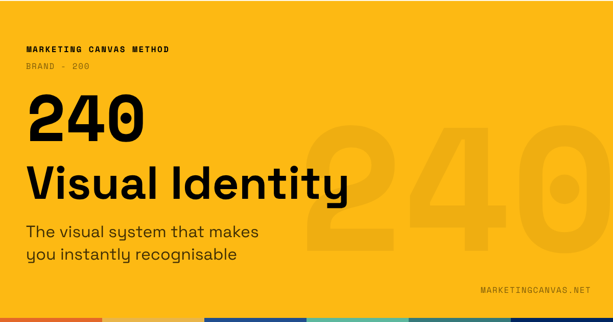
Marketing Canvas - Visual Identity
Visual identity is the only Brand dimension customers score before any interaction begins. The first impression formed from a colour, a typeface, or a photography style is a scoring event — rapid and largely subconscious. Dimension 240 of the Marketing Canvas applies four tests to determine whether what customers see matches what the brand stands for.
About the Marketing Canvas Method
This article covers dimension 240 — Visual Identity, part of the
Brand meta-category. The Marketing Canvas Method structures
marketing strategy across 24 dimensions and 9 strategic archetypes.
Full framework reference at
marketingcanvas.net →
·
Get the book →
In a nutshell
Visual Identity (dimension 240) is the visible expression of everything the brand stands for — logo, typography, colour, photography style, tone of voice, packaging, store design, digital experience. It is the layer customers actually see and touch.
Purpose, Positioning, and Values are internal architecture. Visual Identity is the façade that makes that architecture legible to the outside world. A brand can have a sharp purpose and clear values that customers never perceive, because the visual signals contradict or dilute them. Dimension 240 scores whether the visible layer matches the promise.
In the Marketing Canvas, Visual Identity sits within the Brand meta-category alongside Purpose (210), Positioning (220), and Values (230). It is the last of the four Brand dimensions — the one that translates all the others into something a customer can actually recognise.
What visual identity actually is
Visual identity is not just a logo. It is the complete system of signals that make a brand recognisable before a single word is read.
The most common failure in visual identity is not ugliness. It is inconsistency. A premium positioning with a budget-looking website creates cognitive dissonance. An innovation purpose with a conservative visual identity sends mixed signals. A sustainability-led brand using stock photography of white offices and generic smiling faces undermines its own story.
The Marketing Canvas tests Visual Identity against four questions — the same four that determine whether an identity is an asset or a liability:
Consistency — Does the brand feel the same across every touchpoint? Website, social media, packaging, sales presentations, email signatures, physical locations: the brand feeling should survive the channel change.
Alignment — Does the identity reflect Purpose, Positioning, and Values? A brand that stands for transparency should look transparent — open, legible, uncluttered. A brand that stands for premium craft should look handmade, not mass-produced.
Distinctiveness — Is the brand recognisable without the logo? This is the hardest test. Strip the logo from a social post, a packaging shot, a trade show stand. If the brand could belong to any competitor, distinctiveness is failing.
Likeability — Do target audiences find it appealing? Not universally appealing — strategically appealing to the specific people the brand is trying to reach.
Score negative when the brand looks different on social media than in stores, or when competitors' visual identities are interchangeable with yours. Score positive when someone encountering the brand in a new context — a trade show, a LinkedIn post, a delivery box — would recognise it instantly.
Visual identity in the Marketing Canvas
The canonical question
Is your brand instantly recognisable, and does what customers see reflect what you stand for?
Visual Identity appears in the Vital 8 of three archetypes — in different roles, for different strategic reasons:
Secondary Brake for A1 (Disruptive Newcomer): A disruptor entering a new market depends on being noticed and understood immediately. Rapid growth frequently outpaces identity coherence — different teams produce different materials, brand guidelines are informal, the visual language fragments. For A1, a weak Visual Identity score means the story isn't landing even when the product is right.
Secondary Brake for A7 (Scale-Up Guardian): The Scale-Up Guardian faces the same problem at higher speed. Hypergrowth across geographies, channels, and team sizes is the fastest way to dilute visual identity. The brand that looked coherent at 50 employees starts to splinter at 500. Protecting visual identity during scale is the A7 challenge — it requires governance, not just creativity.
Secondary Accelerator for A9 (Category Creator): A company creating a new market category faces a specific visual identity problem: customers cannot yet visualise what the category looks like. A distinctive, ownable visual identity helps customers recognise the new category before they fully understand it. Green Clean's visual shift — moving from generic eco-green to clinical-white-with-green-accents — signalled "health protection" rather than "cleaning products." The visual identity taught the category.
The four tools of visual identity
Visual identity is built from five core components. Each needs to be managed as part of a system, not designed in isolation:
Logo — The anchor of the system. Should be instantly recognisable, scalable from a favicon to a billboard, and capable of standing alone without a tagline. The logo is not the brand, but it is the most compressed expression of it.
Colour palette — The most powerful recognition tool. Colour increases brand recognition by up to 80% and is the first element processed in snap judgements. A primary colour and a disciplined secondary palette give the system range without incoherence. Proprietary colour ownership — the kind Tiffany has with its blue, or Hermès with its orange — is a competitive asset that takes years to build and seconds to dilute.
Typography — Fonts carry personality at a subconscious level. A modern sans-serif suggests clarity and accessibility. A refined serif suggests heritage and authority. Mixing type families without a clear logic produces visual noise. Most brands need two typefaces: one for display (personality), one for body (readability).
Imagery — Photography style, illustration conventions, graphic elements, and iconography. This is where most brands lose consistency first. When three different teams commission three different photographers with three different briefs, the imagery stops telling a single story.
Brand guidelines — The document that makes the system sustainable. Not a creative constraint — a consistency engine. Without guidelines, every new hire, agency, and market makes independent decisions that slowly fragment the identity.
Why consistency is a strategic imperative
Research consistently shows that visual consistency is not just an aesthetic preference — it is a commercial one.
Studies find that consistent branding across platforms can increase revenue by 33%, and that 73% of consumers trust a brand more when it presents a consistent visual identity. The Ehrenberg-Bass Institute found that products from high-cohesion brand portfolios achieve 17% higher brand recall than those from low-cohesion portfolios — a measurable commercial effect from visual discipline alone.
The mechanism is psychological: visual consistency is interpreted as reliability. A brand that looks the same everywhere signals that it behaves the same everywhere. Inconsistency, even subtle, reads as unprofessionalism or worse — as a brand that does not fully believe its own story.
Statements for self-assessment
Rate your agreement on a scale from −3 (completely disagree) to +3 (completely agree). There is no zero: the Marketing Canvas forces a directional position on every dimension.
Note on Detailed Track scoring: if averaging sub-question scores produces a mathematical zero, the method rounds to −1. A split score means the dimension is not clearly helping your goal — and "not clearly helping" requires the same investigation as "hurting."
Interpreting your scores
Negative scores (−1 to −3): Your visual identity lacks consistency, alignment, or distinctiveness — or all three. The likely result: customers cannot recognise the brand across contexts; the visual signals contradict the positioning; trust erodes because the brand looks different in different places. The identity is not working as a strategic asset.
Positive scores (+1 to +3): Your visual identity is consistent, aligned with purpose and values, distinctively ownable, and liked by the right audiences. The brand is recognisable without the logo. The visual layer makes the strategic promise visible and believable before a word is read.
Case study: Green Clean
Green Clean is a fictional eco-friendly residential cleaning service used as the recurring worked example throughout the Marketing Canvas Method.
Score: −2 to −1 (Weak) Green Clean's visual identity was assembled rather than designed. The website uses a stock photography library of forests and leaves. The social media uses bright greens and cartoonish icons. The service vehicle is plain white. The invoice template is a generic Word document. There is no logo consistency rule: the stacked version appears on the website, the horizontal version on vehicles, and a wordmark variant on the app. A customer encountering Green Clean on Instagram would not recognise them on a doorstep. The four tests all fail. Consistency: no. Alignment: no (the visuals say "eco" not "health"). Distinctiveness: no. Likeability: inconclusive because there is no unified identity to evaluate.
Score: +1 to +2 (Developing) Green Clean has developed a visual identity system connecting "health" and "home" — a palette of off-white, clean greens, and clinical blues that signals medical-grade standards rather than generic eco-friendliness. The logo exists in one canonical version. Photography guidelines specify real homes, real light, real people — not stock. But execution is uneven: the vehicles haven't been updated, the invoice template still looks generic, and two social media accounts use different colour proportions. The system exists. It is not yet fully applied.
Score: +2 to +3 (Strong) Green Clean's visual identity passes all four tests without effort. A customer who finds them on Instagram, receives their Family Health Report, sees their van outside a neighbour's house, and reads a local press feature would recognise the brand immediately across all four contexts — without seeing the logo in three of them. The off-white and clean-green palette is theirs. The photography style — natural light, visible ingredient labels, children in the background — is theirs. Every touchpoint looks like it was made by the same team with the same brief. The identity makes the positioning visible before a word is read.
Connected dimensions
Visual Identity does not operate in isolation. Four dimensions connect most directly:
220 — Positioning: Visual identity makes positioning visible. A brand positioned as "the indoor health protection company" needs a visual language that looks clinical and trustworthy — not naturalistic and decorative. If the identity contradicts the positioning, customers feel the dissonance even if they cannot name it.
230 — Values: Visual identity expresses values without words. A transparency value requires an open, uncluttered visual language. An environmental integrity value requires imagery that shows real commitment, not stock nature photography.
430 — Channels: Channels must carry visual identity consistently. A brand present across six channels that applies its identity differently in each one loses the cumulative recognition effect that makes visual identity commercially valuable.
520 — Stories: Stories are told through visual identity. The photography style, colour palette, and typographic voice are the container for every piece of content the brand produces. A weak visual system undermines strong storytelling — the message is right but the vessel dilutes it.
Conclusion
Visual Identity is the only Brand dimension that customers score for you before any interaction begins. The first impression formed from a logo on a van, a colour on a packaging shelf, or a typography choice on a social post is a scoring event — a rapid, largely subconscious assessment of whether this brand looks like one worth trusting.
The strategic imperative is not to look beautiful. It is to look consistent. A mediocre identity applied with total discipline across every touchpoint outperforms a brilliant identity applied inconsistently. Consistency is what turns recognition into trust, and trust is what turns visual identity from a design asset into a commercial one.
Sources
Cameron Chapman, "A Logo Is Not a Brand", Harvard Business Review, June 2011 — hbr.org
Marty Neumeier, The Brand Gap, New Riders, 2006 — amazon.com
Ward, Trinh, Beal, Dawes, Romaniuk, "Standing out while fitting in: Visual branding cohesion across a product portfolio", Journal of Marketing Management, Ehrenberg-Bass Institute, January 2025 — journals.sagepub.com
Marketing Canvas Method, Appendix E — Dimension 240: Visual Identity, Laurent Bouty, 2026
About this dimension
Dimension 240 — Visual Identity is part of the Brand meta-category (200) in the Marketing Canvas Method. The Brand meta-category contains four dimensions: Purpose (210), Positioning (220), Values (230), and Visual Identity (240).
The Marketing Canvas Method is a complete marketing strategy framework built around 6 meta-categories, 24 dimensions, and 9 strategic archetypes. Learn more at marketingcanvas.net or in the book Marketing Strategy, Programmed by Laurent Bouty.
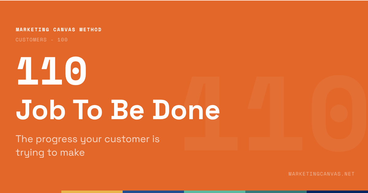
Marketing Canvas - Job To Be Done
Customers don't buy products — they hire them to make progress. Dimension 110 of the Marketing Canvas explains how to define the job at all three layers (functional, emotional personal, emotional social), why it is a Fatal Brake for Category Creators, and the single diagnostic sentence that exposes whether your team actually knows it.
About the Marketing Canvas Method
This article covers dimension 110 — Job To Be Done, part of the
Customers meta-category. The Marketing Canvas Method structures
marketing strategy across 24 dimensions and 9 strategic archetypes.
Full framework reference at
marketingcanvas.net →
·
Get the book →
In a nutshell
Job To Be Done (dimension 110) captures the ultimate objective that inspires a customer to hire your product or service. Not a description of what your product does. The reason a customer reaches for it in the first place — the progress they are trying to make in their life.
Theodore Levitt put it plainly in 1960: people don't want a quarter-inch drill. They want a quarter-inch hole. But the Marketing Canvas goes further. The hole is still only the surface. The functional job ("hang a picture") sits beneath an emotional job ("feel proud of my home") and a social job ("be seen as someone with good taste"). All three determine which product wins. Scoring only the functional layer produces a dimension score that flatters and misleads.
In the Marketing Canvas, JTBD is the first dimension in the Customers meta-category — the starting point for everything. Before positioning, before features, before pricing: who are your customers and what are they trying to accomplish?
What JTBD actually is
Customers don't buy products. They hire them to make progress.
That reframing has a sharp implication: the real competition for any product is not other products in the same category. It is every solution the customer could hire for the same job. Spotify competes with podcasts, meditation apps, and audiobooks — because all of them compete for the same job: "help me feel less anxious during my commute." Netflix competes with sleep. Understanding the job reveals the competition that a feature-based analysis never finds.
Jobs change slowly. Solutions change constantly.
This is the strategic insight that makes JTBD durable. A customer's functional job ("get from A to B without owning a car") has existed for decades. The solutions that serve it — taxis, rental cars, Uber, Lime scooters — change with technology. Brands that define themselves by the solution become obsolete when the solution changes. Brands that define themselves by the job remain relevant regardless.
Clayton Christensen, who popularised the framework in Competing Against Luck (2016), put it this way: jobs aren't just about function — they have powerful social and emotional dimensions. A brand that only understands the functional layer of its customer's job is working with a partial map.
Clayton Christensen, professor at Harvard Business School talks about the job to be done.
The three layers of every job
The Marketing Canvas structures JTBD across three scored sub-questions — one per layer. All three must be understood to score the dimension honestly:
Functional job — the tangible, measurable task the customer needs to accomplish. "Get my home clean." "File my tax return." "Track my fitness." This is the layer most companies understand reasonably well. It is necessary but not sufficient.
Emotional personal job — how the customer wants to feel as a result of getting the job done. "Feel safe in my own home." "Feel in control of my finances." "Feel like someone who takes care of themselves." This layer is what differentiates brands in mature categories where functional performance has converged. Two cleaning services that perform identically will be separated by which one makes the customer feel more like the person they want to be.
Emotional social job — how the customer wants to be perceived by others as a result of the purchase. "Be seen as a responsible parent." "Be known as someone who makes smart financial decisions." "Be recognised as someone who takes health seriously." This layer drives premium pricing, word-of-mouth, and tribal loyalty. It is the layer most commonly undiscovered because customers rarely articulate it directly — it has to be observed or inferred.
Job To Be Done
JTBD in the Marketing Canvas
The canonical question
What job is the customer hiring your product to do?
JTBD appears in the Vital 8 of three archetypes — in the highest-stakes roles:
Fatal Brake for A9 (Category Creator): You cannot create a category around a job you haven't named. This is the existential challenge for any company attempting category creation — the job must be defined, named, and taught to the market before any scaling investment makes sense. Green Clean's entire strategic progression hinged on shifting from "eco-cleaning company" (a crowded, undifferentiated category) to "the company that protects your family from indoor toxins" (a job the market hadn't yet named). The 2021 JTBD score of −1 blocked all ALIGN activity until the job was defined. That gate is not a bureaucratic rule — it reflects the reality that you cannot market a job the customer doesn't yet recognise.
Secondary Brake for A4 (Stagnant Leader): Losing touch with the job is the first sign of strategic drift. Leaders stagnate when their product roadmap continues to answer the job their customers used to have rather than the one they have now. Kodak understood the job of "preserve memories" — but only in the film layer. When the job migrated to digital, Kodak's JTBD score quietly turned negative while revenue held. The revenue metric lagged the strategic failure by years.
Secondary Brake for A8 (Niche Expert): A niche expert's authority rests on understanding the customer's job at a depth generalists cannot match. When a niche expert begins to drift toward average-customer thinking — serving the mainstream version of the job rather than the specific, nuanced version their segment actually has — the authority erodes. The niche is lost before the revenue line shows it.
Marketing Canvas by Laurent Bouty - Job To Be Done
The red flag test
The Marketing Canvas applies a single diagnostic sentence to determine whether a JTBD score can reach +2 or above:
Can your team complete the sentence "Customers hire us to help them ___" without mentioning a feature?
If the answer requires a feature — "customers hire us to help them use our proprietary cleaning formula" — the job is not yet defined. The feature is the solution. The job is independent of any particular solution. A score of 0 or below is the honest result until the sentence can be completed in customer language: "customers hire us to help them know their family is safe at home."
This test consistently exposes the gap between a company that sells a product and a company that understands its job. The sentence has to be written in customer language, not marketing copy. "Enable sustainable home care solutions" fails the test. "Help me know my children aren't breathing toxins" passes it.
Statements for self-assessment
Rate your agreement on a scale from −3 (completely disagree) to +3 (completely agree). There is no zero — the Marketing Canvas forces a directional position on every dimension.
Note on Detailed Track scoring: if averaging sub-question scores produces a mathematical zero, the method rounds to −1. A split score means the dimension is not clearly helping your goal — and "not clearly helping" requires the same investigation as "hurting."
Interpreting your scores
Negative scores (−1 to −3): Your understanding of the customer's job is incomplete, product-defined, or unvalidated by research. The likely result: marketing talks about solutions customers don't recognise as theirs; innovation addresses the wrong problem; competitors who understand the job more deeply will win the customer without a price war.
Positive scores (+1 to +3): You understand what customers are hiring you to do — at all three layers — and that understanding is grounded in research, not assumption. Marketing speaks the customer's language. Product decisions trace back to the job. You can name competitors from completely different categories that serve the same job.
Case study: Green Clean
Green Clean is a fictional eco-friendly residential cleaning service used as the recurring worked example throughout the Marketing Canvas Method.
Score: −2 to −1 (Weak) Green Clean understands the functional job superficially: "get the house clean using eco-friendly products." They have not identified the emotional personal job ("feel confident that my home is genuinely safe, not just superficially tidy") or the emotional social job ("be the kind of parent who makes responsible choices for my family"). Their marketing talks about product ingredients and eco-certifications — solution language, not job language. The team cannot complete the red flag sentence without mentioning a product feature. Customers who share the deeper job don't recognise themselves in Green Clean's messaging. The brand reaches people who already care about eco-cleaning; it doesn't reach the larger group who care about family health and haven't yet connected that job to a cleaning service.
Score: +1 to +2 (Developing) Green Clean has begun to articulate the deeper job: "protect indoor health." The functional layer is clear. The emotional personal layer is partially mapped — customer research has identified that parents are the primary segment and that the dominant emotional driver is "not worrying about what my children are exposed to." The emotional social layer is still assumed rather than researched. Marketing has started shifting from ingredient-led to outcome-led language, but execution is uneven. Some campaigns lead with health; others still lead with eco-credentials. The team can complete the red flag sentence most of the time, though the phrasing varies between team members — a sign the job definition hasn't fully landed internally.
Score: +2 to +3 (Strong) Green Clean's JTBD is precisely defined across all three layers and validated by customer research. Functional: "keep my home free from toxic chemical residues." Emotional personal: "feel confident that the air my children breathe at home is safe." Emotional social: "be a household my neighbours know takes health and environment seriously." The Family Health Report — a monthly transparency dashboard showing toxin load avoided per visit — was designed directly from the emotional personal layer. It addresses the job, not the service feature. Every team member completes the red flag sentence in the same language. Marketing leads with the job. The job definition has been stable for 18 months, even as the product has evolved.
Connected dimensions
JTBD does not operate in isolation. Five dimensions connect most directly:
120 — Aspirations: The job feeds the aspiration. If the job is "protect my family's health," the aspiration is "be a parent who makes responsible choices." The aspiration is the identity version of the job — who the customer wants to become as a result of getting it done.
130 — Pains & Gains: Pains block the job. Gains accelerate it. A precise JTBD definition is the prerequisite for mapping pains and gains usefully — without it, you're cataloguing frictions without knowing which ones matter.
220 — Positioning: Positioning is how you frame the job externally. Green Clean's positioning shift from "eco-friendly cleaning" to "indoor health protection" is a direct translation of the JTBD from internal strategy to external claim. Positioning that doesn't reference the job occupies no mental real estate.
310 — Features: Features must solve the job. Every feature that doesn't serve the customer's job is complexity without value. The JTBD definition is the filter that decides which features matter and which are engineering ambition.
320 — Emotions: The emotional job defines the target feeling. Emotional benefits in the value proposition are the delivery mechanism for the emotional layer of the job. If you don't know the emotional job, you cannot design the right emotional benefit.
Conclusion
Job To Be Done is the first dimension in the Marketing Canvas for a reason. Everything downstream — positioning, features, pricing, experience, stories — only makes sense if it is oriented toward a job the customer actually has.
The strategic error is not failing to understand JTBD in theory. Most marketers can explain the drill-and-hole metaphor. The error is defining the job in product terms rather than customer terms, validating it with internal assumptions rather than customer research, and stopping at the functional layer without mapping the emotional dimensions that determine which brand wins when products perform comparably.
The test is simple: can your team complete the sentence without mentioning a feature? If they can — in consistent, customer-language — the dimension is working. If they can't, everything built on top of it is built on a assumption.
Sources
Theodore Levitt, "Marketing Myopia", Harvard Business Review, 1960 — hbr.org
Clayton Christensen, Taddy Hall, Karen Dillon, David S. Duncan, Competing Against Luck, Harper Business, 2016
Alan Klement, When Coffee and Kale Compete, 2018 — alanklement.com
Tony Ulwick, Jobs to be Done: Theory to Practice, Strategyn Press, 2016 — strategyn.com
Marketing Canvas Method, Appendix E — Dimension 110: Job To Be Done, Laurent Bouty, 2026
About this dimension
Dimension 110 — Job To Be Done is part of the Customers meta-category (100) in the Marketing Canvas Method. The Customers meta-category contains four dimensions: Job To Be Done (110), Aspirations (120), Pains & Gains (130), and Engagement (140).
The Marketing Canvas Method is a complete marketing strategy framework built around 6 meta-categories, 24 dimensions, and 9 strategic archetypes. Learn more at marketingcanvas.net or in the book Marketing Strategy, Programmed by Laurent Bouty.