BLOG
A collection of article and ideas that help Smart Marketers to become Smarter
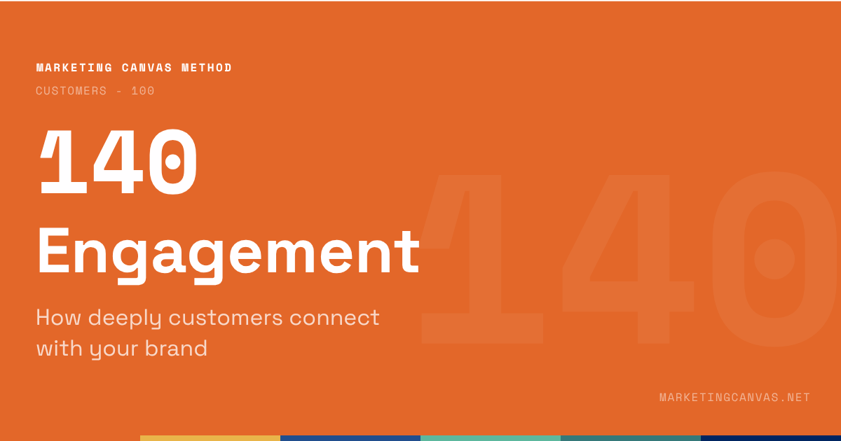
Marketing Canvas - Engagement
Satisfaction and engagement are not the same thing. A customer can score 7/10 on satisfaction and never return. Dimension 140 of the Marketing Canvas explains the difference, how to measure it, and why engagement is the leading indicator that predicts churn before it appears in the revenue line.
About the Marketing Canvas Method
This article covers dimension 140 — Engagement, part of the
Customers meta-category. The Marketing Canvas Method structures
marketing strategy across 24 dimensions and 9 strategic archetypes.
Full framework reference at
marketingcanvas.net →
·
Get the book →
In a nutshell
Engagement (dimension 140) measures the quality and depth of the relationship between brand and customer. Not satisfaction. A customer can be satisfied and completely disengaged.
That distinction is the entire point of this dimension. Satisfaction measures how a customer felt about the last interaction. Engagement measures whether the customer is actively participating in the relationship — recommending the brand unprompted, providing feedback, returning without being asked, defending the brand when challenged. These are different signals, and they require different interventions.
In the Marketing Canvas, Engagement sits within the Customers meta-category alongside Job To Be Done (110), Aspirations (120), and Pains & Gains (130). It is the last of the four Customer dimensions — and the one that translates everything upstream into a measurable, trackable relationship signal.
Engagement as a leading indicator of churn
The most commercially important insight in this dimension is also the least intuitive: engagement is a leading indicator of churn, while revenue is a lagging one.
Churn does not happen suddenly. It is preceded by a sequence of declining engagement signals — fewer referrals, slower response to outreach, silence where there used to be feedback, reduced product usage depth, a shift from promoter to passive. By the time churn appears in the revenue line, the customer made the decision weeks or months earlier. Companies that track engagement signals catch that decision in progress. Companies that track only revenue discover it after the fact.
Research consistently confirms this pattern. A 2025 analysis of customer engagement as a retention predictor found that engagement metrics — frequency of use, depth of feature adoption, responsiveness to outreach — signal churn risk before any revenue indicator does. Customers who begin ignoring key features are significantly more likely to churn; those who maintain consistent usage patterns, even at modest levels, renew at materially higher rates.
The practical implication for the Marketing Canvas: a company that scores Engagement at −1 is not just describing a weak customer relationship today. It is describing a churn problem that will show up in User Lifetime (630) figures within the next 6–12 months.
What engagement actually measures
Engagement is active participation. The four observable forms:
Recommendation — does the customer refer the brand to others without being asked? Unprompted referral is the strongest engagement signal because it requires the customer to put their own reputation behind the brand. Green Clean's 35% referral rate by 2024 was the clearest evidence of high engagement — customers were actively recruiting new ones.
Feedback — does the customer respond to outreach, complete surveys, attend review sessions, and provide input into product or service evolution? A customer who stops providing feedback is not neutral — they have disengaged. Silence is a signal.
Return without prompt — does the customer come back without a campaign, a discount, or a re-engagement effort? Repeat purchase driven by marketing spend is retention. Repeat purchase driven by habit and relationship is engagement.
Defence under challenge — does the customer defend the brand when it is criticised? This is the tribal signal. Customers who have moved from satisfied to engaged will tell a sceptical colleague "actually, here's why I use them" without being asked to.
The NPS instrument
The classic measurement tool for Engagement is the Net Promoter Score — a single question that segments customers into three groups based on their likelihood to recommend:
Promoters (score 9–10): actively recommend the brand to others. The growth engine. Every promoter generates acquisition at zero additional cost. The strategic goal is to grow this group and give them the tools to advocate effectively.
Passives (score 7–8): satisfied but not engaged. They stay until something better comes along or a pain accumulates. They do not recommend, but they do not damage the brand either. The strategic goal is to understand what would move them to promoter status.
Detractors (score 0–6): dissatisfied and potentially vocal. They represent churn risk and reputational risk simultaneously. The strategic goal is not to ignore them — detractor verbatims are the richest source of improvement intelligence in any customer base.
The NPS score itself (% Promoters − % Detractors) is useful as a tracking metric. What matters more in the MCM audit is the ratio between the two groups and whether the company has systems in place to act on what both groups are saying. A high NPS with no feedback loop is a number, not a strategy.
Score negative if engagement is unmeasured, or measured only through satisfaction surveys. Score positive when the company tracks promoter/detractor ratios, acts on the feedback, and can demonstrate a link between engagement scores and business outcomes.
Engagement in the Marketing Canvas
The canonical question
How deeply connected are your customers to your brand?
Engagement appears in the Vital 8 of three archetypes — and the roles span the full range of urgency:
Fatal Brake for A3 (Brand Evangelist): The Brand Evangelist archetype is built entirely on tribal belonging. If the tribe is not engaged, there is no tribe — just customers who happen to have bought the same product. Patagonia's NPS of 70+ and customer retention of 82% by 2022 are not incidental. They are the strategic output of an engagement system built around Worn Wear, environmental activism, and community events that make customers active participants rather than passive purchasers. For A3, a low Engagement score does not mean "improve the relationship." It means the entire archetype is failing.
Primary Accelerator for A4 (Stagnant Leader): A leader experiencing stagnation faces a leaky bucket — churn is rising while acquisition is fighting to refill it. Deepening engagement with the existing customer base is the primary defence. It is cheaper to re-engage a passive customer than to acquire a new one. It is far cheaper to convert a detractor's concern into product improvement than to lose them and acquire a replacement. For A4, Engagement is not a nice-to-have — it is the mechanism that slows the leak while the experience is being fixed.
Primary Accelerator for A7 (Scale-Up Guardian): Hypergrowth tends to destroy the relationships that created growth. As teams scale, as processes become standardised, as the personal touch disappears, early adopters shift from promoters to passives. The Scale-Up Guardian's specific challenge is maintaining engagement quality while growing volume. Tracking engagement signals during rapid growth is the early warning system that tells leadership whether the brand is scaling its relationship — or just scaling its revenue.
Statements for self-assessment
Rate your agreement on a scale from −3 (completely disagree) to +3 (completely agree). There is no zero — the Marketing Canvas forces a directional position on every dimension.
Note on Detailed Track scoring: if averaging sub-question scores produces a mathematical zero, the method rounds to −1. A split score means the dimension is not clearly helping your goal — and "not clearly helping" requires the same investigation as "hurting."
Interpreting your scores
Negative scores (−1 to −3): Engagement is unmeasured, or measured only through satisfaction surveys that don't distinguish between satisfied-and-disengaged and genuinely loyal. Detractors are not being systematically identified or addressed. Promoters are not being activated. Churn signals are invisible until they appear in the revenue line — by which point the decision has already been made.
Positive scores (+1 to +3): Engagement is tracked systematically through promoter/detractor ratios and behavioural signals. Detractor feedback feeds directly into service and product improvements. Promoters have tools and reasons to advocate. The company can demonstrate a measurable link between engagement scores and retention outcomes. Engagement is functioning as the leading indicator it is designed to be.Case study: Green Clean’s Engagement strategy
Misaligned understanding (-3, -2, -1): Green Clean lacks the tools to measure engagement and struggles to address customer dissatisfaction. Detractors outnumber promoters, harming the brand’s reputation, while sustainability efforts are absent from its engagement strategy.
Surface understanding (0): Green Clean uses basic tools like surveys but lacks a cohesive approach to managing detractors and empowering promoters. Sustainability is a peripheral concern, limiting its appeal to eco-conscious customers.
Deep understanding (+1, +2, +3): Green Clean leverages NPS and behavioral data to track engagement effectively. It proactively resolves detractor concerns, encourages promoters to share positive reviews, and integrates sustainability into its messaging, fostering strong customer relationships.
Case study: Green Clean
Green Clean is a fictional eco-friendly residential cleaning service used as the recurring worked example throughout the Marketing Canvas Method.
Score: −2 to −1 (Weak) Green Clean has no formal engagement measurement. The team sends an annual satisfaction survey — three questions, 22% response rate — and reads the results as confirmation that customers are happy. There is no NPS measurement. No promoter/detractor tracking. No system for capturing or acting on feedback between services. When a customer cancels, the cancellation is processed without any outreach to understand why. The churn rate of 20% in 2021 is treated as an industry benchmark issue, not an engagement signal. The team cannot name a single specific action taken in response to customer feedback in the past twelve months. Engagement is not measured. Engagement is not managed.
Score: +1 to +2 (Developing) By 2022, Green Clean has introduced NPS measurement after each service visit. They have identified a promoter group (score 9–10) representing 38% of customers, and a detractor group (score 0–6) representing 14%. The promoter group is being asked for referrals informally. The detractor group is contacted by the founder within 48 hours of a low score — a process that is recovering approximately 40% of those customers. A quarterly feedback session with a sample of long-term customers is feeding service improvements. But the system is still primarily reactive: engagement is being tracked, but not yet used as a leading churn indicator. The referral rate sits at 18% — growing, but not yet the dominant acquisition channel.
Score: +2 to +3 (Strong) Green Clean's engagement system is proactive and closed-loop. NPS is tracked after every service visit and monthly at the account level. Detractor verbatims are reviewed weekly and feed directly into the service improvement backlog — four product changes in 2023 traced directly to detractor feedback. Promoters receive structured advocacy tools: referral cards, a community group, and the option to share their Family Health Report data publicly with anonymisation. The referral rate reached 35% by 2024, making word-of-mouth the largest single acquisition channel. Churn fell from 20% to 12% between 2021 and 2024 — a decline that correlated directly with the improvement in NPS and the reduction in the detractor-to-promoter ratio. Engagement is the company's most reliable leading indicator of both retention and growth.
Connected dimensions
Engagement does not operate in isolation. Four dimensions connect most directly:
130 — Pains & Gains: Engagement drops when pains accumulate. The most reliable way to convert a promoter into a passive — or a passive into a detractor — is to leave a mapped pain unaddressed. Pains & Gains research identifies what to fix; Engagement measurement tracks whether fixing it is working.
510 — Listening (VOC): VOC systems feed engagement data. The feedback loop that makes engagement actionable requires a systematic listening infrastructure — not just NPS, but the full VOC stack that captures what customers say, where they say it, and at which stage of the journey.
630 — User Lifetime: Engagement predicts lifetime. The correlation between promoter status and customer lifetime value is well-established. A customer who actively recommends the brand has already demonstrated a level of commitment that translates directly into longer retention and higher ARPU.
520 — Stories: Engaged customers become storytellers. The most valuable content the brand can produce is a promoter's authentic account of why they use and recommend it. Engagement measurement identifies who those promoters are. Stories strategy gives them a stage.
Conclusion
Satisfaction is easy to achieve and easy to mistake for something more. A customer who rates the last service 7/10 and never comes back is satisfied. A customer who rates it 6/10, calls to say why, and stays for three more years after the issue is resolved is engaged.
The dimension that distinguishes between those two customers — and builds systems to identify, track, and act on the difference — is Engagement. It is the Customer meta-category's mechanism for translating everything upstream (JTBD clarity, aspiration alignment, pain elimination) into a measurable relationship.
For archetypes where brand loyalty is the strategic imperative — A3, A4, A7 — a low Engagement score is the diagnostic that explains why the strategy is not working, even when the product is sound. Fix Engagement, and the downstream metrics follow. Leave it unmeasured, and the churn signal arrives in the revenue line: accurate, too late, and expensive to reverse.
Sources
Frederick Reichheld, "The One Number You Need to Grow", Harvard Business Review, December 2003 — hbr.org
Stellafai, "6 Leading Indicators to Accurately Predict Renewal and Churn", 2025 — stellafai.com
Marketing Canvas Method, Appendix E — Dimension 140: Engagement, Laurent Bouty, 2026
About this dimension
Dimension 140 — Engagement is part of the Customers meta-category (100) in the Marketing Canvas Method. The Customers meta-category contains four dimensions: Job To Be Done (110), Aspirations (120), Pains & Gains (130), and Engagement (140).
The Marketing Canvas Method is a complete marketing strategy framework built around 6 meta-categories, 24 dimensions, and 9 strategic archetypes. Learn more at marketingcanvas.net or in the book Marketing Strategy, Programmed by Laurent Bouty.
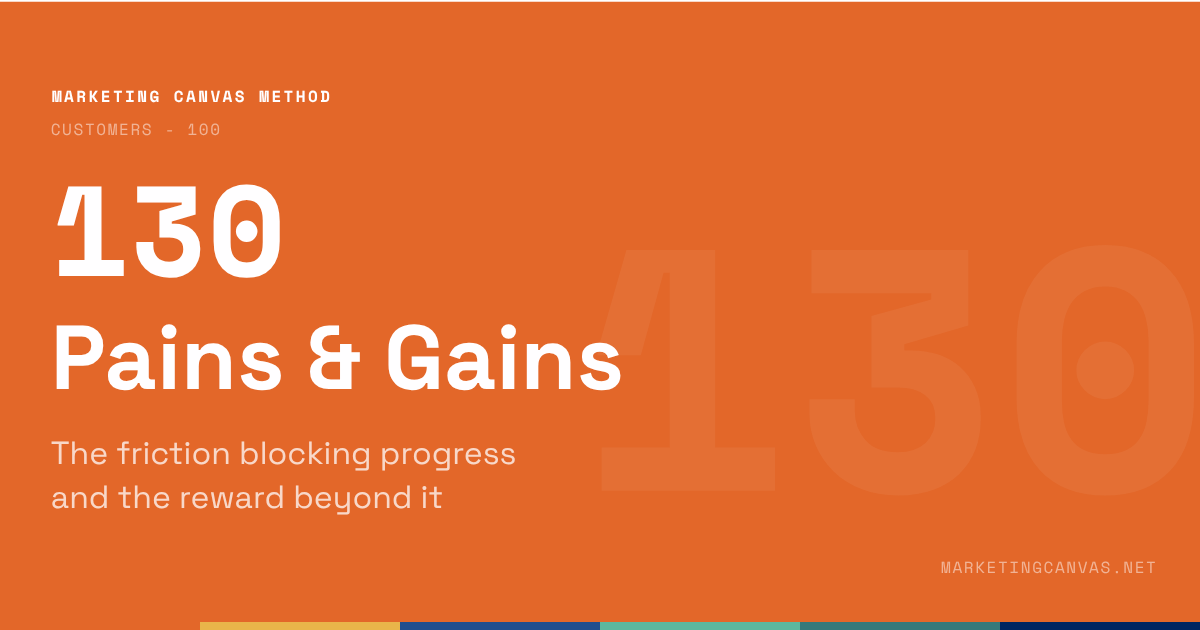
Marketing Canvas - Pains & Gains
A list of customer frustrations is research. A list of frustrations mapped to the journey stages where they occur is strategy. Dimension 130 of the Marketing Canvas explains the difference — and why getting it right determines the reliability of every downstream score.
About the Marketing Canvas Method
This article covers dimension 130 — Pains & Gains, part of the
Customers meta-category. The Marketing Canvas Method structures
marketing strategy across 24 dimensions and 9 strategic archetypes.
Full framework reference at
marketingcanvas.net →
·
Get the book →
In a nutshell
Pains & Gains (dimension 130) maps the obstacles and accelerators along the customer's job journey. Pains are the constraints, annoyances, and anxieties that slow progress. Gains are the moments of delight that exceed expectations — the unexpected experiences that make a customer stop and think: I didn't expect that.
The dimension is borrowed from Alexander Osterwalder's Value Proposition Canvas, but the Marketing Canvas sharpens it with one critical rule: pains and gains must be anchored to specific moments in the customer journey, not listed as abstract attributes. A list of frustrations is research. A list of frustrations mapped to the journey stages where they occur is strategy.
In the Marketing Canvas, Pains & Gains sits within the Customers meta-category alongside Job To Be Done (110), Aspirations (120), and Engagement (140). It is the research foundation that makes every downstream dimension scoreable with evidence rather than assumption.
The canonical distinction: list vs. map
Most companies do some version of pain and gain discovery. They run surveys, read reviews, conduct interviews, and compile a list of what customers find frustrating and what they appreciate. That list has value. But it has a critical limitation: it doesn't tell you when the pain occurs.
A pain that occurs before purchase — "I can't find reliable information about what's actually in the product" — requires a different initiative than a pain during purchase — "the checkout process is confusing" — or after purchase — "I don't know how to dispose of the packaging responsibly." All three are real. All three are different problems. Treating them as a single category of "customer frustrations" produces generic solutions that address none of them precisely.
The same applies to gains. A gain at the moment of first use — "the onboarding made me feel smart, not stupid" — serves a different strategic purpose than a gain during ongoing use — "I discovered a feature I hadn't expected that saved me an hour" — or at the advocacy stage — "the annual impact report made me feel proud enough to share it with my network."
The scoring test: can your team name specific pains at specific journey stages, backed by customer research rather than internal assumption? If yes, the dimension is working. If the team can only produce a generic list, the score cannot exceed +1 regardless of how long that list is.
The three journey stages
The Marketing Canvas structures pain and gain mapping across three stages:
Before purchase — the awareness, research, and consideration phase. Pains here are typically informational: difficulty finding credible information, inability to compare options clearly, uncertainty about whether the product fits the job. Gains here are trust signals: content that makes the customer feel informed rather than sold to, transparent pricing, social proof from people who share the customer's profile.
During — purchase, onboarding, and first use. Pains are typically friction: a complicated checkout, an overwhelming onboarding, a first experience that doesn't deliver the promised outcome quickly enough. Gains are confidence signals: a seamless transaction, an onboarding that makes the customer feel competent, a first result that delivers on the promise.
After — ongoing use, support interactions, renewal, and advocacy. Pains here are the most commercially costly: the confusion that leads to churn, the support interaction that erodes trust, the renewal moment that feels like a trap. Gains here are the highest-leverage: the unexpected delight that converts a satisfied customer into an active advocate.
Most companies over-invest in the "during" phase — the purchase moment — and under-invest in "before" and "after," which is precisely where acquisition and retention are won or lost.
Pains & Gains in the Marketing Canvas
The canonical question
What frustrates your customers and what delights them along their job journey?
The strategic role: foundational, not featured
Pains & Gains is the only dimension in the Customers meta-category that does not appear in any archetype's Vital 8. This is not an oversight — it is a deliberate design decision that reflects the dimension's true nature.
Think of it like gravity: it operates everywhere without being called out as a specific strategic priority. Pains & Gains is the research layer that feeds the scored dimensions above it. When you score Experience (420), the evidence comes from mapped pains. When you design Magic (440), the raw material comes from mapped gains. When you build Moments (410), you are working with the journey stages where pains and gains were discovered.
A company that has never mapped pains and gains rigorously will systematically overrate Experience, Magic, and Moments — because without specific evidence, teams default to optimistic assumptions. The Pains & Gains score is therefore a leading indicator of how reliable the rest of the audit is.
How to research pains and gains
Five methods, used in combination, produce a complete picture:
Customer interviews — the highest-signal source. One-on-one conversations focused on specific journey stages, asking customers to walk through their experience moment by moment. The interviewer's job is to resist explaining and keep probing: "tell me more about that moment," "what were you thinking when that happened," "what would have made that better."
Focus groups — useful for surfacing the language customers use to describe their experiences. The dynamic between participants often reveals shared frustrations that individuals might not articulate alone.
Customer journey mapping workshops — structured sessions where the team maps the journey from the customer's perspective, then validates each stage with customer evidence. The discipline: no stage can be populated with internal assumptions alone.
Social listening and review analysis — review platforms, social media conversations, and support ticket analysis provide unprompted feedback — the pains customers feel strongly enough to write down without being asked.
Feedback loops from existing touchpoints — systematic analysis of support interactions, NPS verbatims, and post-purchase surveys. The key is treating this data as journey-mapped evidence, not as an aggregate score.
Statements for self-assessment
Rate your agreement on a scale from −3 (completely disagree) to +3 (completely agree). There is no zero — the Marketing Canvas forces a directional position on every dimension.
Note on Detailed Track scoring: if averaging sub-question scores produces a mathematical zero, the method rounds to −1. A split score means the dimension is not clearly helping your goal — and "not clearly helping" requires the same investigation as "hurting."
Interpreting your scores
Negative scores (−1 to −3): Your understanding of customer pains and gains is absent, assumed, or not mapped to specific journey stages. The downstream effect is systematic: Experience (420), Moments (410), and Magic (440) scores will be based on internal assumptions rather than customer evidence, producing an audit that flatters rather than diagnoses.
Positive scores (+1 to +3): You have researched pains and gains using multiple methods, mapped them to specific journey stages, and can name specific initiatives that trace back to specific mapped pain or gain moments. The rest of your audit is grounded. Experience, Magic, and Moments scores have an evidence base.
Case study: Green Clean
Green Clean is a fictional eco-friendly residential cleaning service used as the recurring worked example throughout the Marketing Canvas Method.
Score: −2 to −1 (Weak) Green Clean has no formal pain and gain mapping. The team's understanding of customer frustrations comes from occasional informal conversations and their own assumptions about eco-conscious consumers. They believe the main pain is "finding eco-friendly products" — but this is a category-level assumption, not a journey-mapped insight. When asked to name the specific moment where customers most commonly abandon consideration of Green Clean, nobody can answer. When asked what the single biggest gain a new customer experiences at first service is, answers vary widely between team members. The research does not exist. Scores on Experience and Magic are almost certainly inflated.
Score: +1 to +2 (Developing) Green Clean has run a customer survey and conducted six customer interviews. They have identified a significant "before" pain: health-conscious parents spend considerable time researching whether eco-cleaning claims are credible, but Green Clean's website does not make it easy to verify ingredient safety independently. They have identified a strong "during" gain: the first service visit, when the cleaner explains the Family Health Report and what it will show, creates a moment of trust that customers consistently describe as "not what I expected from a cleaning company." The "after" stage is under-mapped — churn drivers are not yet understood. Research is partial but directional.
Score: +2 to +3 (Strong) Green Clean has mapped pains and gains across all three journey stages with customer-validated evidence. Before: the primary pain is "I can't tell which eco-claims are real without spending hours researching" — addressed by the published ingredient list and third-party certifications visible on the website before booking. During: the main pain is "I'm not sure what to expect from the first visit" — addressed by a structured onboarding sequence that sets expectations and delivers the first Family Health Report within 24 hours. After: the primary gain driver is the monthly impact statement showing cumulative toxin load avoided — customers who receive it are 3× more likely to refer Green Clean to a neighbour. Every initiative in Experience (420) and Magic (440) traces back to a specific mapped pain or gain at a specific journey stage.
Connected dimensions
Pains & Gains is the research input for multiple downstream dimensions:
110 — JTBD: Pains block the job; gains accelerate it. The pain map is the obstacle layer sitting between the customer and the job they are trying to accomplish. Understanding pains at journey stages often reveals which aspect of the job is most underserved.
410 — Moments: Pains and gains map to specific journey moments. Dimension 130 is the discovery phase; dimension 410 is the design phase built on that discovery. You cannot score Moments honestly without having completed the Pains & Gains mapping first.
420 — Experience: Experience design eliminates pains. The initiatives that raise an Experience score should trace directly to specific mapped pains at specific journey stages. If they don't, the Experience score is assumption-based.
440 — Magic: Magic creates unexpected gains. The raw material for Magic — the specific moments of delight that exceed expectations — comes from gain mapping. Without it, Magic initiatives are based on what the team finds delightful, not what customers actually experience as exceeding their expectations.
Conclusion
Pains & Gains has a paradoxical position in the Marketing Canvas: it is the most foundational dimension in the Customers meta-category, and the one least likely to appear in headlines about strategy.
That is precisely why it matters. The teams that skip rigorous pain and gain mapping — or treat it as a list-generation exercise rather than a journey-mapping discipline — produce audits built on assumption. They score Experience at +2 because they believe the experience is good, not because they have mapped the journey stage by stage and found evidence that it is.
The scoring test is the same as it has always been: not "do we know what customers find frustrating?" but "can we name specific pains at specific journey stages, backed by research?" The first question has a comfortable answer. The second one is the one that matters.
Sources
Alexander Osterwalder, Yves Pigneur, Greg Bernarda, Alan Smith, Value Proposition Design, Wiley, 2014 — strategyzer.com
Tony Ulwick, Jobs to be Done: Theory to Practice, Strategyn Press, 2016 — strategyn.com
Marketing Canvas Method, Appendix E — Dimension 130: Pains & Gains, Laurent Bouty, 2026
About this dimension
Dimension 130 — Pains & Gains is part of the Customers meta-category (100) in the Marketing Canvas Method. The Customers meta-category contains four dimensions: Job To Be Done (110), Aspirations (120), Pains & Gains (130), and Engagement (140).
The Marketing Canvas Method is a complete marketing strategy framework built around 6 meta-categories, 24 dimensions, and 9 strategic archetypes. Learn more at marketingcanvas.net or in the book Marketing Strategy, Programmed by Laurent Bouty.