BLOG

A collection of article and ideas that help Smart Marketers to become Smarter

marketingcanvas.net Laurent Bouty marketingcanvas.net Laurent Bouty

Marketing Canvas - Budget

Budget is the 24th Marketing Canvas dimension — scoring not how much you spend, but how deliberately. Learn the four properties, the 3-Cycle allocation logic, and the 90/10 innovation reserve principle.

About the Marketing Canvas Method

This article covers dimension 640 — Budget, part of the Metrics meta-category. The Marketing Canvas Method structures marketing strategy across 24 dimensions and 9 strategic archetypes.
Full framework reference at marketingcanvas.net →  ·  Get the book →

In a nutshell

Budget is the 24th and final dimension of the Marketing Canvas — and the one that governs all the others. It scores not how much you spend on marketing, but how deliberately you spend it. The dimension measures four properties: allocation logic (is the budget based on strategic priorities, not inertia?), planning integration (is it a component of the overall business plan with a defined timeframe?), monitoring discipline (do you reallocate when something is not working?), and innovation reserve (do you protect a portion — typically 10% — for experimental approaches?).

The canonical framing: a company that allocates 100% of its marketing budget to proven tactics will never discover the channel, message, or format that produces breakthrough results. A company that cannot defend its budget allocation against its own strategic priorities has substituted familiarity for strategy.

Introduction

Every initiative identified across the 23 preceding dimensions — every fix, every accelerator, every growth driver — competes for the same finite resource: the marketing budget. Budget is the dimension that determines which of those initiatives actually happen, in what sequence, and at what scale.

This is why the Marketing Canvas positions Budget as a discipline question, not a quantum question. The amount of budget available is a constraint. How that budget is allocated — against which priorities, in which cycle, with what monitoring — is the strategic choice. Two companies with identical budgets can produce radically different outcomes depending on whether their allocation logic follows strategic evidence or historical habit.

The most expensive budget decision a marketing team makes is the one it doesn't consciously make: replicating last year's allocation because changing it requires a conversation no one wants to have.

What the Marketing Canvas scores in Budget

The dimension scores four properties — allocation logic, planning integration, monitoring discipline, and innovation reserve — each addressing a distinct layer of resource discipline.

Allocation logic — is the budget allocated based on multiple factors (industry benchmarks, business capacity, strategic goals, and urgency) rather than inertia? The canonical failure mode is the "same as last year" allocation: the prior year's budget is reproduced with a percentage adjustment, with no systematic re-examination of whether the distribution still reflects the strategic priorities. Allocation logic scores whether the budget follows the strategy or whether the strategy is reverse-engineered to justify the budget. A company in Cycle 1 of the Strategic Action Engine (fixing Fatal Brakes) should have a materially different allocation from the same company in Cycle 3 (scaling growth drivers). If the allocation doesn't shift as the strategy evolves, the budget is not serving the strategy — it is constraining it. Industry benchmarks provide the calibration reference: typically 6–12% of revenue for established businesses, up to 20% for growth-stage companies. The benchmark is not a target; it is a diagnostic.

Planning integration — is the marketing budget a component of the overall business plan, with defined costs linked to specific goals within a defined timeframe? Budget that exists as a standalone line item, detached from the strategic plan it is supposed to fund, produces the most common budget dysfunction: money is available, but there is no explicit connection between what is being bought and what outcome is expected. The chain of accountability the method scores runs from budget item to initiative (Step 4) to dimension score (Step 3) to strategic goal (Step 2). If any link is missing, the budget is partially floating.

Monitoring discipline — do you constantly monitor marketing performance and reallocate spending from underperforming initiatives to those that are working? The test is not whether performance is tracked — most marketing teams track something. The test is whether tracking produces reallocation. A team that reviews campaign performance monthly and continues funding underperforming initiatives for the remainder of the budget cycle because "it's already in the plan" does not have monitoring discipline; it has reporting. Monitoring without reallocation authority is observation without consequence.

Innovation reserve — do you protect a portion of the budget, typically 10%, for exploring new approaches, testing new channels, and discovering what the existing allocation misses? The 90/10 principle is the canonical structure: 90% on proven activities that are already demonstrably working; 10% on experimental approaches where the outcome is uncertain. The 10% is not a luxury allocation for when the primary budget is performing well — it is insurance against strategic rigidity. A company that allocates 100% to proven tactics has committed its entire resource base to yesterday's understanding of what works. The failure mode runs in both directions: below 5% for innovation protects the status quo at the cost of adaptability; above 25% starves the proven activities that generate current returns.

Marketing Canvas Method by Laurent Bouty - Marketing Budget

Budget and the 3-Cycle Roadmap

The most strategically significant connection in the Budget dimension is its relationship to the 3-Cycle Strategic Roadmap (Step 5). The canonical cycle allocations determine how the budget should be distributed across the three action streams — FIX, ALIGN, and SCALE — at each phase of strategy execution:

Cycle 1 — Foundation: 80% FIX (Fatal Brakes) / 10% ALIGN (Accelerators) / 10% SCALE (Growth Drivers)

The dominant allocation is repair. Fatal Brakes cannot be papered over with growth investment. A brand with a broken positioning (220) cannot be fixed by doubling the media budget (530). A product with weak features (310) cannot be rescued by an influencer campaign (540). In Cycle 1, the budget's primary function is to fund the foundational work that makes everything else possible. The 10% in ALIGN and SCALE is not wasted — it maintains momentum and tests the growth thesis — but it is not the primary investment.

Cycle 2 — Build: 20% FIX (maintenance) / 60% ALIGN / 20% SCALE

The Fatal Brakes have been addressed. The budget shifts to funding the accelerators — the dimensions that drive the archetype's primary mission. Brand positioning is being sharpened. The value proposition is being refined. The customer experience is being systematically improved. The FIX allocation drops to maintenance level because the structural problems have been resolved, not because they no longer need monitoring.

Cycle 3 — Scale: 10% FIX (maintenance) / 30% ALIGN / 60% SCALE

The budget now funds growth at scale. The Growth Drivers identified in the Vital Audit receive the majority of the investment. The risk in Cycle 3 is premature allocation: companies that skip Cycle 1 and move directly to Cycle 3 investment discover that growth spend on a broken foundation produces volume without compounding returns.

The Budget dimension (641) scores whether the company's actual allocation reflects the cycle it is in — or whether the allocation is driven by what is most visible, most politically comfortable, or most familiar.

Statements for self-assessment

Score each of the four sub-questions from −3 to +3 (no zero), then average for the dimension score. If the average is mathematically zero, round to −1.

  1. Your marketing budget allocation is based on several factors including your industry sector, business capacity, goals, and urgency (641)

  2. Your marketing budget is a component of your overall business plan, outlining the costs of how you will achieve your marketing goals within a certain timeframe (642)

  3. You constantly monitor your marketing efforts — if something in your marketing plan is not working, you move that spending into another area (643)

  4. You leave a portion of your budget (10%) for exploring new ways, figuring out what works and what doesn't, and testing new approaches (644)

Interpreting your scores

Negative scores (−1 to −3): Budget allocation is driven by inertia, prior year habit, or political comfort rather than strategic evidence. Planning integration is absent or superficial — the budget is not connected to specific initiatives with defined outcomes. Monitoring produces reporting but not reallocation. There is no innovation reserve, or it has been absorbed into existing line items. The budget is not serving the strategy; the strategy is being reverse-engineered to justify the budget.

Positive scores (+1 to +3): Allocation logic follows strategic priorities and cycle position. The budget is integrated into the business plan with traceable connections between spend, initiatives, dimensions, and goals. Monitoring has reallocation authority and exercises it. The 10% innovation reserve is protected and generating learning. The budget is an active strategic instrument, not a historical artefact.

Strategic Role

Fatal Brake for A6 (Value Harvester): In a declining market, every euro of marketing spend must demonstrate return. There is no budget slack to absorb misallocation — the market contraction is simultaneously compressing the revenue base from which the budget is drawn and raising the pressure on each remaining customer relationship. A Value Harvester with weak budget discipline is compounding the market problem with a spending problem. Waste is not a nuisance in A6; it is existential. The 641 score — allocation based on strategic evidence rather than inertia — is the most critical sub-question for A6.

Secondary Accelerator for A2 (Efficiency Machine): The Efficiency Machine archetype wins on cost structure and operational discipline. Budget discipline in A2 is not just a financial governance function — it is a strategic signal. A marketing team that cannot maintain budget discipline while the operations team is optimising every cost line sends a structural contradiction to the organisation. A2 companies with strong budget scores reinforce the operational excellence narrative; A2 companies with weak budget scores undermine it from within marketing.

Growth Driver for A2 (Margin Extraction): When the Efficiency Machine deploys the Margin Extraction growth driver, budget discipline is the mechanism. Reducing marketing spend on activities that produce low marginal return — while protecting spend on activities that generate efficient acquisition and retention — directly improves margin without reducing commercial output. The 643 score (monitoring and reallocation discipline) is the specific property that makes Margin Extraction possible: you can only reallocate away from low-return activities if you know which activities are low-return.

In most other archetypes, Budget operates as a constraint discipline rather than a strategic lever — necessary hygiene, but not the dimension that defines the archetype's strategy. The exception is A6, where budget discipline is survival, and A2, where it is a competitive differentiator.

Case study: Green Clean

Green Clean is a fictional eco-friendly residential cleaning service used as the recurring worked example throughout the Marketing Canvas Method.

Score: −2 to −1 (Weak) Green Clean's marketing budget for the current year is €18,000 — approximately 7.2% of revenue, within the benchmark range for a service business at this stage. The allocation was set by the founder in January by reviewing the prior year's spend and making minor adjustments based on what felt underfunded. No benchmark comparison was conducted. No connection was made between the budget allocation and the strategic priorities identified from the dimension scores. The largest line item (€7,200, 40%) is paid social advertising — the same proportion as last year — despite the fact that the acquisition analysis (610) has shown paid social produces the highest CAC and the lowest customer lifetime of any channel. The budget has not been connected to the decision to build the owned media foundation first (530). Monitoring is monthly in theory; in practice, the budget is reviewed when campaigns end. There is no reallocation mechanism — budget is committed to campaigns at the start of the quarter and not adjusted. There is no innovation reserve. The 10% that would fund channel experiments is absorbed into the paid social budget by default.

Score: +1 to +2 (Developing) Green Clean has restructured its budget allocation for the first time using strategic evidence. Following the Vital Audit, the budget has been connected to the three action streams: €10,800 (60%) allocated to Cycle 1 FIX and ALIGN priorities — primarily the owned media content infrastructure, the subscription model architecture, and the Family Health Report development; €5,400 (30%) to proven acquisition and retention activities; €1,800 (10%) protected as an innovation reserve to test two new channel hypotheses (a partnership with a paediatric clinic network and a podcast sponsorship in the indoor health category). The allocation has been formally documented in the business plan with expected outcomes for each stream. Monitoring is now monthly with a defined reallocation trigger: any initiative performing below 70% of its target for two consecutive months is paused and the budget redirected. The innovation reserve has already produced one useful finding: the clinic partnership generated a cost-per-lead 40% below the paid social benchmark. The 10% is earning its place.

Score: +2 to +3 (Strong) Green Clean's budget management operates at the cycle level with quarterly allocation reviews. The company is in Cycle 2 of its Strategic Action Engine: the 20/60/20 split is in effect, with 20% on FIX maintenance (ongoing content production, subscription system upkeep), 60% on ALIGN (deepening the Family Health Report as a differentiation asset, building the referral programme, strengthening the earned media infrastructure), and 20% on SCALE (amplifying the indoor health category narrative through paid media targeted to lookalike audiences of the referral cohort). The 10% innovation reserve — now a protected line that is not subject to reallocation pressure — has cycled through six experiments in 18 months. Three have been discontinued after failing to outperform the control. Two have been graduated into the main budget after demonstrating positive ROI. One is in its second testing cycle. The 641 allocation logic is explicitly benchmarked against Gartner CMO survey data for comparable service businesses annually, with a documented rationale for any deviation. The budget is not a constraint on the strategy — it is an expression of it.

Connected dimensions

Budget connects to every dimension in the Marketing Canvas through resource allocation — every initiative in the 15-slot Strategic Action Engine draws on budget. Four connections are most direct:

  • 610 — Acquisition: Budget funds acquisition. The size and composition of the acquisition budget determines CAC, channel mix, and the rate at which new customers enter the base. A weak 641 allocation that over-invests in high-CAC channels while under-investing in owned media infrastructure is a budget problem expressed as an acquisition problem.

  • 620 — ARPU: Budget funds Stimulation initiatives. The upsell programmes, subscription architecture, and loyalty mechanics that improve purchase frequency and transaction value all require investment. An ARPU strategy without a budget line is a goal without a mechanism.

  • 630 — Lifetime: Budget funds retention. The CRC component of the 634 sub-question is a budget allocation question: how much of the marketing budget is being directed toward keeping customers versus finding new ones? An under-funded retention programme produces the churn consequences that 630 measures.

  • All 24 dimensions: Budget is the dimension that determines which of the other 23 dimensions receive attention in the current strategic cycle. A dimension that scores −2 in the Vital Audit but receives no budget allocation in the Action Engine plan will still score −2 in the next cycle. The budget is the bridge between the diagnosis and the improvement.

Conclusion

Budget is the dimension that closes the Marketing Canvas cycle. Every insight generated across the other 23 dimensions — every job definition, every positioning choice, every experience design decision, every channel strategy — ultimately requires a budget allocation to move from understanding to action.

The strategic discipline the method requires is not about the size of the budget. It is about the clarity of its connection to strategy. A small budget allocated with precision against the right priorities at the right cycle stage will outperform a large budget allocated by inertia. The 90/10 principle is the practical expression of this: fund what is proven at 90%, fund the discovery of what comes next at 10%, and have the monitoring discipline to know which is which.

The test that closes the review: open the current year's marketing budget. For each line item, identify which dimension score it is designed to improve, which initiative in the Action Engine it funds, and what outcome improvement it is expected to produce. If any line item cannot be traced to a specific strategic purpose — it is funding inertia, not strategy. That is where 641 improvement begins.

Sources

  1. Gartner CMO Spend and Strategy Survey, annual — gartner.com (benchmark reference for marketing spend as % of revenue by industry)

  2. Christine Moorman, The CMO Survey: Highlights and Insights, Deloitte/Duke Fuqua/AMA, annual — cmosurvey.org

  3. Marketing Canvas Method, Appendix E — Dimension 640: Budget, Laurent Bouty, 2026

About this dimension

Dimension 640 — Budget is the final dimension of the Metrics meta-category (600) and the 24th dimension of the Marketing Canvas Method. The Metrics meta-category contains four dimensions: Acquisition (610), ARPU (620), User Lifetime (630), and Budget (640).

The Marketing Canvas Method is a complete marketing strategy framework built around 6 meta-categories, 24 dimensions, and 9 strategic archetypes. Learn more at marketingcanvas.net or in the book Marketing Strategy, Programmed by Laurent Bouty.

Marketing Canvas Method - Question - Marketing Budget

Marketing Canvas Method - Question - Marketing Budget

Read More
marketingcanvas.net Laurent Bouty marketingcanvas.net Laurent Bouty

Marketing Canvas - User Lifetime

Lifetime measures how long customers stay — scored as 1/churn rate. Learn the four properties, the CRC/CAC benchmark, and why a leaky bucket makes every other marketing investment less efficient.

About the Marketing Canvas Method

This article covers dimension 630 — User Lifetime, part of the Metrics meta-category. The Marketing Canvas Method structures marketing strategy across 24 dimensions and 9 strategic archetypes.
Full framework reference at marketingcanvas.net →  ·  Get the book →

In a nutshell

Lifetime measures how long customers remain active — expressed as 1 divided by the churn rate. A 10% annual churn rate produces an average customer lifetime of 10 years. A 50% churn rate produces a lifetime of 2 years. The dimension scores four properties: measurement capability (can you calculate churn?), churn level (is it below market average?), trend (is churn improving?), and cost efficiency (is Customer Retention Cost proportionate to Customer Acquisition Cost?).

Lifetime is the Retention lever's primary metric. When the strategic goal is to grow revenue by keeping customers longer rather than acquiring new ones, Lifetime is the scoreboard. A leaky bucket makes every other marketing investment less efficient — acquisition, ARPU growth, brand building — because each one is partially undone by customers who leave before they return their full value.

Introduction

Acquisition brings customers in. Retention determines how long they stay. The relationship between the two is not symmetrical: what you invest to acquire a customer only pays back over time, and the longer the customer stays, the more time there is for that investment to compound. Shorten the lifetime, and the economics of acquisition become structurally harder to justify.

The Marketing Canvas treats Lifetime as a metrics discipline, not a loyalty programme design exercise. The dimension scores whether the company knows its churn rate, how that rate compares to market benchmarks, whether it is improving, and whether the investment in retention is proportionate — not excessive, not negligent.

The churn mathematics

The core formula is simple and worth holding precisely:

Customer Lifetime = 1 ÷ Churn Rate

  • 5% annual churn → 20-year average lifetime

  • 10% annual churn → 10-year average lifetime

  • 25% annual churn → 4-year average lifetime

  • 50% annual churn → 2-year average lifetime

The revenue mathematics of churn reduction are powerful and non-linear. Reducing annual churn by 5 percentage points — from 20% to 15%, for example — can increase total lifetime value per customer by 25 to 95%, depending on the business model and ARPU level. The range is wide because the compounding effect of extended lifetime interacts differently with high-ARPU versus low-ARPU relationships, and with businesses that generate more value from long-tenure customers through upsell and cross-sell than from short-tenure ones.

The practical implication: a 5-point improvement in churn is rarely a 5% improvement in commercial outcome. It is frequently a 30–60% improvement in the total value the acquired customer base will generate over its lifetime. This asymmetry — small churn improvements producing large value changes — is why Retention-focused archetypes treat Lifetime as a Fatal or Primary dimension rather than a supporting metric.

Marketing Canvas Method by Laurent Bouty - Lifetime

What the Marketing Canvas scores in Lifetime

The dimension scores four properties — measurement capability, churn level, trend, and CRC/CAC relationship — each addressing a distinct layer of retention health.

Measurement capability is the prerequisite that must be met before any other Lifetime property can be managed. Can you calculate your churn rate, because you know who is buying and using your products and services? A company that cannot identify which customers have stopped purchasing — because it lacks a direct customer relationship, because purchase identity is not tracked, or because "churn" has never been formally defined for the business model — cannot manage the others. Defining churn requires first agreeing on what "active" means. In subscription models, it is straightforward: did the customer renew? In transactional models, it requires a defined activity window: a customer who has not purchased within 12 months when the average purchase cycle is 6 months is churned. The definition must exist before the measurement can.

Churn level — is your churn rate below or equal to average market churn for your category? Churn benchmarks vary dramatically by industry — SaaS businesses might target 5–7% annual churn; consumer subscription services often run 20–30%; transactional retail models have different definitions entirely. The method scores relative to industry, not absolute thresholds. A 15% annual churn rate in a category where competitors average 25% is a positive score. The same rate in a category where the benchmark is 8% is negative.

Trend scores direction, not just position. A churn rate that is above industry average but visibly improving is a different strategic situation from a rate that is average but deteriorating. The method scores both the current level and the momentum independently — because a company that is losing ground on retention is in a different position from one that is gaining it, even when the current absolute numbers look similar.

The CRC/CAC relationship — is your Customer Retention Cost proportionate to your Customer Acquisition Cost, with the combined total running at 20–30% of revenue for mature businesses? This property diagnoses the investment balance between finding customers and keeping them. Below 20% combined, the company is likely underinvesting in one or both. At 20–30%, the economics are proportionate. Above 30%, the signal is that something upstream is broken: when retention cost is high, the root cause is almost never a retention spending problem — it is a product, experience, or fit problem. You are paying to hold customers who would leave without the financial incentive, rather than retaining customers who stay because the value is genuine. If CRC is rising without a corresponding improvement in churn trend, the spending is compensating for a deeper problem rather than solving it. The correct response is to investigate dimension 420 (Experience) and 140 (Engagement) — not to increase the retention budget further.

The leaky bucket consequence

The strategic framing the method applies to Lifetime is architectural, not tactical. A leaky bucket — high or rising churn — creates a compounding drag on every other marketing investment:

Acquisition becomes less efficient. The CLTV/CAC ratio (610) falls as customer lifetime shrinks. The acquisition spend that was justified by a 4-year lifetime is no longer justified by a 2-year lifetime at the same CAC. The acquisition engine keeps running; the economics quietly deteriorate.

ARPU growth is partially cancelled. Investments in cross-sell, upsell, and frequency programmes (620) build value in the existing base. If churn removes 30% of that base annually, the ARPU growth achieved in the retained segment is offset by the lost revenue from departing customers. The Stimulation lever loses efficiency every time the Retention lever is leaking.

Brand investment returns less. Customers who experience the brand, develop loyalty, and become advocates — the highest-value customers in any archetype — are disproportionately long-tenure. High churn eliminates the customers most likely to generate word-of-mouth, referral, and community value before those effects compound.

The canonical formulation: every 1% improvement in churn releases capacity across the entire marketing system. Every 1% worsening locks it.

Statements for self-assessment

Score each of the four sub-questions from −3 to +3 (no zero), then average for the dimension score. If the average is mathematically zero, round to −1.

  1. You are capable of measuring user's lifetime (1/churn) because you know who is buying and using your products and services (631)

  2. Your churn level is below or equal to average market churn level (632)

  3. The historical trend of your churn evolution is positive (improving) and presents a positive outlook for next year (633)

  4. Your CRC (Customer Retention Cost) is aligned with your CAC (Customer Acquisition Cost) — CAC + CRC runs at 20–30% of revenue for mature businesses, 50–70% for startups (634)

Interpreting your scores

Negative scores (−1 to −3): Churn is unmeasured, above industry benchmark, deteriorating, or the CRC/CAC balance signals over-spending to compensate for an upstream product or experience problem. The leaky bucket is draining value from every other marketing investment. The priority is measurement first, then diagnosis of root cause, then targeted retention investment.

Positive scores (+1 to +3): Churn is tracked at cohort level, below industry average, improving through deliberate retention strategy, and the CRC/CAC ratio is proportionate. The Retention lever is functioning. Lifetime is extending and with it the total value generated by the acquired customer base.

Strategic Role

Fatal Brake for A4 (Stagnant Leader): The Stagnant Leader has a large installed base and a growth problem. In this context, churn is the existential threat: the customer base that the strategy depends on for ARPU growth and market share maintenance is being depleted. A weak 630 for A4 means the strategy is trying to grow value from an asset that is shrinking. Sage and Peloton both faced this dynamic — large bases, rising churn in the core segment, requiring fundamental retention intervention before any growth strategy could take hold. The leaky bucket is A4's most dangerous structural problem.

Primary Accelerator for A7 (Scale-Up Guardian): Hypergrowth creates a retention stress test. The service and experience that earned loyalty at 10,000 customers often strains at 100,000. New customers are acquired faster than the service model can be extended to them. Churn rises not because the product has degraded but because the delivery system hasn't scaled alongside the customer base. Airbnb and Spotify both navigated this: the core experience had to be systematically re-engineered at each order of magnitude of scale to prevent churn from rising with growth. For A7, Lifetime is a Primary Accelerator because protecting it during hypergrowth is the strategic capability that separates sustainable scale from growth that exhausts itself.

Secondary Accelerator for A3 (Brand Evangelist): The Brand Evangelist archetype depends on deep customer relationships that generate advocacy, word-of-mouth, and community identity. These effects compound over time — a customer in year five generates more referral value, more community participation, and more brand evangelism than a customer in year one. High churn truncates the compounding before it reaches full value. A strong 630 for A3 doesn't just protect revenue; it protects the community depth that makes the evangelism archetype function.

Secondary Accelerator for A6 (Value Harvester): In a declining market, the customer base is the asset being harvested. Every churned customer is an irreplaceable unit of that asset — they cannot be replaced by acquisition in a contracting market. Lifetime extension is the primary mechanism for extracting more value from the existing base before it naturally erodes. Combined with ARPU growth (620), extended Lifetime is what allows an A6 to generate increasing value from a shrinking pool.

Growth Driver for A6 (Stability Lock-in): When the Value Harvester deploys the Stability Lock-in growth driver, Lifetime extension is the primary mechanism. The strategy: make it structurally easier to stay than to leave — through contract architecture, integration depth, switching cost design, and service quality that makes alternatives unattractive. The 630 score for A6 measures whether this lock-in is producing measurable lifetime extension, not just whether the tactic exists.

Case study: Green Clean

Green Clean is a fictional eco-friendly residential cleaning service used as the recurring worked example throughout the Marketing Canvas Method.

Score: −2 to −1 (Weak) Green Clean has never formally defined what constitutes a churned customer. The founder believes churn is "low" based on the intuition that most regular customers seem to keep booking — but this is not measured. There is no definition of what counts as "active": a customer who booked six cleans last year and none this year is not flagged anywhere in the system. The CRM migration that improved ARPU measurement has created a transaction log, but no cohort analysis has been run. The team cannot state its churn rate, cannot compare it to any benchmark, and has no historical trend data. Retention activities consist of a birthday discount email sent to customers on the anniversary of their first booking — not a strategy, but a single tactic with no measured impact. The leaky bucket is running; the size of the leak is unknown.

Score: +1 to +2 (Developing) Green Clean has defined its churn metric: a customer is considered churned if they have not booked a clean within 90 days when their historical booking frequency was fortnightly or more often. Applying this definition retroactively, the team has calculated a 12-month churn rate of 22%. A benchmark research exercise has established that comparable residential cleaning services in the region average 28–32% annual churn, placing Green Clean's current rate below market average — a stronger position than the team expected. The churn trend over the past six months shows improvement: the monthly churn rate has fallen from 2.1% to 1.7% since the introduction of the subscription model (which provides an explicit renewal commitment that reduces passive drift). CRC has been formally calculated for the first time: the total cost of the birthday discount programme, the proactive re-engagement emails, and the subscription management time runs at approximately 8% of revenue. CAC runs at approximately 14% of revenue. Combined, CAC + CRC is 22% — within the 20–30% mature business benchmark. The measurement exists. The trend is positive. The investment ratio is sound.

Score: +2 to +3 (Strong) Green Clean's churn management is cohort-level and predictive. Monthly cohort analysis tracks churn by acquisition channel, service tier, and customer tenure — revealing that customers acquired through the referral programme have a 12-month churn rate of 11%, versus 31% for customers acquired through paid social. This channel-level insight has redirected acquisition investment: referral programme budget has increased, paid social has been reduced, and the mix shift is producing compounding lifetime improvement. Annual churn has fallen from 22% to 14% over 24 months — from slightly below the market average benchmark to substantially below it. The 14% rate produces an average customer lifetime of 7.1 years, compared to 4.5 years at the 22% baseline: a 58% increase in expected lifetime at the same ARPU, without acquiring a single additional customer. CRC has risen slightly to 11% of revenue as the proactive at-risk customer programme has been built out — but combined with CAC of 12%, the total remains within the 20–30% benchmark at 23%. The churn model now includes a predictive layer: customers who miss two consecutive bookings are flagged and receive a personal outreach call within 7 days. The at-risk recovery rate is 41%.

Connected dimensions

Lifetime does not operate in isolation. Four dimensions connect most directly:

  • 140 — Engagement: Engagement predicts lifetime. The most reliable leading indicator of churn is declining engagement — a customer who is using the product less, participating in fewer touchpoints, and showing reduced activity before formally cancelling or lapsing. A strong 140 score functions as an early-warning system for 630: engagement data identifies at-risk customers before they appear in churn statistics. When 630 scores are weak despite retention investment, the diagnostic starts at 140.

  • 420 — Experience: Experience quality determines whether customers stay. Churn that cannot be explained by price sensitivity, competitive alternatives, or life circumstances is almost always an experience failure — something in the journey is consistently disappointing customers in a way that accumulates until departure. A rising CRC without a corresponding improvement in 633 is the signal: the retention spend is compensating for an experience problem that 420 needs to solve. Spending more to keep customers who are leaving because of a broken experience is the wrong lever.

  • 610 — Acquisition: CAC must be justified by Lifetime. The CLTV/CAC ratio (610) depends on how long the acquired customer stays. A short lifetime makes an otherwise healthy CAC structurally unprofitable. The two dimensions must be scored and managed in relation to each other: improving 630 improves the return on 610 investment without changing the acquisition economics.

  • 620 — ARPU: ARPU × Lifetime = total customer value. This is the fundamental identity connecting the two Stimulation and Retention lever metrics. Growing ARPU in a high-churn environment is a partial strategy. Extending Lifetime with flat ARPU is also partial. The combination — ARPU rising and Lifetime extending simultaneously — is the full expression of customer value maximisation, and the strategic goal of the archetypes where both dimensions appear in the Vital 8.

Conclusion

Lifetime is the dimension that determines how much time each customer relationship has to generate value. Every investment in acquisition, ARPU growth, experience quality, and brand building operates inside the window that Lifetime defines. Shorten that window and every upstream investment returns less. Extend it and the compounding begins.

The diagnostic test is the churn arithmetic: calculate your current churn rate, convert it to a customer lifetime using the 1/churn formula, and then multiply that lifetime by your ARPU. The result is the total expected value of a newly acquired customer. Now reduce the churn rate by 5 percentage points and recalculate. The difference between those two numbers — achievable with deliberate retention investment — is what Lifetime management is worth commercially.

If you have not run that calculation, 631 scores negative. Everything else follows from measurement.

Sources

  1. Frederick F. Reichheld, The Loyalty Effect: The Hidden Force Behind Growth, Profits, and Lasting Value, Harvard Business School Press, 1996 — foundational churn-to-value mathematics

  2. Robbie Kellman Baxter, The Forever Transaction, McGraw-Hill Education, 2020 — subscription and retention architecture

  3. Marketing Canvas Method, Appendix E — Dimension 630: Lifetime, Laurent Bouty, 2026

About this dimension

Dimension 630 — Lifetime is part of the Metrics meta-category (600) in the Marketing Canvas Method. The Metrics meta-category contains four dimensions: Acquisition (610), ARPU (620), User Lifetime (630), and Budget/ROI (640).

The Marketing Canvas Method is a complete marketing strategy framework built around 6 meta-categories, 24 dimensions, and 9 strategic archetypes. Learn more at marketingcanvas.net or in the book Marketing Strategy, Programmed by Laurent Bouty.

Marketing Canvas Method - User Lifetime and Churn

Read More
marketingcanvas.net Laurent Bouty marketingcanvas.net Laurent Bouty

Marketing Canvas - ARPU

ARPU measures whether you are maximising revenue from each customer through frequency, spend, and value growth. Learn the four properties, the revenue equation, and why measurement capability is the prerequisite everything else depends on.

About the Marketing Canvas Method

This article covers dimension 620 — ARPU, part of the Metrics meta-category. The Marketing Canvas Method structures marketing strategy across 24 dimensions and 9 strategic archetypes.
Full framework reference at marketingcanvas.net →  ·  Get the book →

In a nutshell

ARPU — Average Revenue Per User — is the metric that scores whether you are extracting maximum value from each customer relationship, not just from your customer base in aggregate. The dimension scores four properties: measurement capability (do you know who is buying and how much?), purchase frequency (are customers buying often enough?), average spend per transaction (is the value per purchase competitive?), and trend (is ARPU growing over time?).

ARPU is the Stimulation lever's primary metric. When the strategic goal is to grow revenue by getting more value from existing customers rather than acquiring new ones, ARPU is the scoreboard. Revenue can grow with a flat or even shrinking customer base if ARPU is rising. That possibility is only accessible to companies that can measure it.

Introduction

Every marketing strategy has a revenue growth direction. Acquiring more customers (Acquisition lever). Keeping them longer (Retention lever). Getting more value from each one (Stimulation lever). ARPU is what the Stimulation lever measures — the revenue generated per active customer, and whether it is moving in the right direction.

The dimension is not about whether you understand the concept of average revenue. It is about whether your business has the instrumentation to know, at the individual customer level, who is buying what, how often, and at what transaction value — and whether deliberate strategies are moving those numbers upward over time.

What does the Marketing Canvas score in ARPU?

The dimension scores four properties — measurement capability, purchase frequency, average spend per transaction, and trend — each a distinct layer of revenue-per-customer health.

Measurement capability is the prerequisite that everything else depends on. Can you measure ARPU, because you know who is buying and using your products and services? Companies that sell through intermediaries — retailers, distributors, resellers, channel partners — frequently cannot measure ARPU at the customer level. They know what they ship to the channel. They do not know who buys it, how frequently that person returns, or what they spend across the relationship. The method's position is unambiguous: strategy built on unmeasurable metrics is fiction. If you cannot measure ARPU, you cannot manage it, benchmark it, or improve it with any precision. A negative measurement capability score is not a data problem — it is a business model problem. The route to a positive score typically requires a direct relationship with the customer, whether through owned channels, a loyalty programme, direct distribution, or subscription architecture.

Purchase frequency — is the average number of purchases per customer per period above industry average? Frequency is one of the two levers within ARPU that can be deliberately moved, the other being average transaction value. Frequency improvement strategies — subscription models, loyalty programmes, replenishment triggers, behavioural nudges, service bundling — all work by increasing the number of times a customer transacts, not the size of each transaction. A weak frequency score relative to industry benchmarks suggests the customer's potential buying rhythm is not being captured.

Average spend per purchase — is the average transaction value per customer above industry average and above direct competitors? Transaction value improvement strategies — upselling to premium tiers, cross-selling complementary products, bundling, value-based pricing discipline — all work by increasing the revenue extracted from each interaction, independent of how often it occurs. A weak score here often traces upstream to dimension 330 (Prices) or 310 (Features): either the pricing architecture is not capturing full willingness to pay, or the product range does not provide sufficient upsell surface.

Trend is the most strategic of the four properties because it reveals direction, not just position. A current ARPU above industry average is a position. A rising ARPU trend is a momentum signal. The method scores both: where you are (frequency and spend, benchmarked against industry) and where you are going (trajectory over time). A company with below-average ARPU but a strongly positive trend is in a different strategic position from one with above-average ARPU that has been flat for two years.

Marketing Canvas Metrics ARPU

ARPU in the revenue equation

The Marketing Canvas places ARPU explicitly in the revenue model. In the method's framework:

Revenue = AOP × NT × ATV × 12 (for subscription or recurring models)

Where:

  • AOP = Active Operating Periods (the number of active customers)

  • NT = Number of Transactions per customer per period

  • ATV = Average Transaction Value per purchase

  • × 12 = annualisation factor

ARPU captures the NT × ATV components. When ARPU grows — either through frequency (NT) or transaction value (ATV) — revenue grows, even if AOP is flat or declining. This is the commercial logic that makes ARPU the primary growth mechanism for archetypes whose customer base is stable or contracting.

The implication: a business that is not growing its customer count can still grow revenue if it is managing ARPU deliberately. This is not a consolation prize for low-acquisition businesses — it is the preferred growth strategy for several archetypes, particularly A6 (Value Harvester), where the customer base is the asset to be maximised before it erodes.

The measurement prerequisite in practice

Measurement capability has a compounding effect on all other ARPU properties. A company that cannot measure ARPU cannot validly assess frequency, average spend, or trend — because all three require knowing who is buying and at what level.

The diagnostic questions are practical: Do you have a direct relationship with your end customers, or does an intermediary sit between you and them? Can you identify individual customers across multiple transactions and aggregate their behaviour over time? Do you have a system — CRM, loyalty programme, subscription platform, or equivalent — that captures purchase identity at the transaction level? Can you calculate, for any given customer, how many times they have purchased and at what average value?

If the answer to any of these is no, measurement capability scores negative. The consequence is not just a low ARPU score — it is the strategic constraint that Stimulation lever strategies are inaccessible without the infrastructure to identify and act on individual customer behaviour.

Marketing Canvas Method - Metrics - ARPU

Scoring guidance

Fast Track (statement-level)

Rate your agreement with the following statement on a scale from −3 to +3 (no zero):

"Our ARPU is helping achieve our goal."

A score of −3 to −1 means ARPU is unmeasured, declining, or below industry benchmarks with no improving trend. A score of +1 to +3 means ARPU is tracked at the individual customer level, above competitive benchmarks, and growing through deliberate strategy.

No score of zero is possible in the Marketing Canvas. If your response produces a neutral result — ARPU measured but flat, or competitive on one property and weak on another — the method rounds to −1. Partial ARPU management is not ARPU management: knowing what your ARPU is without having a strategy to improve it produces no commercial value.

Detailed Track (sub-question scoring)

Score each of the four sub-questions from −3 to +3 (no zero), then average for the dimension score. If the average is mathematically zero, round to −1.

  1. You are capable of measuring Average Revenue per User because you know who is buying and using your products and services (621)

  2. The average purchase frequency of your users is above industry average and above direct competitors (622)

  3. The average spending of each purchase of your users is above industry average and above direct competitors (623)

  4. The historical trend of your ARPU evolution is positive (growth) and presents a positive outlook for next year (624)

Interpreting your scores

Negative scores (−1 to −3): ARPU is unmeasured, below industry benchmark, declining, or all three. The most common root cause is 621 — the measurement infrastructure does not exist, making deliberate ARPU strategy impossible. If 621 is negative, it must be resolved before 622, 623, or 624 can be meaningfully improved.

Positive scores (+1 to +3): ARPU is tracked at the individual customer level, above competitive benchmarks on frequency and transaction value, and showing a positive trend driven by deliberate cross-sell, upsell, or subscription strategies. The Stimulation lever is active and measurable.

Strategic Role

Primary Accelerator for A6 (Value Harvester): The Value Harvester archetype faces a structurally declining customer base — through market contraction, category disruption, or strategic wind-down. The core mission is to extract maximum revenue from the remaining base before it erodes further. ARPU is the primary instrument: if you cannot grow the customer count, you must grow what each customer generates. Nokia's PC division, IBM's legacy hardware operations, the physical media businesses of the early 2000s — all faced this equation. ARPU is not a growth story in A6; it is a survival and value extraction strategy. A weak 620 score for A6 means the value in the existing base is being left on the table.

Secondary Accelerator for A2 (Efficiency Machine): Efficiency businesses win on cost structure, but ARPU discipline prevents the trap of growing volume at declining transaction values. A2 companies that allow average spend per purchase to drift below market — through discount dependency, race-to-bottom pricing, or failure to develop premium tiers — sacrifice the margin that makes operational efficiency commercially meaningful. ARPU keeps the revenue per unit healthy while the cost structure is being optimised.

Secondary Accelerator for A4 (Stagnant Leader): A stagnant leader has a large installed base that is not growing. ARPU is the mechanism through which that base generates increasing revenue without acquisition investment. Upsell programmes, premium tier introduction, frequency stimulation through loyalty architecture — these are the A4 ARPU strategies. Sage and Peloton both faced this challenge: large customer bases with flat or declining ARPU, requiring deliberate Stimulation lever investment to restore revenue growth from existing relationships.

Secondary Accelerator for A8 (Niche Expert): In a niche, customer count is bounded by market definition. ARPU is the primary revenue growth mechanism once the addressable niche has been substantially penetrated. Deep expertise enables premium pricing (623) and expanded service scope that generates frequency (622). Hermès cannot grow by acquiring more customers — the niche is intentionally small. It grows ARPU by deepening the relationship, expanding the product universe, and maintaining pricing discipline that competitors in adjacent categories cannot match.

Growth Driver for A4 (Premium Stimulation): When the A4 archetype deploys the Stimulation growth driver, ARPU is the scorecard. The strategic question shifts from "how do we acquire more customers?" to "how do we get more value from the customers we have?" Premium service tiers, bundle architecture, frequency programmes — all converge on the NT × ATV components of the revenue equation. A positive 624 trend is the evidence that the Stimulation strategy is working.

Case study: Green Clean

Green Clean is a fictional eco-friendly residential cleaning service used as the recurring worked example throughout the Marketing Canvas Method.

Score: −2 to −1 (Weak) Green Clean operates a direct service model — customers book cleans through the website and pay directly — so the measurement capability question should be straightforward. In practice, bookings are tracked in a spreadsheet by date and postcode, not by named customer. The team cannot produce a list of customers sorted by revenue, frequency, or tenure. They know the total revenue per month; they do not know which customers generate that revenue or how it has changed at the individual level. Purchase frequency is estimated at "every two to three weeks per regular customer" — an informal observation, not a measured figure. Average spend per clean is known (€89 average booking value) but not benchmarked against competitors in any formal way. There is no deliberate strategy to increase either frequency or transaction value. ARPU is in the system conceptually but is not being managed.

Score: +1 to +2 (Developing) Green Clean has migrated customer bookings to a CRM system that associates every transaction with a named customer. For the first time, the team can calculate individual-level purchase frequency and annual revenue per customer. The results are diagnostic: the top 20% of customers (by annual revenue) generate 61% of total revenue; the bottom 30% have purchased only once. Average frequency for regular customers is 2.1 cleans per month; the industry benchmark for comparable residential services is estimated at 1.8, placing Green Clean slightly above average. Average transaction value is €89, against a benchmarked competitor average of €82 — above market. The ARPU trend for the past 12 months is flat: frequency has been stable, average spend has not moved. The measurement is now in place. The strategy to move the trend is the next step: a bundled subscription offer (quarterly commitment at a discount) is under development to convert sporadic customers into regular ones and improve frequency among the bottom segment.

Score: +2 to +3 (Strong) Green Clean's ARPU management is fully instrumented and actively growing. The subscription model introduced 18 months ago has migrated 44% of active customers to monthly or quarterly commitments, increasing average purchase frequency from 2.1 to 2.7 cleans per month across the base. Average transaction value has grown from €89 to €104, driven by a tiered service architecture — Standard Clean, Deep Clean, and the Full Indoor Health Audit — that provides deliberate upsell surface at every booking interaction. The Indoor Health Audit, priced at €220, is purchased by 28% of active customers at least once per year, contributing significantly to ATV uplift. ARPU trend for the past 12 months shows 17% year-on-year growth. The method's revenue equation is operating as designed: AOP is growing modestly (+8%), but the NT × ATV component is growing at more than twice that rate, meaning revenue growth outpaces customer acquisition growth. The Stimulation lever is doing its work.

Connected dimensions

ARPU does not operate in isolation. Four dimensions connect most directly:

  • 310 — Features: Features enable cross-sell and upsell. The product or service range must provide sufficient depth to give customers a reason to increase their transaction value or expand their relationship. A company with a single product at a single price point has no upsell surface. Features (310) is the upstream dimension that determines the ceiling of what ARPU can reach through 623 (average spend) improvement.

  • 330 — Prices: Pricing architecture directly affects ARPU. A pricing structure with only one tier and no premium options constrains transaction value regardless of customer willingness to pay. Value-based pricing discipline — ensuring that price reflects the full value delivered, not the competitor floor — is the upstream condition for 623 to score positively. The 330 and 623 scores move together: weak pricing architecture produces a ceiling on transaction value that no frequency strategy can compensate.

  • 420 — Experience: Better experience supports higher ARPU. Customers who have an outstanding experience are more likely to purchase more frequently, less likely to resist premium tier offers, and more resistant to competitor alternatives that might siphon frequency away. The 420 score is an upstream predictor of 622 and 624 performance. Experience degradation is typically visible in ARPU trend data before it appears in churn data.

  • 630 — Lifetime: ARPU × Lifetime = total customer value. This is the fundamental identity that connects the two Metrics dimensions most directly. A high ARPU with low lifetime produces a different strategic outcome than a moderate ARPU with high lifetime. The method requires both to be scored and interpreted in relation to each other — and the CLTV/CAC ratio (610) cannot be calculated without knowing both components.

Conclusion

ARPU is the dimension that determines whether the customer base you have is generating the revenue it is capable of generating. Every acquired customer represents a revenue potential. The gap between that potential and actual revenue is the ARPU opportunity — the difference between what the customer could spend with you and what they do.

The strategic discipline the method requires begins with measurement: knowing who is buying, at what frequency, at what transaction value. Without that, every ARPU strategy is hypothesis. With it, the Stimulation lever becomes the most capital-efficient growth mechanism available — growing revenue without the cost and risk of acquiring new customers.

The single most diagnostic question: can you name your top 20% of customers by annual revenue right now, without running a manual query? If the answer is no, the measurement prerequisite hasn't been met. That is where 620 improvement begins.

Sources

  1. Robbie Kellman Baxter, The Membership Economy, McGraw-Hill Education, 2015 — foundational framework for frequency and recurring revenue strategy

  2. Madhavan Ramanujam & Georg Tacke, Monetizing Innovation, Wiley, 2016 — pricing architecture and willingness-to-pay instrumentation

  3. Marketing Canvas Method, Appendix E — Dimension 620: ARPU, Laurent Bouty, 2026

About this dimension

Dimension 620 — ARPU (Average Revenue Per User) is part of the Metrics meta-category (600) in the Marketing Canvas Method. The Metrics meta-category contains four dimensions: Acquisition (610), ARPU (620), User Lifetime (630), and Budget/ROI (640).

The Marketing Canvas Method is a complete marketing strategy framework built around 6 meta-categories, 24 dimensions, and 9 strategic archetypes. Learn more at marketingcanvas.net or in the book Marketing Strategy, Programmed by Laurent Bouty.

Marketing Canvas Method - Metrics - ARPU

Read More
marketingcanvas.net Laurent Bouty marketingcanvas.net Laurent Bouty

Marketing Canvas - User Acquisition

Acquisition scores four metrics — CAC, conversion rate, CLTV/CAC ratio, and time to conversion. Learn the canonical diagnostic range and why the ratio matters more than the absolute number.

About the Marketing Canvas Method

This article covers dimension 610 — User Acquisition, part of the Metrics meta-category. The Marketing Canvas Method structures marketing strategy across 24 dimensions and 9 strategic archetypes.
Full framework reference at marketingcanvas.net →  ·  Get the book →

In a nutshell

Acquisition — formally, Acquisition (Gross Adds) — is the dimension that scores whether your customer acquisition engine is efficient: acquiring new customers at a cost and rate that supports your business goals, not just growing the customer count. The dimension scores four metrics: Customer Acquisition Cost (CAC), conversion rate, CLTV/CAC ratio, and time to conversion.

These are not vanity metrics. They are the structural indicators of whether growth is sustainable or being bought at a loss. The most diagnostic is the CLTV/CAC ratio: below 1:1, you lose money on every customer acquired. At 3:1, the unit economics work. Above 5:1, you are almost certainly underinvesting in growth.

Introduction

Every business acquires customers. The strategic question is not whether acquisition is happening — it is whether the economics of acquisition are healthy enough to sustain the strategy. A company can grow its customer base rapidly while systematically destroying value, if the cost of acquiring each customer exceeds what that customer will ever return.

The Marketing Canvas treats Acquisition as a metrics discipline, not a channel selection exercise. The dimension doesn't score which platforms you advertise on or how many leads your campaigns generate. It scores the four numbers that determine whether the acquisition engine is structurally sound: how much each customer costs to acquire, how many prospects convert, whether lifetime value justifies acquisition spend, and how long the conversion process takes.

Acquisition is the first of four Metrics dimensions (610, 620, 630, 640) that form the measurement backbone of the Canvas. Without functioning Metrics dimensions, the other five meta-categories produce strategic intent without commercial accountability.

What the Marketing Canvas scores in Acquisition

The dimension scores four metrics, each a distinct diagnostic layer of acquisition health.

CAC (Customer Acquisition Cost) — is your cost of acquiring a new customer below industry average and below direct competitors? CAC is the total investment in marketing and sales divided by the number of new customers acquired in a period. The critical framing the method applies: CAC is only meaningful relative to what the acquired customer returns. A high CAC is not automatically a problem. A CAC that exceeds the lifetime value of the customer it acquired is always a problem. Before scoring CAC in isolation, the method cross-references it with the CLTV/CAC ratio. The ratio matters more than the absolute number.

Conversion rate — is the rate at which prospects become buyers above industry average? A low conversion rate is a signal that something in the middle of the funnel is failing — the proposition, the proof, the experience, the pricing, or the channel. It rarely lives in the acquisition funnel itself; the root cause is almost always upstream in the Canvas.

CLTV/CAC ratio — does the lifetime value customers generate justify the investment in acquiring them? This is the canonical diagnostic of acquisition health. Below 1:1, the business is losing money on every customer acquired, structurally unprofitable regardless of revenue growth. At 3:1, the economics work — customers return three times their acquisition cost over their lifetime, the threshold widely recognised as the minimum for sustainable growth investment. Above 5:1, the company is likely underinvesting in growth: excess margin that could be redeployed into acquisition is sitting idle while the market may be growing faster than the company is. The method flags both failure modes: below-1:1 as structurally broken, above-5:1 as a growth opportunity signal.

Time to conversion — is the time elapsed between first contact and first purchase shorter than industry average? Time to conversion is both a commercial metric (faster conversion means capital cycles more quickly) and a diagnostic signal. Slow conversion typically indicates friction in the sales or onboarding process, insufficient proof at the decision stage, or a mismatch between channel and buyer readiness. It is one of the most sensitive indicators of experience (420) and proof (340) gaps, because the last obstacles to conversion are almost always credibility and confidence.

Marketing Canvas - Acquisition

What the Marketing Canvas scores in Acquisition

The dimension scores four metrics, each a distinct diagnostic layer of acquisition health.

CAC (Customer Acquisition Cost) — is your cost of acquiring a new customer below industry average and below direct competitors? CAC is the total investment in marketing and sales divided by the number of new customers acquired in a period. The critical framing the method applies: CAC is only meaningful relative to what the acquired customer returns. A high CAC is not automatically a problem. A CAC that exceeds the lifetime value of the customer it acquired is always a problem. Before scoring CAC in isolation, the method cross-references it with the CLTV/CAC ratio. The ratio matters more than the absolute number.

Conversion rate — is the rate at which prospects become buyers above industry average? A low conversion rate is a signal that something in the middle of the funnel is failing — the proposition, the proof, the experience, the pricing, or the channel. It rarely lives in the acquisition funnel itself; the root cause is almost always upstream in the Canvas.

CLTV/CAC ratio — does the lifetime value customers generate justify the investment in acquiring them? This is the canonical diagnostic of acquisition health. Below 1:1, the business is losing money on every customer acquired, structurally unprofitable regardless of revenue growth. At 3:1, the economics work — customers return three times their acquisition cost over their lifetime, the threshold widely recognised as the minimum for sustainable growth investment. Above 5:1, the company is likely underinvesting in growth: excess margin that could be redeployed into acquisition is sitting idle while the market may be growing faster than the company is. The method flags both failure modes: below-1:1 as structurally broken, above-5:1 as a growth opportunity signal.

Time to conversion — is the time elapsed between first contact and first purchase shorter than industry average? Time to conversion is both a commercial metric (faster conversion means capital cycles more quickly) and a diagnostic signal. Slow conversion typically indicates friction in the sales or onboarding process, insufficient proof at the decision stage, or a mismatch between channel and buyer readiness. It is one of the most sensitive indicators of experience (420) and proof (340) gaps, because the last obstacles to conversion are almost always credibility and confidence.

MARKETING CANVAS - METRICS - ACQUISITION - QUESTION core.jpeg

The B2B translation

The four metrics apply universally, but their absolute values vary enormously by context. The method applies one interpretive rule: score relative to industry and competitive benchmarks, not absolute thresholds.

In B2B, CAC includes sales team compensation, RFP response costs, proof-of-concept investments, executive relationship-building, and the full duration of a multi-month sales cycle. A CAC of €50,000 is not inherently high for a contract worth €500,000 annually. The ratio remains the diagnostic. A CAC of €5,000 for the same contract is exceptional efficiency. A CAC of €50,000 for a contract worth €40,000 is a structural loss regardless of how many deals are being closed.

Time to conversion in B2B enterprise can extend to 12–18 months for complex deals. The relevant benchmark is not a consumer e-commerce conversion window — it is the industry standard for equivalent deal complexity. Scoring time to conversion requires knowing that benchmark.

Why low CAC can be a warning signal

The method flags a counterintuitive risk: a CAC that is dramatically below competitors, without a corresponding explanation in channel efficiency or product virality, may indicate that the company is acquiring customers from segments that do not generate sufficient lifetime value.

The mechanism: the cheapest customers to acquire are often the least qualified. They convert quickly because the proposition appears to solve a problem it doesn't actually solve at depth. They churn early. CLTV is low. The CLTV/CAC ratio that looked healthy at acquisition looks broken six months later.

This is why 610 and 630 (Lifetime) must be scored together. A 611 score of +3 with a 630 score of −2 is not a success story. It is a churn problem being temporarily obscured by acquisition volume.

Statements for Self-Assessment

Score each of the four sub-questions from −3 to +3 (no zero), then average for the dimension score. If the average is mathematically zero, round to −1.

  1. Your Customer Acquisition Cost (CAC) is below industry average and is below your direct competitors (611)

  2. Your conversion rate (from lead to buyer) is above industry average and is above your direct competitors (612)

  3. Your CLTV/CAC ratio is above industry average with a ratio above 3:1 and below 5:1 (613)

  4. Your time to conversion rate (from lead to buyer) is above industry average and is above your direct competitors (614)

Interpreting your scores

Negative scores (−1 to −3): Acquisition metrics are unmeasured, above industry average in cost, or the CLTV/CAC ratio is below 3:1, indicating that growth is being purchased at a structural loss. Conversion rates and time to conversion suggest friction that is not being identified or addressed. The acquisition engine is running without a dashboard.

Positive scores (+1 to +3): CAC is tracked, benchmarked, and competitive. The CLTV/CAC ratio sits in the 3:1–5:1 range or, if above 5:1, is being actively used to justify increased acquisition investment. Conversion rate and time to conversion are above industry benchmarks. The acquisition engine is instrumented and improving.

Strategic Role

Fatal Brake for A2 (Efficiency Machine): Cost-efficient customer acquisition is the core strategic capability of the Efficiency Machine archetype. A2 competes on operational excellence — the ability to serve customers at a cost structure competitors cannot match. If CAC is above industry average for an A2, the strategic foundation is cracked: the business that is supposed to win on cost efficiency is paying more than its competitors to acquire each customer. No operational efficiency downstream compensates for that. Acquisition is the one dimension where A2 cannot afford a weak score.

Secondary Brake for A7 (Scale-Up Guardian): Hypergrowth creates acquisition pressure: the company needs to acquire customers faster than before, often in new segments or geographies, using channels that haven't yet been optimised. CAC tends to rise during scale-up because the cheapest, most efficient acquisition channels (organic, referral) have been saturated. If 610 is not actively managed during the scale-up phase, the unit economics that justified growth at €X per customer begin to look different at €2X per customer across a larger base.

Secondary Accelerator for A1 (Disruptive Newcomer): A disruptor needs early customers at a cost that doesn't exhaust runway before product-market fit is confirmed. The acquisition metrics for A1 are diagnostic: if CAC is rising as the early adopter segment is saturated and the company tries to reach mainstream customers, it is a signal that the proposition hasn't yet crossed the chasm. A1 uses 610 scores as a product-market fit indicator, not just a marketing efficiency metric.

Secondary Accelerator for A5 (Pivot Pioneer): A company in strategic pivot is effectively re-entering the acquisition problem with a new proposition, new segment, or new channel. The metrics reset. Old CAC benchmarks may not apply. 610 for A5 scores whether the new acquisition engine is being built with the right unit economics from the start, rather than inheriting the assumptions of the previous strategic direction.

Growth Driver for A5 and A7: In both archetypes, new customer acquisition directly drives the growth engine. For A7, the scale-up is the growth engine — more customers, faster. For A5, the new direction's viability is validated by whether it can acquire customers at sustainable economics. In both cases, 610 is not a maintenance metric; it is the primary growth indicator.

Case study: Green Clean

Green Clean is a fictional eco-friendly residential cleaning service used as the recurring worked example throughout the Marketing Canvas Method.

Score: −2 to −1 (Weak) Green Clean has never formally calculated its CAC. The founder estimates it is "around €80 per new customer" based on a rough calculation of advertising spend divided by bookings — but this excludes time spent on social media, the cost of the free introductory clean offered to first-time customers, and the referral credits paid to existing customers who recommend the service. The real CAC, once fully loaded, is likely closer to €160. At an average first-year contract value of €420, this produces a CLTV/CAC ratio that depends entirely on how long customers stay — and Green Clean has not calculated churn. Conversion rate is not tracked: the team knows how many bookings it receives but not how many website visitors or enquiries did not convert. Time to conversion is unknown. None of the four metrics is being actively managed. The acquisition engine is operating without instrumentation.

Score: +1 to +2 (Developing) Green Clean has instrumented its acquisition funnel for the first time. CAC has been calculated at €138 using a fully loaded methodology (advertising, social media time, referral credits, introductory clean cost). Industry benchmarks for residential home services in the region suggest an average CAC of €180, placing Green Clean competitive but not exceptional. Conversion rate from enquiry to first booking is 31%, compared to an estimated industry average of 28% — marginally above benchmark, consistent with the Family Health Report serving as a credibility accelerator at the decision stage. CLTV has been estimated at €1,200 over an average 3-year customer lifetime, producing a CLTV/CAC ratio of approximately 8.7:1 — above the 5:1 threshold, signalling that Green Clean is likely underinvesting in acquisition relative to the lifetime value it generates. Time to conversion from first contact to first booking averages 11 days. The metrics exist. The strategic implications are beginning to be drawn: the above-5:1 ratio suggests the acquisition budget should be increased, not managed for efficiency.

Score: +2 to +3 (Strong) Green Clean's acquisition economics are fully instrumented and actively managed against strategic targets. CAC is tracked by channel — organic search (€62), referral programme (€89), paid social (€147), partnership (€104) — enabling deliberate reallocation toward the lowest-cost, highest-quality channels. The CLTV/CAC ratio has been recalculated using cohort data: customers acquired through the referral programme have a 4.2-year average lifetime versus 2.8 years for paid social acquisitions, making referral the highest-value channel by ratio even when CAC is higher in absolute terms. Conversion rate has improved to 38% following a redesign of the enquiry-to-booking sequence, including a same-day response protocol and the Family Health Report preview offered at enquiry stage. Time to conversion has fallen to 7 days. The CLTV/CAC ratio now sits at 6.4:1 across all channels combined, prompting a deliberate decision to increase acquisition investment rather than manage CAC downward — the economics justify acceleration.

Connected dimensions

Acquisition does not operate in isolation. Five dimensions connect most directly:

  • 330 — Prices: Pricing directly affects conversion rate (612) and time to conversion (614). A price that is misaligned with perceived value creates friction at the decision stage that no acquisition optimisation can overcome. The 330 score is often the upstream root cause of a weak 612 score.

  • 430 — Channels: Channel selection determines acquisition cost (611). The channels used to reach prospects determine both the CAC and the quality of acquired customers. A channel that produces low-CAC customers who churn quickly may score well in 611 while producing a weak 613. Channel-level CLTV/CAC analysis is the most granular form of 610 assessment.

  • 530 — Media: Media mix efficiency drives acquisition cost. The compounding media system (owned → earned → shared → paid amplification) systematically reduces CAC over time as organic and referral channels grow. A company dependent on paid media will see CAC plateau or rise; a company with strong owned and earned media infrastructure will see CAC fall as the system matures.

  • 620 — ARPU: ARPU must justify CAC. A low ARPU with a high CAC produces a CLTV/CAC ratio below 3:1 regardless of lifetime. Before investing in acquisition growth, the method checks whether the revenue each acquired customer generates is sufficient to make the investment worthwhile.

  • 630 — Lifetime: Lifetime value makes acquisition cost sustainable. The CLTV in the CLTV/CAC ratio is a function of both ARPU and how long customers stay. A weak 630 (high churn) can make a healthy-looking 611 (low CAC) into a structural loss. The two dimensions must be scored and interpreted together.

Conclusion

Acquisition is the dimension that connects marketing strategy to commercial viability. Every other dimension in the Canvas — the job definition, the positioning, the features, the experience, the stories — ultimately expresses itself in whether customers are acquired at a cost and rate that makes the business sustainable.

The strategic discipline the method requires is not campaign optimisation. It is instrumentation: knowing the CAC, knowing the conversion rate, knowing the CLTV/CAC ratio, and making deliberate decisions based on what those numbers mean relative to industry benchmarks and strategic goals.

The single most actionable diagnostic: calculate your CLTV/CAC ratio. If it is below 3:1, fix it before investing further in growth. If it is above 5:1, you are almost certainly leaving growth on the table. The ratio tells you whether to optimise for efficiency or invest for acceleration — and getting that choice wrong is among the most expensive strategic mistakes a marketing function can make.

Sources

  1. David Skok, "SaaS Metrics 2.0 — A Guide to Measuring and Improving What Matters", For Entrepreneurs blog — forentrepreneurs.com (foundational CLTV/CAC framework)

  2. Ilya Volodarsky, "The Startup Metrics You Need to Monitor", Harvard Business Review, 2016 — hbr.org

  3. Marketing Canvas Method, Appendix E — Dimension 610: Acquisition (Gross Adds), Laurent Bouty, 2026

About this dimension

Dimension 610 — Acquisition (Gross Adds) is part of the Metrics meta-category (600) in the Marketing Canvas Method. The Metrics meta-category contains four dimensions: Acquisition (610), ARPU (620), User Lifetime (630), and Budget/ROI (640).

The Marketing Canvas Method is a complete marketing strategy framework built around 6 meta-categories, 24 dimensions, and 9 strategic archetypes. Learn more at marketingcanvas.net or in the book Marketing Strategy, Programmed by Laurent Bouty.

Marketing Canvas Method - Metrics - Acquisition by Laurent Bouty

Read More
marketingcanvas.net Laurent Bouty marketingcanvas.net Laurent Bouty

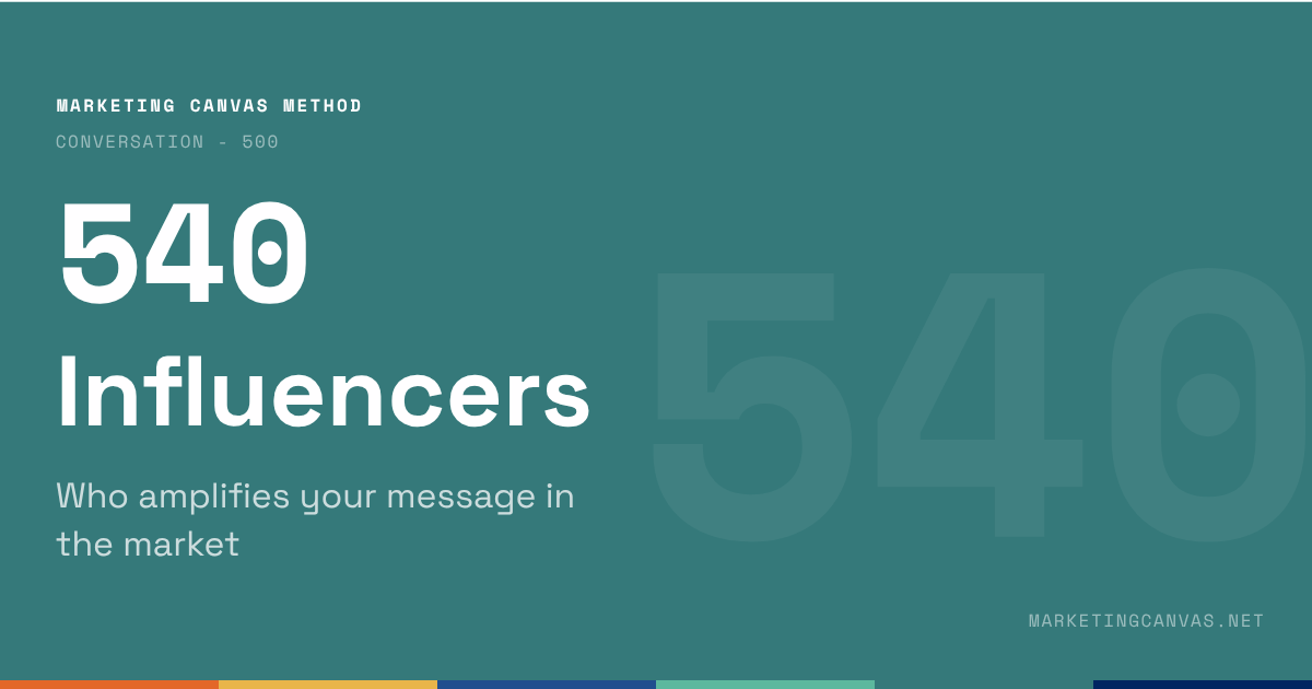
Marketing Canvas - Influencers

The Influencers dimension of the Marketing Canvas scores four properties — purpose alignment, goal clarity, authenticity, and long-term measurement. Learn why follower count is the wrong selection criterion.

About the Marketing Canvas Method

This article covers dimension 540 — Influencers, part of the Conversation meta-category. The Marketing Canvas Method structures marketing strategy across 24 dimensions and 9 strategic archetypes.
Full framework reference at marketingcanvas.net →  ·  Get the book →

In a nutshell

Influencers is the dimension that scores whether the people carrying your brand's message to new audiences are doing so with genuine conviction — or merely performing it for a fee. The distinction matters strategically because an influencer reading a script is advertising with a human face. It produces awareness. It creates no trust. An influencer genuinely using and recommending the product in their own language creates the most powerful form of proof available: peer endorsement.

The Marketing Canvas scores four properties — purpose alignment, goal clarity, authenticity, and long-term measurement — plus a sustainability criterion. The single most diagnostic question: does your company allow influencers creative freedom, or does it script and control the content until the authenticity is gone?

Introduction

Influencer marketing has matured from a novelty tactic into a structural component of how brands earn credibility at scale. But the term "influencer" has been so narrowly associated with social media content creators that it often obscures the more strategically significant question: who are the people whose opinions your target customers actually trust — and are those people carrying your brand's message?

The Marketing Canvas definition is deliberately broad. An influencer is anyone whose voice carries authority with your target audience. That includes social media creators with large followings. It also includes industry analysts, thought leaders, professional advisors, satisfied customers with relevant networks, and community leaders. The dimension applies universally across industries; only the cast changes.

What does the Marketing Canvas mean by Influencers?

The dimension scores four canonical properties, plus a fifth sustainability criterion:

541 — Purpose alignment: Are you working with influencers whose values genuinely match your brand purpose, and who function as authentic ambassadors rather than paid distribution channels? The selection criterion the method scores is not follower count — it is audience alignment. An influencer with 8,000 followers who are all parents concerned about home safety is more strategically valuable to Green Clean than an influencer with 800,000 general lifestyle followers. Purpose alignment is also a safeguard: an influencer who doesn't believe in the brand will eventually say so, or simply perform inauthentic content that the audience can detect.

542 — Goal clarity: Have you defined clear and actionable objectives for your influencer activity, connected to your overall marketing goals? Influencer activity without defined goals produces vanity metrics — reach, impressions, likes — that feel significant and are difficult to connect to commercial outcomes. The method scores whether goals are specific (what change in brand perception, consideration, or behaviour is the influencer activity targeting?) and whether those goals are aligned with the archetype's strategic priorities.

543 — Authenticity: Do you let influencers develop content for their audience in their own voice? This is the criterion that separates peer endorsement from advertising-with-a-face. Scripted influencer content is recognisable to audiences, produces the engagement metrics of organic content, and delivers the trust levels of a display ad. Authentic content — where the influencer has genuine experience with the product and describes it in their own language, to their own community, with their own perspective — transfers the influencer's credibility to the brand. The method scores whether the company has the discipline to allow this, or whether legal, brand, and marketing review processes have controlled the authenticity away.

544 — Long-term measurement: Have you set long-term metrics for your influencer relationships, prioritising indicators of brand impact and community engagement over short-term campaign performance? Transactional influencer strategies — one campaign, pay-per-post, move on — optimise for reach and produce no compounding value. Long-term relationships with purpose-aligned influencers compound: the influencer's knowledge of the brand deepens, the audience's association between influencer and brand strengthens, and the credibility transfer accumulates over time. Annual ROI measured in brand consideration and community growth is the right measurement frame. Post-level engagement rates are a signal; they are not the strategy.

545 — Sustainability: Are you working with influencers whose behaviour is consistent with sustainability principles, and are you minimising the environmental and ethical footprint of your influencer activity? This includes both the influencer's public conduct (a sustainability brand partnering with an influencer whose behaviour contradicts environmental values is a proof problem, not just a PR problem) and the operational sustainability of the programme.

The authenticity criterion in detail

The canonical distinction the method draws is worth holding precisely:

Influencer as advertising vehicle: The brand provides a brief, often a script, product talking points, and required disclosures. The influencer posts. The audience receives brand messaging delivered through a trusted human face. Awareness is built. Trust is not transferred — the audience recognises the commercial transaction and adjusts their interpretation accordingly. This is paid media with a warmer tone. It is scored as paid media efficiency, not as peer endorsement.

Influencer as genuine ambassador: The influencer has direct experience with the product or brand. They speak about it in their own language, to their own community, from their own perspective. They may be compensated, but the compensation does not dictate the content. The audience receives a recommendation from someone they trust, and that recommendation carries the influencer's personal credibility. Trust is transferred. This is the most powerful form of proof available — it is scored under dimension 340 (Proof) as well as 540, because it functions as both endorsement and content strategy.

The strategic failure the method diagnoses is companies that start with the second intention — genuine ambassadors — and then systematically dismantle it through approval workflows, mandatory messaging, legal review, and creative constraints until what arrives in the feed is indistinguishable from sponsored content. The 543 score measures whether the company has allowed authenticity to survive the internal process.

Influencers in B2B

The framing of influencer strategy as a consumer social media tactic obscures one of the most commercially significant applications of the dimension: B2B influence.

In B2B contexts, influencers look different but function identically. The trusted voice whose opinion shapes purchase decisions is not a content creator with an Instagram following — it is the Gartner analyst who classifies your platform in the Magic Quadrant, the industry conference speaker who cites your methodology in a keynote, the experienced CTO who posts about their implementation experience on LinkedIn, or the respected consultant who recommends your approach to their clients.

Each of these operates on the same structural logic as consumer influencer marketing: they have an audience that trusts them, and their endorsement transfers credibility to the brand. The selection criteria are the same — purpose alignment, authenticity, goal clarity, long-term relationship orientation. The content format is different. The strategic function is identical.

A B2B company that scores 540 by only considering social media creators has misunderstood the dimension. The question is: who do your buyers trust before they make a decision, and are those people encountering your brand in a way that earns their authentic endorsement?

Statements for self-assessment

Score each of the five sub-questions from −3 to +3 (no zero), then average for the dimension score. If the average is mathematically zero, round to −1.

  1. You are working with influencers that match your brand purpose and are your brand ambassadors (541)

  2. You have defined clear and actionable goals for your influencer strategy aligned with your marketing strategy goals (542)

  3. You let your influencers develop content that tells a story for their audience in their own voice while highlighting your brand (543)

  4. You have set long-term metrics for your influencers, preferably annual ROI targets in brand image and community engagement (544)

  5. You are working with influencers showcasing sustainable behaviour and you are optimising the sustainability impact of your influencer strategy (545)

Interpreting your scores

Negative scores (−1 to −3): Influencer activity is transactional, follower-count-selected, or script-controlled. Awareness may be being generated; trust is not being transferred. The target audience's most trusted voices are not carrying the brand's message. Commercial outcomes from influencer spend are difficult to attribute and likely low.

Positive scores (+1 to +3): Influencer relationships are purpose-aligned, long-term, and authenticity-preserving. The people your target customers trust are encountering your brand, understanding it at depth, and endorsing it in their own voice. The endorsement functions as peer proof (340), not just reach. Measurement is oriented toward long-term brand impact rather than campaign-level vanity metrics.

Strategic Role

Growth Driver for A1 (Disruptive Newcomer): A disruptor introduces something the market hasn't seen before. The brand has no heritage credibility to draw on, and paid media cannot manufacture trust for an unknown proposition. Third-party voices — early adopters, category-adjacent influencers, industry observers — are the primary mechanism through which trust is established before the brand has earned it through scale. For A1, 540 scores whether the company has deliberately seeded credible voices with genuine product access, or is relying on paid awareness campaigns that the market hasn't yet decided to trust.

Growth Driver for A7 (Scale-Up Guardian): Rapid growth creates a credibility maintenance challenge. The influencer community that endorsed the brand at launch may not be the right community at scale. New segments require new trusted voices. New markets require locally credible advocates. 540 for A7 scores whether the influencer programme is scaling in proportion to the business — maintaining authentic third-party validation as the brand reaches audiences that have no prior relationship with it.

Growth Driver for A9 (Category Creator): Creating a category requires teaching the market that the category exists and why it matters. Influencers are category educators — trusted voices who explain the new concept to their communities in terms those communities can understand. Green Clean's indoor health protection category is taught more effectively by a parent blogger who has experienced the Family Health Report than by any brand-produced content. For A9, 540 is the dimension that converts category language (510) and category stories (520) into peer-endorsed understanding at scale.

Secondary Brake for A3 (Brand Evangelist): The Brand Evangelist archetype is built on authentic community and tribal identity. The wrong influencer partnerships — commercial, follower-count-selected, scripted — can actively dilute the authenticity that the tribe values. Patagonia's community credibility would be undermined by paid lifestyle influencers who don't genuinely share environmental convictions. Harley-Davidson's tribal identity would be weakened by sponsored content from celebrities who don't ride. For A3, 540 is a brake rather than an accelerator: the risk is not absence of influencers but the wrong influencers, who signal to the tribe that the brand has prioritised reach over authenticity.

Secondary Accelerator for A8 (Niche Expert): A niche expert's authority rests on being recognised as the best-in-segment option by the people whose opinion the segment trusts. Expert influencers — analysts, specialists, practitioners with deep credibility in the niche — validate that authority in ways the brand cannot self-certify. A Gartner mention, a specialist publication citation, a respected practitioner's recommendation: these carry the proof weight that a niche expert's positioning requires.

Case study: Green Clean

Green Clean is a fictional eco-friendly residential cleaning service used as the recurring worked example throughout the Marketing Canvas Method.

Score: −2 to −1 (Weak) Green Clean has run two influencer campaigns in the past year, both sourced through a micro-influencer marketplace. The selection criterion was follower count and cost-per-post. Neither influencer had demonstrated prior interest in indoor health, family safety, or sustainability. Both received a product brief, required talking points, and a mandatory disclosure script. The resulting posts were published, received moderate engagement from the influencers' general lifestyle audiences, and generated eleven visits to the Green Clean booking page. No relationship continues beyond the campaign. The brand paid for reach. It received no credible endorsement. The audience that matters — parents actively researching indoor health protection — did not encounter Green Clean through any voice they trust on the subject.

Score: +1 to +2 (Developing) Green Clean has identified three micro-influencers whose existing content demonstrates genuine alignment with the indoor health protection job: a parent blogger who writes about reducing chemical exposure in family environments, a wellness content creator who has reviewed cleaning product ingredients, and a local community leader active in sustainable home practices. All three have been approached with a relationship brief rather than a campaign brief — the brand explained its mission, offered product access and service experience, and gave full creative freedom. Two of the three have published content. The content is recognisably authentic: it uses the influencers' own language, references their personal experience with the Family Health Report, and frames the endorsement around their own concerns rather than Green Clean's messaging. Goals are partially defined — brand consideration in the target segment — but measurement is informal. The compounding value of long-term relationships has not yet been built.

Score: +2 to +3 (Strong) Green Clean's influencer programme functions as an ambassador system rather than a campaign channel. Eight long-term partners — all purpose-aligned, all with genuine indoor health or sustainability credibility — have direct experience with the brand's service and the Eco-Proof Report. Each creates content in their own format, on their own schedule, in their own language. Green Clean provides product access, behind-the-scenes access to methodology, and early information about service developments. Creative briefs are replaced by relationship conversations. The audience each influencer reaches is the specific segment Green Clean most needs to reach: parents who are already researching indoor air quality and family health. Annual measurement tracks brand consideration uplift and community growth rather than post-level engagement. Several influencers have become genuine advocates — their personal endorsement pre-dates and exists independently of any commercial arrangement, which their audiences can distinguish. The programme has generated earned media: two of the influencers' Family Health Report posts were cited by a national parenting publication, extending the endorsement to a credibility tier the brand could not have accessed through paid media.

Connected dimensions

Influencers does not operate in isolation. Four dimensions connect most directly:

  • 520 — Stories: Influencers tell stories. The content an influencer creates is a story — about their own experience, about the brand's relevance to their audience, about the job the product helped them get done. A strong 520 (content strategy) creates the narrative framework; a strong 540 extends that framework through voices the brand doesn't own. Influencer content that follows the customer-as-protagonist arc (520) is more compelling than brand-prompted product description.

  • 340 — Proof: Influencer endorsement is a form of proof. Peer endorsement is the highest-credibility proof type available — it carries the influencer's personal reputation as collateral. A strong 543 (authenticity) score means the influencer content is functioning as genuine endorsement, not sponsored content. The overlap between 540 and 340 is significant: the same influencer relationship that scores in 540 is simultaneously generating proof assets (testimonials, case study narratives, third-party validation) that score in 340.

  • 530 — Media: Influencers operate across shared and earned media. Organic influencer content is shared media when it generates community conversation and earned media when it results in press coverage or independent citation. A strong 530 (media system) is built to receive and amplify authentic influencer content — the owned media infrastructure captures the referral traffic, the email system nurtures the audience that arrives, and the earned media compounds from publications that cite influencer endorsements.

  • 230 — Values: Influencers must share brand values — not just claim to. The 545 (sustainability) sub-question is the clearest expression of this, but the values alignment requirement extends to the full 230 dimension. An influencer whose public behaviour contradicts the brand's stated values is not a PR risk; it is a proof problem. The audience infers that the brand's values are performative if the people it aligns with don't live them.

Conclusion

The Influencers dimension scores something more fundamental than campaign reach or follower count. It scores whether the people whose opinions your target customers trust are carrying your brand's message — and whether they are doing so because they genuinely believe it, or because they were paid to say it.

The strategic test is the authenticity question: if the brand removed all mandatory messaging and creative constraints, what would the influencer say? If the answer is "probably the same thing, in their own words" — the relationship is an asset. If the answer is "nothing, or something very different" — the brand has a paid distribution channel, not an ambassador.

Building the second type of relationship takes longer, costs more selectivity, and requires internal discipline to resist the temptation to control the message. The commercial return — trust transferred, proof generated, community formed — is structurally more valuable than reach purchased and forgotten.

Sources

  1. Jonah Berger, Contagious: Why Things Catch On, Simon & Schuster, 2013

  2. Mark Schaefer, Known: The Handbook for Building and Unleashing Your Personal Brand in the Digital Age, Schaefer Marketing Solutions, 2017

  3. Marketing Canvas Method, Appendix E — Dimension 540: Influencers, Laurent Bouty, 2026

Marketing Canvas Method - Conversations - Influencers by Laurent Bouty

Read More
marketingcanvas.net Laurent Bouty marketingcanvas.net Laurent Bouty

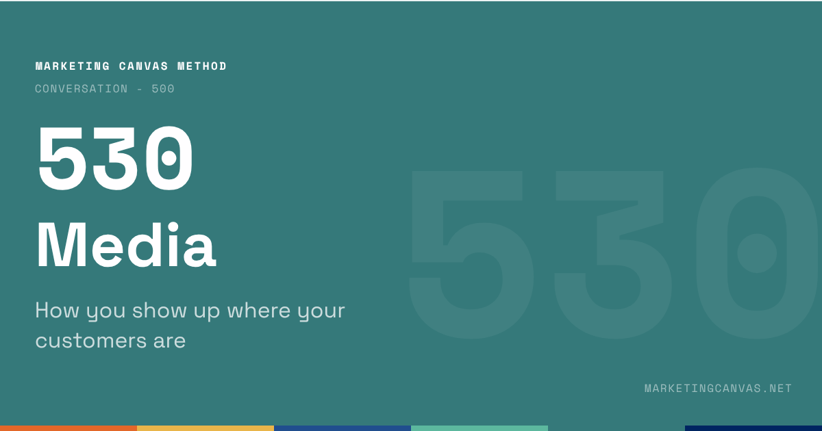
Marketing Canvas - Media Strategy

Media is the distribution layer of the Marketing Canvas. Learn how the four media types — owned, earned, shared, paid — work as a system, not silos, and why sequence matters.

About the Marketing Canvas Method

This article covers dimension 530 — Media Strategy, part of the Conversation meta-category. The Marketing Canvas Method structures marketing strategy across 24 dimensions and 9 strategic archetypes.
Full framework reference at marketingcanvas.net →  ·  Get the book →

In a nutshell

Media is the distribution layer of the Marketing Canvas Method — the system that determines how far your stories travel, who receives them, and at what cost. The dimension scores four media types: owned, earned, shared, and paid. The method's critical insight is that these four types must function as an orchestrated system, not independent silos. When they do, each reinforces the others. When they don't, you are paying to compensate for what a system would have delivered for free.

The sequencing principle is canonical: build owned first, then use it to earn credibility, generate sharing, and amplify with paid. Companies that start with paid media before building owned media are paying rent on someone else's attention.

Introduction

Every marketing story needs distribution. Dimension 520 (Stories) answers what to say and how to structure it. Dimension 530 (Media) answers where those stories go and how they reach the right people at the right moment.

This is not a channel selection exercise. The Marketing Canvas treats media as an architecture question: what is the role of each media type in your strategy, how do they connect to each other, and are they sequenced correctly? A strong media score requires more than presence across four types — it requires deliberate orchestration with each type performing a distinct function in a coherent whole.

The four media types

The Marketing Canvas organises media into four categories, adapted from the PESO model (Paid, Earned, Shared, Owned). Each type has a distinct strategic function.

531 — Owned media is the foundation. Your website, blog, email list, app, and any platform you control without paying for distribution. Owned media is the only type where you hold both the content and the audience relationship. It cannot be algorithmically deprioritised, editorially rejected, or priced out of your reach. Everything else in the media system should be built to drive traffic back to owned. A weak or inconsistent owned media base means the rest of the system has no home base to return to.

532 — Earned media is authority you cannot buy. Press coverage, analyst mentions, organic search rankings, third-party reviews, award recognition. Earned media carries more credibility weight than owned because the source is independent — the company did not pay for the endorsement, and the audience knows it. The strategic goal of earned media is not coverage volume; it is the specific credibility signals that reach the specific decision-makers who will not trust owned media alone. In B2B, an analyst firm citing your methodology is earned media. In consumer markets, a major publication's review is earned media. Both perform the same function: borrowed authority.

533 — Shared media is engagement and community. Social platforms, forums, user-generated content, communities where your audience participates. The strategic function of shared media is conversation — it is the media type where the flow is bidirectional and where brand advocates can amplify content beyond the brand's own reach. The critical distinction: shared media with an engaged community is a multiplier. Shared media without community is a broadcast channel you don't control, and a less efficient one than paid. The score for 533 measures whether community actually exists — not whether the brand has social media accounts.

534 — Paid media is targeted amplification. Advertising across digital and offline channels — search, social, display, video, print, broadcast. Paid media's strategic function is reach that the other three types cannot yet deliver, or speed that organic growth cannot match. The diagnostic question the method applies: is paid media being used to amplify what is already working organically, or is it being used to substitute for owned, earned, and shared foundations that don't exist? The first use is leverage. The second is dependency — and dependency on paid becomes structurally expensive as soon as budgets contract.

535 — Sustainability: Is the media strategy compatible with sustainability principles? This includes both the sustainability of the media mix itself (a strategy built entirely on paid is not sustainable as a business model) and the environmental and ethical considerations of media choices (platforms, production practices, carbon footprint of digital advertising).

PESO model from Spinsucks (credentials: https://spinsucks.com/communication/peso-model-breakdown/)

The system logic: why sequence matters

The four types are not interchangeable. They serve different functions at different costs, with different credibility profiles and different dependencies. The method's sequencing principle is not a suggestion — it is a structural constraint that most organisations violate in the direction of paid-first.

The correct sequence:

  1. Build owned. Without a functioning website, a content infrastructure, and an email relationship with your audience, you have no home base. Stories you earn, share, or pay for have nowhere to land that you control. Every campaign that drives traffic to a weak owned infrastructure is writing a cheque you can't cash.

  2. Earn credibility. Once owned media is solid, third-party validation becomes possible and compounding. Press coverage links back to your site. Analyst mentions send audiences to your content. SEO rankings are a form of earned media built on owned content. Earned media is slow but non-depleting — a strong article from three years ago continues to rank and generate credibility without further investment.

  3. Generate sharing. When owned and earned are functional, community forms around real value rather than manufactured engagement. Customers share because the content genuinely helps them. The shared media layer amplifies without additional cost.

  4. Amplify with paid. Paid media is most efficient when it amplifies content and propositions that are already proven to resonate organically. Paid budget spent on content that hasn't earned any organic engagement is a signal that something upstream in the system is broken.

The pathology the method diagnoses: companies that reverse this sequence, starting with paid because it produces immediate, measurable results, and then discovering that they have built an audience they rent rather than own. When the paid budget stops, the audience disappears. This is not a media strategy problem — it is a media architecture problem.

Companies that start with paid media before building owned media are paying rent on someone else's attention. Stopping the rent means leaving the property.

Media and acquisition cost

The 530 score has a direct, measurable relationship with the 610 (Acquisition) score. A well-orchestrated media system — strong owned base, compounding earned authority, engaged shared community — systematically reduces the cost of acquiring each new customer over time. Paid media efficiency improves when prospects arrive having already encountered the brand through earned or shared touchpoints. The trust is partially built before the first paid impression.

A media strategy that is entirely paid-dependent produces a flat or rising acquisition cost curve. Every new customer costs approximately the same as the last, because there is no compounding infrastructure. The paid-first company runs faster to stay in the same place.

Statements for Self-Assessment

Score each of the five sub-questions from −3 to +3 (no zero), then average for the dimension score. If the average is mathematically zero, round to −1.

  1. Your owned media are solid, consistent with your goals and serve as the foundation for your media strategy (531)

  2. Your earned media strategy helps you to secure authority and credibility of your business to your audience (532)

  3. You have created engagement and community for your customers through your shared media strategy (533)

  4. You have amplified your targeting for achieving your goals through paid off-line and on-line media (534)

  5. Your media strategy is compatible with the concept of sustainability (535)

Interpreting your scores

Negative scores (−1 to −3): Media types are siloed, over-invested in the wrong sequence, or structurally dependent on paid without owned foundations. Likely result: acquisition costs are flat or rising; brand credibility is low because no independent voices have validated it; community doesn't exist because there is nothing to gather around.

Positive scores (+1 to +3): The four media types are orchestrated into a coherent system. Owned is the foundation. Earned is compounding. Shared is generating community conversation. Paid is amplifying proven content rather than compensating for absent foundations. Acquisition cost trends downward as the system matures.

Strategic Role

Media rarely appears as a Fatal or Primary dimension in any archetype — it is the amplification layer that makes other dimensions' work visible to the market. Its absence is rarely the primary reason a strategy fails; its weakness is usually the reason a strategy that should be working isn't reaching its potential audience.

Secondary Accelerator for A1 (Disruptive Newcomer): A disruptor's story needs distribution to reach beyond the early adopter fringe. New brands have no earned media heritage, limited owned infrastructure, and no community yet. Building the media system quickly — prioritising owned first, then using early press coverage and community formation to reduce paid dependency — determines how fast the disruption can scale. A weak 530 for A1 means the product is good and the story is clear, but no one beyond the founding circle hears it.

Secondary Accelerator for A7 (Scale-Up Guardian): Scale-up creates the opposite problem: rapid growth can outpace the media system's capacity to maintain brand coherence. New audiences encounter the brand through inconsistent channels. Paid spend scales faster than owned infrastructure can receive. The earned media narrative hasn't kept pace with what the company has become. A strong 530 for A7 means the media architecture has scaled alongside the business — new owned properties in new markets, earned authority in new categories, community forming around the expanded brand.

Secondary Accelerator for A9 (Category Creator): Creating a category requires persistent category education across multiple media touchpoints. A category cannot be taught in a single paid impression. The owned media library builds the intellectual case. Earned media validates it through independent voices. Shared media spreads the language through community adoption. Paid media introduces the category to cold audiences who then continue their education through owned and earned. All four types are required for category creation. A weak 530 for A9 means the category story is being told inconsistently, too narrowly, or is being terminated every time paid budget runs out.

Growth Driver for A3 (Brand Evangelist): In the Brand Evangelist archetype, media amplification of member advocacy is the primary growth engine. Patagonia's earned media (documentary filmmaking, environmental activism coverage) and shared media (customer-generated content, community activism) are not marketing support functions — they are the growth mechanism. The brand earns media because its customers do things worth reporting. The 530 score for A3 measures whether the media system is built to receive and amplify the advocacy the brand has earned, or whether it is ignoring it.

Case study: Green Clean

Green Clean is a fictional eco-friendly residential cleaning service used as the recurring worked example throughout the Marketing Canvas Method.

Score: −2 to −1 (Weak) Green Clean's media footprint is almost entirely owned — a website and an email list of past customers. The website is irregularly updated. The email list has not been used for content distribution in six months. Earned media does not exist: the brand has never been featured in a publication, has no search rankings for any competitive keyword, and has received no independent reviews. Shared media consists of a Facebook page and an Instagram account with a combined following of 340 people, almost exclusively friends and family of the founder, generating no community conversation. Paid media has been used sporadically — two Facebook campaigns in the past year, each running for two weeks, each terminated when the budget ran out. There is no system. There is presence in three types with no architecture connecting them. The paid campaigns had nowhere coherent to send traffic.

Score: +1 to +2 (Developing) Green Clean has rebuilt its owned media foundation: the website now publishes "Safe Home" content weekly, the email list is active with a fortnightly digest, and the blog is indexed and generating modest organic traffic. Earned media is beginning to form: one local parenting magazine has featured the brand, a sustainability blogger with a relevant audience has written an unprompted review, and the brand now appears in Google results for "eco-friendly cleaning service [city]." Shared media has shifted from broadcast to conversation: Instagram posts about the Family Health Report now consistently generate comments from customers sharing their own indoor air quality concerns. Paid media is used to amplify the Safe Home content to cold audiences in the target demographic, driving traffic to the owned blog rather than directly to a booking page. The system is forming. The sequencing is approximately correct. Owned is the foundation; paid is amplifying content that is already earning organic engagement.

Score: +2 to +3 (Strong) Green Clean's media system is fully orchestrated. Owned media is the anchor: the website serves as a resource hub for the indoor health protection category, generating consistent organic traffic through search and content. The email list has grown to 4,200 subscribers through content-led lead generation, and the sequence from first-touch content to first booking is documented and measured. Earned media is compounding: the brand is regularly cited in national parenting and sustainability publications, has been featured in two podcast interviews, and its Eco-Proof Report has been referenced by an independent environmental research organisation — generating credibility that paid media cannot buy. Shared media carries authentic community conversation: customers post Family Health Reports, tag Green Clean, and share indoor air quality content unprompted. The community amplifies without the brand paying for reach. Paid media is used surgically — retargeting known visitors and amplifying the highest-performing organic content to lookalike audiences. The acquisition cost curve has been falling for 18 months as the owned and earned infrastructure compounds.

Connected dimensions

Media does not operate in isolation. Four dimensions connect most directly:

  • 520 — Stories: Media distributes stories. The quality of the 520 content determines whether distribution delivers value or noise. Strong stories with weak distribution stall. Weak stories with strong distribution produce reach without conversion. The combination — strong content, strong distribution — is what makes campaigns compound rather than decay.

  • 430 — Channels: Media and channels overlap in digital contexts. An e-commerce brand's paid social media is simultaneously a media channel and a sales channel. The distinction the method maintains: channels (430) are where transactions happen; media (530) is where audience attention is built before the transaction moment. The line blurs in digital; the diagnostic question remains which function is primarily being served.

  • 340 — Proof: Earned media is a form of proof. A press mention, an analyst citation, an independent review all function as third-party validation of the brand's claims — which is the same function as proof in the value proposition. A strong 532 (earned media) score and a strong 340 (proof) score tend to move together, because the same credibility-building activities produce both.

  • 610 — Acquisition: Media effectiveness directly drives acquisition cost. The compounding media system — owned growing organically, earned building without additional investment, shared amplifying for free — produces a falling cost-per-acquisition curve. Paid-only media produces a flat or rising curve. The 530 score is a leading indicator of where 610 is heading.

Conclusion

Media is the dimension that determines whether everything else in the Marketing Canvas reaches the people it was designed for. A precise JTBD, a compelling positioning, an exceptional experience — none of it creates commercial value if the audience the brand needs never encounters it.

The strategic discipline the method requires is architectural, not tactical. The question is not which platform to post on this week. It is whether the media system — all four types, in the right sequence, with the right roles — is built to compound over time. Paid-first strategies produce visible results quickly and structural weakness quietly. Owned-first strategies are slower and produce compounding returns that paid-first companies eventually cannot afford to replicate.

The test: if you stopped all paid media today, what would remain? The answer to that question is your real media foundation score.

Sources

  1. Gini Dietrich, Spin Sucks: Communication and Reputation Management in the Digital Age, Que Publishing, 2014 — the origin of the PESO model framework

  2. Mark W. Schaefer, Marketing Rebellion: The Most Human Company Wins, Schaefer Marketing Solutions, 2019

  3. Marketing Canvas Method, Appendix E — Dimension 530: Media, Laurent Bouty, 2026

About this dimension

Dimension 530 — Media is part of the Conversation meta-category (500) in the Marketing Canvas Method. The Conversation meta-category contains four dimensions: Listening (510), Stories (520), Media (530), and Influencers (540).

The Marketing Canvas Method is a complete marketing strategy framework built around 6 meta-categories, 24 dimensions, and 9 strategic archetypes. Learn more at marketingcanvas.net or in the book Marketing Strategy, Programmed by Laurent Bouty.

Marketing Canvas Method - Conversation - Media Strategy

Read More
marketingcanvas.net Laurent Bouty marketingcanvas.net Laurent Bouty

Marketing Canvas - Content and Stories

Stories is the content strategy dimension of the Marketing Canvas Method. Learn the five properties of effective brand storytelling — and why the most common failure is narcissism.

About the Marketing Canvas Method

This article covers dimension 520 — Content & Stories, part of the Conversation meta-category. The Marketing Canvas Method structures marketing strategy across 24 dimensions and 9 strategic archetypes.
Full framework reference at marketingcanvas.net →  ·  Get the book →

In a nutshell

Stories is the content strategy dimension of the Marketing Canvas Method. It scores whether a brand's narratives serve both the organisation and the user — structured around how customers think and speak, equipped with clear calls to action, distributed through the right medium, and grounded in truthfulness.

The most common storytelling failure is narcissism: brands that tell their own story rather than their customer's story. Effective brand narratives put the customer as the protagonist and the brand as the guide. The dimension scores whether your content has made that shift — or is still performing a company monologue to an audience that has already moved on.

Introduction

Every organisation produces content. The strategic question the Marketing Canvas asks is not whether you produce content — it is whether your content does work. Does it educate? Does it move the audience toward a decision? Does it make the brand more credible, more human, more trustworthy?

Stories is the dimension that answers those questions systematically. It is not about production volume or creative quality. It is about whether the narratives you create are oriented toward your customer's world or your company's world — and whether they are designed with intention, not improvised under deadline pressure.

Marketing Canvas by Laurent Bouty - Stories

Marketing Canvas by Laurent Bouty - Stories

What does the Marketing Canvas mean by Stories?

In the Marketing Canvas Method, Stories is not synonymous with social media content or blog output. It is the entire content strategy infrastructure: the narratives the brand creates and shares to educate, persuade, and connect across every channel and every stage of the customer journey.

The dimension scores five properties:

521 — Reflection: Do content goals serve both the organisation and the user? Content that only serves the organisation is advertising. Content that only serves the user is journalism. Stories that score well do both simultaneously — they advance the brand's objectives while genuinely answering a question, solving a problem, or articulating an aspiration the customer already holds.

522 — Structure: Is content organised around how users think and speak — not around how the company is structured? The most structurally weak content reads like an internal org chart. Products are described in product management language. Services are segmented by department. Stories that score well are structured around the customer's decision process, their language, their sequence of questions. The company's internal logic is irrelevant to the reader.

523 — Call to Action: Does every piece of content have a clear next step? Content without a CTA is a conversation that ends before it reaches the point. The CTA doesn't need to be "buy now." It can be "read this next," "share with a colleague," "download the reference," or "book a call." The question the method asks is whether the content was designed with intent — was there a deliberate decision about what the reader should do next, and does the content deliver it?

524 — Medium selection: Is the format appropriate for the content type and the available resources? A complex methodology needs different treatment than a single customer insight. A B2B technical audience needs different formats than a consumer lifestyle audience. Medium selection scores whether the company has made conscious choices about format — or whether everything becomes a blog post by default because that is the path of least resistance.

525 — Truthfulness: Are your stories truthful, and do they communicate honestly about sustainability? The sustainability dimension is not an add-on. It is the anchor for all content credibility. Brands that overstate environmental credentials destroy the trust that authentic content builds. The method scores whether stories reflect what the brand actually does — not what the brand would like to claim.

The canonical narrative arc

The most important structural insight in the Stories dimension is this: the customer is the protagonist. The brand is the guide.

This is not a stylistic preference. It is the architecture of every effective brand narrative, from the simplest testimonial to the most complex thought leadership series.

The arc follows three moves:

  1. The job: The customer has a problem they need to solve — a job to be done (dimension 110). The story opens here, in the customer's situation, using the customer's language.

  2. The solution: The brand provides a path to resolution — features (310), experience (420), proof (340). The brand doesn't rescue the customer; it equips them.

  3. The transformation: The customer achieves what they were aspiring to (120). They are not just satisfied — they have become a version of themselves that was not possible before the solution existed.

When this arc is intact, content resonates. Readers recognise themselves in step one, lean toward step two, and want step three. When this arc is missing — when the brand puts itself at the centre, leads with features rather than jobs, or skips the transformation entirely — the content performs for the company's ego while leaving the customer unmoved.

The red flag: content that leads with "We are proud to announce..." is the arc inverted. The brand is announcing its own importance. The customer has no reason to care.

Stories as the delivery vehicle for Proof

The connection between 520 and 340 (Proof) is one of the most underused insights in the Marketing Canvas.

Proof establishes credibility. Stories make proof compelling. The combination is what converts sceptics.

  • A case study is a story with evidence — the narrative arc applied to a real customer situation, with measurable outcomes.

  • A testimonial is a story with social proof — a peer narrator whose credibility transfers to the brand.

  • A "how it works" demonstration is a story with logical explanation — the brand's claim tested against a realistic scenario.

A brand with strong proof (340) but weak stories (520) has evidence that no one reads. A brand with strong stories (520) but weak proof (340) has compelling content that doesn't survive scrutiny. The dimension combination score — both above +1 — is what produces the content that drives both conversion and trust.

Statements for Self-Assessment

Score each of the five sub-questions from −3 to +3 (no zero), then average for the dimension score. If the average is mathematically zero, round to −1.

  1. Your content and stories goals are reflecting your organisation's goals and user's needs (521)

  2. Your content and stories are created and structured based on your understanding of how users think and speak about a subject (522)

  3. Your content and stories have clear calls to action — you know exactly what you want your users to do after reading (523)

  4. You have chosen your content and stories medium adequately in function of your type of story as well as resources, like time and money (524)

  5. Your content and stories are truthful and communicate about sustainability (525)

Interpreting your scores

Negative scores (−1 to −3): Content is disconnected from the customer's job, organised around internal company logic, missing calls to action, or lacks credibility. The likely result: content is produced but doesn't convert; the audience it reaches doesn't recognise themselves; trust is not built because proof is absent or unconvincing.

Positive scores (+1 to +3): Content is structured around how customers think and speak. The brand serves as guide, not protagonist. Every piece has a deliberate next step. Medium selection is intentional. Proof and story are integrated. Content measurably contributes to acquisition, retention, or category education.

Strategic Role

Stories appears in the Vital 8 more frequently than any other Conversation dimension. Its archetype footprint covers both the growth and the evangelism archetypes — where narrative is not a marketing support function but the primary strategic mechanism.

Primary Accelerator for A1 (Disruptive Newcomer): A disruptor's product is often unfamiliar. The market doesn't know it needs it yet. In this context, stories are not marketing — they are the primary mechanism for market education. Canva, Odoo, Tesla at launch: none of these brands could rely on category familiarity. Each had to teach the market what they were disrupting and why it mattered. Stories is the engine. A weak 520 score for A1 means the market never learns the lesson.

Primary Accelerator for A9 (Category Creator): Creating a category requires naming it, teaching it, and repeating it until the market adopts the language. Nespresso didn't launch a coffee machine — it created a premium home espresso ritual. Salesforce didn't sell software — it taught the market that software could live in the cloud. The narrative was the strategy. The company that tells the category story most consistently owns the category. A weak 520 for A9 means the category is left undefined — and a competitor will define it instead.

Secondary Accelerator for A3 (Brand Evangelist): Evangelism is the archetype where customers carry the story further than the brand can. The brand's role is to create stories so authentic, so charged with shared identity, that customers want to retell them. Patagonia's documentary filmmaking, Harley-Davidson's customer mythology — these are brand stories that customers adopted as their own. The 520 score for A3 measures whether the brand's stories are evangelism-ready or whether they stop at brand awareness.

Secondary Brake for A5 (Pivot Pioneer): A brand in pivot faces a story problem: the existing narrative no longer serves the new direction, but the new narrative isn't yet credible. A weak 520 during a pivot creates a dangerous gap — the market is told the company has changed, but the stories still tell the old version. LEGO's pivot from failing toy company to platform for creativity required a complete narrative reconstruction. The dimension scores whether the pivot story has been rebuilt, not just the business model.

Growth Driver for A1 and A3: In both archetypes, viral storytelling directly drives revenue growth — not as a side effect but as the primary acquisition mechanism. The customer story that spreads is worth more than any paid media campaign.

Case study: Green Clean

Green Clean is a fictional eco-friendly residential cleaning service used as the recurring worked example throughout the Marketing Canvas Method.

Score: −2 to −1 (Weak) Green Clean produces content regularly — a monthly blog, occasional social posts, a product page for each cleaning product. The content describes the products, explains the ingredients, and mentions eco-certification. It is accurate. It is also entirely company-centric: every piece begins with what Green Clean offers, not with what the customer is trying to accomplish. There are no calls to action beyond "add to cart." The customer segment Green Clean most wants to reach — parents concerned about indoor health — cannot find themselves in the content. The stories don't start in their world. There is no arc from job to transformation. No case studies. No customer voices. The content is a product catalogue dressed as a blog.

Score: +1 to +2 (Developing) Green Clean has begun restructuring its content around the customer's job. A series called "The Safe Home Guide" now leads with the parent's concern — "what am I exposing my children to when I clean?" — rather than with product features. The narrative arc is partially present: posts open with the customer situation, introduce the relevant Green Clean solution, but often stop before delivering the transformation. CTAs have been added to most articles, though they vary in clarity — some are specific ("book your first clean"), others are vague ("learn more"). A first customer case study has been published, featuring a family who switched from conventional products after a child's respiratory reaction. Medium selection is improving: longer content has moved to the blog; short-form testimonials are now used on Instagram. Stories are beginning to do work. The architecture is still uneven.

Score: +2 to +3 (Strong) Green Clean's content strategy is fully structured around the customer-as-protagonist arc. The "Safe Home" narrative series follows families through the discovery-to-commitment journey — opening with the indoor health concern, demonstrating the Green Clean methodology, and closing with the family's reported change in confidence and peace of mind. Each piece has a deliberate CTA mapped to the reader's stage: first-contact content leads to a "calculate your home's risk" tool; mid-funnel content leads to a trial booking; post-service content leads to referral sharing. Case studies now include before/after air quality measurements from the Eco-Proof Report, converting the brand's proprietary tool from a service feature into a content asset. VOC language sourced directly from dimension 510 (Listening) feeds the content briefs — customers' own phrasing about "knowing what my family breathes" appears verbatim in headlines and section openers. Stories and Proof (340) are fully integrated. Content measurably drives acquisition and retention.

Connected dimensions

Stories does not operate in isolation. Five dimensions connect most directly:

  • 110 — JTBD: Stories narrate job resolution. The most effective content opens in the customer's job situation — using their language, not the brand's. A strong JTBD definition (110) is the raw material that makes story structure (522) possible. Without a clear job statement, content defaults to product description.

  • 220 — Positioning: Stories deliver positioning in narrative form. The positioning claim (220) is the argument. The story is the demonstration. Positioning without stories is a claim without evidence. Stories without positioning is content without a point.

  • 320 — Emotions: Stories create emotional connection. The emotional job (320) defines what the customer is trying to feel. The story is the mechanism that delivers that feeling. A story that is technically accurate but emotionally inert does not produce advocacy.

  • 340 — Proof: Stories are the delivery vehicle for proof. A case study is a story with evidence. A testimonial is a story with social proof. Proof without story is data. Story without proof is claim. The combination is what converts sceptics into buyers.

  • 510 — Listening: VOC language mining (510) produces the raw material for story structure. The most effective content uses the words customers use to describe their own problems — not the words the marketing team uses to describe the product. Listening tells you how the customer speaks (522). Stories build the structure around it.

  • 530 — Media: Stories need distribution. Media (530) is the system that determines how far and to whom stories travel. Strong stories distributed through the wrong media reach the wrong audience. The quality of 520 determines what is worth distributing; the quality of 530 determines whether distribution works.

Conclusion

Stories is the dimension that turns strategy into language the market can receive. Every other dimension in the Canvas — the job, the positioning, the proof, the experience — exists as internal knowledge until stories make it external and human.

The strategic test is not whether you produce content. It is whether your content starts in the customer's world, serves the customer's job, and moves them toward an outcome they want. If it does, the brand becomes a guide. If it doesn't, the brand becomes a company talking about itself — and customers learned to scroll past company monologues a long time ago.

The architecture check is simple: read your last five pieces of content. Count how many sentences begin with the customer's situation versus the company's product. The ratio tells you where 520 actually stands.

Sources

  1. Donald Miller, Building a StoryBrand, HarperCollins Leadership, 2017

  2. Robert McKee & Thomas Gerace, Storynomics: Story-Driven Marketing in the Post-Advertising World, Twelve, 2018

  3. Joe Pulizzi, Content Inc., McGraw-Hill Education, 2015

  4. Marketing Canvas Method, Appendix E — Dimension 520: Stories, Laurent Bouty, 2026

About this dimension

Dimension 520 — Stories is part of the Conversation meta-category (500) in the Marketing Canvas Method. The Conversation meta-category contains four dimensions: Listening (510), Stories (520), Media (530), and Influencers (540).

The Marketing Canvas Method is a complete marketing strategy framework built around 6 meta-categories, 24 dimensions, and 9 strategic archetypes. Learn more at marketingcanvas.net or in the book Marketing Strategy, Programmed by Laurent Bouty.

Marketing Canvas Method - Conversation - Content and Stories by Laurent Bouty

Read More
marketingcanvas.net Laurent Bouty marketingcanvas.net Laurent Bouty

Marketing Canvas - Listening

Most companies listen reactively — processing complaints, running annual surveys, reading reviews when they arrive. The Marketing Canvas demands proactive listening. Dimension 510 explains the difference, why it is a Fatal Brake for Pivot Pioneers, and the most expensive sentence in marketing.

About the Marketing Canvas Method

This article covers dimension 510 — Listening, part of the Conversation meta-category. The Marketing Canvas Method structures marketing strategy across 24 dimensions and 9 strategic archetypes.
Full framework reference at marketingcanvas.net →  ·  Get the book →

In a nutshell

Listening (dimension 510) is the Voice of the Customer (VOC) infrastructure — not a single survey, but a system that captures everything customers say across every channel, translates it into data, and feeds it into strategic decisions.

The distinction that defines this dimension: listening without action is surveillance. Listening with action is strategy.

Most organisations believe they listen to customers. Most are listening reactively — processing complaints when they arrive, running annual satisfaction surveys, reading reviews when a notification appears. The method demands something more demanding: proactive listening that generates data before it is needed, feeds it into decisions before problems compound, and closes the loop between what customers say and what the company does.

In the Marketing Canvas, Listening sits within the Conversation meta-category alongside Stories (520), Media (530), and Influencers (540). It is the first of the four Conversation dimensions — and it comes first deliberately. The meta-category header says it plainly: listening comes before stories, before media, before influencers. You cannot communicate effectively with people you haven't systematically understood.

Reactive vs. proactive: the canonical distinction

This is the distinction that separates a company with VOC processes from a company with a VOC system.

Reactive listening processes information when it arrives. Customer complains — the complaint is logged. Customer writes a review — someone reads it. Annual survey goes out — results are compiled. NPS score is reported quarterly. Each of these is listening. None of them is proactive. The information arrives at the company's pace, on the company's schedule, filtered through the customers who bothered to respond.

Proactive listening generates information continuously, systematically, and before it is urgently needed. Ongoing customer interviews on a regular cadence — not just when there is a problem to investigate. Social listening infrastructure monitoring what is said about the brand, the category, and competitors across platforms. Support ticket analysis that extracts pattern data from thousands of micro-interactions. Behavioural data from digital touchpoints that reveals what customers actually do, not just what they say. Structured feedback loops at defined journey stages that close the circle between hearing a concern and confirming the fix.

The gap between reactive and proactive is the gap between responding to problems and preventing them. Between knowing what customers said last quarter and knowing what they are saying now. Between confirming assumptions and challenging them.

The canonical test: if the company stopped sending surveys tomorrow, would customer understanding continue to improve? If yes, the listening system is proactive. If no — if surveys are the primary input — the system is reactive, and dimension 510 cannot score above +1.

MARKETING CANVAS TOPICS (1).png

The most expensive sentence in marketing

"We know what customers want."

This sentence costs more than any misaligned campaign, any failed product launch, or any churned enterprise account. It is the signal that internal assumptions have been allowed to substitute for external evidence — that the listening loop has been closed not by data but by conviction.

The canonical position of the Marketing Canvas on this: if the data contradicts the assumption, the assumption must yield. Not the data. Not the interpretation. The assumption.

This sounds obvious. It is routinely violated. Teams that have operated in a category for years develop a fluency with their customers that feels like understanding but is actually pattern recognition. They know what last year's customers said about last year's product. They extrapolate. The market moves. The extrapolation drifts.

The VOC system exists to correct the drift before it becomes a strategy gap. It is the institutional mechanism that keeps the company's model of its customers honest — continuously updated, data-grounded, and resistant to the internal assumptions that are far more comfortable to rely on.

The four properties of an effective VOC system

The Marketing Canvas scores Listening against four properties. Together they describe not just whether a company has listening tools, but whether those tools form a functioning system:

Capture scope (511) — does the VOC system hear everything customers are saying? Not everything worth hearing — everything. The signal that matters is often not in the formal feedback. It is in the support ticket that uses unusual language. The social media comment that frames the category differently. The customer interview that introduces a word the team has never used. A VOC system with limited capture scope is a VOC system with systematic blind spots.

Data discipline (512) — is the VOC process entirely data-driven, with no point where assumptions substitute for evidence? The failure mode here is not fraudulent data. It is filtered data — interview questions that lead to expected answers, survey scales that cluster around mid-range because respondents are conflict-averse, analysis that confirms the hypothesis the team walked in with. Data discipline means designing the listening system to surface inconvenient truths, not just validate comfortable ones.

Journey integration (513) — does the VOC process map to the customer lifecycle? Listening at only one stage of the journey is like taking a patient's temperature once and declaring the health of their entire year. The research that matters for acquisition decisions is different from the research that matters for retention decisions. A journey-integrated VOC system has different listening mechanisms at different stages — capturing the before-purchase research experience, the onboarding moment, the ongoing use patterns, and the renewal conversation separately, because each reveals different strategic information.

Methodological breadth (514) — are multiple research techniques used together? Each technique has a different blind spot. Surveys capture stated preferences but miss revealed behaviour. Interviews surface nuance but are prone to social desirability bias. Behavioural analytics reveal what customers do but not why. Support ticket analysis captures the most frustrated customers but underweights the quietly satisfied ones. No single technique is sufficient. The system that combines four or more creates a triangulated picture that is harder to misread.

Validation discipline — does the company run a JTBD check at the customer level before committing capital to a direction implied by a market signal? A strong market trend is not the same as a validated consumer job. A company can detect a trend correctly and still deploy capital in a direction its specific customer does not need, because it never ran the validation step between signal and decision. This failure is harder to catch because the company genuinely believes it is being data-driven. The tell: VOC data is being used to confirm a direction already chosen, rather than to test it before capital is committed. Volume of consumer data does not protect against this failure. Only validation discipline does.

The second critical failure is the mirror of the first: companies that mistake market signal intake for customer listening. Reactive companies filter data through assumptions. A different failure mode — harder to detect because it is dressed in data — is the company that tracks macro trends attentively but never validates them at the individual customer level. The market is moving toward X does not mean your specific customer's job has changed. Listening without validation is still surveillance, just at a more sophisticated level.

Listening in the Marketing Canvas

The canonical question

Do you systematically capture, analyse, and act on what customers are saying about your brand, products, and market?

Listening is a Fatal Brake for A5 (Pivot Pioneer) — the most strategically consequential placement of any Conversation dimension.

The rationale is direct: you cannot pivot successfully if you don't know where the market is going and whether your specific customer is moving with it. Listening is how you find out both — and the second question matters more than the first.

The Fujifilm and Kodak cases provide the sharpest possible contrast. Both companies faced the same crisis in the early 2000s: digital technology was destroying the photographic film market. Both had data. Kodak had commissioned research in 1981 predicting film's decline — and then calculated how many years they could milk film revenue before needing to act. They listened, and then filtered the listening through their assumption that they had more time. Fujifilm conducted an 18-month technology audit — described in the canonical case library as "the most sophisticated VOC exercise in the book" — mapping every capability they had against every market need they could identify. They listened, and then let the data direct the strategy. Fujifilm still exists. Kodak destroyed over €100B in value.

For A5, Listening is a Fatal Brake because the pivot direction is unknown until the market reveals it. An A5 company that is listening well will identify the new job before competitors do. An A5 company that is listening reactively will discover it in competitors' press releases.

Listening is also a Growth Driver for A9 (Category Creator) — the dimension through which category language is discovered. Green Clean's voice-of-customer language mining is the canonical example: extracting the exact phrases customers used to describe the indoor health protection job and feeding those phrases directly into marketing copy. Customers teach you the vocabulary of the category they are joining. Listening is how you learn it.

Statements for self-assessment

Rate your agreement on a scale from −3 (completely disagree) to +3 (completely agree). There is no zero — the Marketing Canvas forces a directional position on every dimension.

  1. You have set a VOC system that captures everything that customers are saying about your brand and your value proposition.

  2. Your entire VOC process is data-driven — at no point are you making assumptions that substitute for evidence.

  3. Your VOC process is based on an in-depth knowledge of your user's journey and customer lifecycle.

  4. You are using different techniques together to ensure you are getting the most from your research.

  5. Your VOC system captures your customers' views on sustainability.

(Dimensions 511–514 + 515 in the Marketing Canvas scoring system)

Note on Detailed Track scoring: if averaging sub-question scores produces a mathematical zero, the method rounds to −1. A split score means the dimension is not clearly helping your goal — and "not clearly helping" requires the same investigation as "hurting."

Interpreting your scores

Negative scores (−1 to −3): Customer understanding relies on assumptions, single-source data, or reactive feedback that arrives too late to be strategic. "We know what customers want" is the operating assumption. The likely result: strategy decisions are made on the basis of internal conviction rather than external evidence. Problems compound before they are detected. For A5, this score is existential — a pivot built on assumed market direction is a rebrand, not a transformation.

Positive scores (+1 to +3): Multiple listening channels feed a structured process that visibly influences product, marketing, and service decisions. Every significant strategy decision can be traced back to a specific customer insight from a specific source. The VOC system generates evidence before it is urgently needed, corrects internal assumptions when data contradicts them, and closes the loop between what customers say and what the company does.

Case study: Green Clean

Green Clean is a fictional eco-friendly residential cleaning service used as the recurring worked example throughout the Marketing Canvas Method.

Score: −2 to −1 (Weak) Green Clean's listening consists of a post-service satisfaction email sent to every customer after each visit. The response rate is 19%. The four questions (overall satisfaction, cleaner performance, product quality, likelihood to recommend) produce scores the team reviews monthly. No action has been taken based on these scores in the past six months — they are tracked but not acted on. Customer interviews have never been conducted. Social media is monitored by the founder personally, approximately once a week, without a systematic process for capturing or analysing what is found. Support tickets are answered and then closed, with no aggregation or pattern analysis. "We know what our customers want" is the informal position of the team. The VOC system exists in form. It does not function as strategy.

Score: +1 to +2 (Developing) Green Clean has introduced quarterly customer feedback sessions — 45-minute conversations with a rotating group of 8–10 customers focused on the full service journey. The sessions are structured but not scripted: customers describe specific moments rather than rate abstract attributes. Two rounds of sessions have already produced one significant insight: customers consistently describe the moment they realise the Family Health Report is personalised to their specific home as the point when they first trusted the brand. This insight was not available from the satisfaction survey. The team has started acting on it: the first Health Report for new customers is now delivered with a phone call rather than an email, specifically to confirm the personalisation in conversation. Social listening is now monitored daily using a basic tool. Support ticket language is being reviewed weekly for recurring patterns. Proactive listening is forming. It is not yet systematic.

Score: +2 to +3 (Strong) Green Clean's VOC system operates at four levels simultaneously. Satisfaction data (post-service NPS) provides the quantitative baseline. Quarterly customer interviews provide the qualitative depth, including specific language analysis — the team has documented the exact phrases health-conscious parents use to describe the indoor health protection job and has fed those phrases directly into website copy, sales conversations, and the Family Health Report narrative. Social listening captures every mention of Green Clean and its category terms in the region, updated daily. Support ticket analysis is reviewed weekly and produces a monthly "friction report" — specific interaction patterns that indicate friction in the journey. Each of these data streams feeds into monthly strategy reviews where at least one decision is required to trace back to VOC evidence. The system has produced three product changes and two messaging updates in the past twelve months. When the team states what customers want, they can cite the specific data source, the sample size, and the date the insight was captured.

Connected dimensions

Listening does not operate in isolation. Five dimensions connect most directly:

  • 110 — JTBD: Listening enables the initial evidence base for the job definition — and, more critically, maintains its accuracy over time. A company can define the job well in year one and then watch it silently decay if no VOC system is actively testing whether the definition still holds. Without 510, a correct 110 ages in amber while the customer's actual job evolves. 510 is how you build 110. It is also how you keep it honest.

  • 130 — Pains & Gains: VOC validates pain mapping. The pains identified in journey research (dimension 130) are hypotheses until the VOC system confirms them with data across a sufficient sample. Pains that appear in one customer interview may be individual; pains that appear in twelve are systemic. Listening is how the difference is established.

  • 140 — Engagement: VOC systems feed engagement data. The promoter/detractor ratios that dimension 140 scores are produced by the listening infrastructure. Without a functioning VOC system, Engagement can only be measured by satisfaction surveys — which, as noted in dimension 140, is not the same as measuring engagement.

  • 420 — Experience: Listening reveals what the experience actually feels like from the customer side. A team that believes the onboarding experience is +2 on Experience may discover through customer interviews that the specific moment the substitute cleaner arrives without prior notice is scoring −2 in the customer's head. Without the listening system, the Experience score is a self-assessment. With it, it becomes evidence-based.

  • 520 — Stories: Listening provides the customer language that makes stories resonate. The most effective content uses the words customers use to describe their own problems — not the words the marketing team uses to describe the product. VOC language mining is the process that produces the raw material for story strategy.

Conclusion

Listening is the first Conversation dimension because it is the prerequisite for all the others. A brand cannot tell credible stories without knowing what customers actually experience. It cannot design effective media without knowing which messages resonate. It cannot identify the right influencers without knowing which voices customers trust.

The strategic test is not whether the company has feedback mechanisms. It is whether those mechanisms are proactive, multi-technique, journey-integrated, and action-connected. A company that sends satisfaction surveys and reads the results is listening. A company that conducts ongoing interviews, monitors social conversation, analyses support ticket patterns, tracks behavioural data, and ties every decision to a specific customer insight is listening strategically.

The difference between those two companies is not tools. It is discipline — the discipline of requiring data to yield when it contradicts assumption, rather than requiring assumption to explain away inconvenient data.

Sources

  1. Harvard Business Review, "Everyone Says They Listen to Their Customers — Here's How to Really Do It", October 2015 — hbr.org

  2. McKinsey & Company, "Are You Really Listening to What Your Customers Are Saying?", McKinsey Quarterly — mckinsey.com

  3. Marketing Canvas Method, Appendix E — Dimension 510: Listening (VOC), Laurent Bouty, 2026

About this dimension

Dimension 510 — Listening (VOC) is part of the Conversation meta-category (500) in the Marketing Canvas Method. The Conversation meta-category contains four dimensions: Listening (510), Stories (520), Media (530), and Influencers (540).

The Marketing Canvas Method is a complete marketing strategy framework built around 6 meta-categories, 24 dimensions, and 9 strategic archetypes. Learn more at marketingcanvas.net or in the book Marketing Strategy, Programmed by Laurent Bouty.

Marketing Canvas Method - Conversation - Listening To

Read More
marketingcanvas.net Laurent Bouty marketingcanvas.net Laurent Bouty

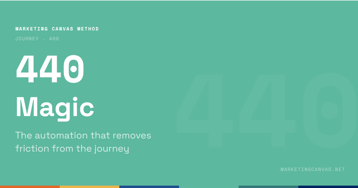
Marketing Canvas - Magic

Satisfaction keeps customers. Magic turns them into advocates. Dimension 440 of the Marketing Canvas scores four components — effortless, stress-free, sensory pleasure, and social pleasure — and explains why exceeding expectations on something the customer doesn't care about isn't magic, it's waste.

About the Marketing Canvas Method

This article covers dimension 440 — Magic, part of the Journey meta-category. The Marketing Canvas Method structures marketing strategy across 24 dimensions and 9 strategic archetypes.
Full framework reference at marketingcanvas.net →  ·  Get the book →

In a nutshell

Magic (dimension 440) scores whether your brand exceeds expectations in ways customers didn't anticipate. Not satisfaction — that is delivering what was promised. Not quality — that is consistency. Magic is the surprise that transforms a satisfied customer into an active advocate.

The most important design principle: exceeding expectations on something the customer doesn't care about isn't magic. It's waste. Magic requires knowing what the customer expects — and then strategically exceeding it at the moment that matters most.

In the Marketing Canvas, Magic sits within the Journey meta-category alongside Moments (410), Experience (420), and Channels (430). It is the peak layer — the dimension that elevates a reliable experience into one customers feel compelled to describe to others. Experience (420) sets the baseline. Magic (440) creates the highs above it.

Magic vs. Experience: the critical distinction

This is the most important conceptual clarification in dimension 440, and the one most commonly missed in workshops.

Experience (420) scores the consistent baseline — whether every customer, in every interaction, receives a response that is intentional, reliable, and meets expectations. Consistency is the standard. A strong Experience score means: nothing is left to chance, the brand's promise is defended at every touchpoint.

Magic (440) scores the peaks — the unexpected moments that exceed what the customer anticipated and produce the emotional response that generates advocacy. Magic is not consistent by definition. It is strategic and selective — designed to occur at the specific moments where the surprise will have the highest impact.

The sequencing rule: fix Experience before investing in Magic. A brand with a −1 on Experience that invests in Magic initiatives is adding peaks to an unreliable baseline. Customers who encounter magic at one touchpoint and inconsistency at another do not become advocates. They become confused — and confusion precedes churn, not advocacy.

Score negative if the customer journey is functional but unremarkable, or if it creates friction the company hasn't noticed. Score positive when specific moments are designed to exceed expectations and customers spontaneously share those moments with others.

The four components of Magic

The Marketing Canvas breaks Magic into four scored components — each addressing a different dimension of the unexpected experience:

Effortless (441) — obstacles removed. The customer expects friction; they encounter none. The booking that takes 30 seconds when they budgeted 5 minutes. The form that pre-fills from their previous interaction. The return process that requires no explanation because the system already knows why. Effortlessness is the absence of friction the customer had learned to expect. It is magical precisely because the absence is unexpected — the category has trained customers to tolerate effort, and the brand has made it disappear.

Stress-free (442) — confusion, uncertainty, and anxiety eliminated. The customer expects to worry about something; they find there is nothing to worry about. The ambiguous delivery window that turns into real-time location tracking. The ingredient claim that is accompanied by independent verification rather than asking the customer to trust. The post-service question that is answered before it was asked. Stress-free magic is the proactive removal of cognitive load — the brand doing the worrying so the customer does not have to.

Sensory pleasure (443) — delight through sight, touch, sound, taste, or smell. In consumer markets this is the Apple unboxing, the Hermès ribbon, the hotel that remembers a pillow preference. The experience engages the senses in a way that exceeds the purely functional expectation. In service contexts, sensory pleasure appears in the aesthetics of a delivered report, the warmth of an unexpected handwritten note, the packaging that communicates care before a word is read.

Social pleasure (444) — status elevation. The customer encounters the brand in a way that makes them feel recognised, celebrated, or elevated in front of others. The loyalty recognition at a hotel check-in that happens in front of other guests. The personalised annual impact report that the customer shows to friends because it makes them look like someone who has made a difference. The referral confirmation that acknowledges the customer as a trusted advisor to their network. Social pleasure magic is the brand giving the customer a story they want to tell.

B2B Magic: cognitive, not sensory

In consumer markets, Magic is often sensory — the unboxing, the ribbon, the pillow preference. In B2B, Magic is cognitive: the insight the client didn't ask for, the risk flagged before it became a problem, the deliverable completed three weeks early without explanation.

The NTT Data case illustrates the distinction. B2B Magic isn't about delight in the consumer sense. It is about demonstrating competence so completely and proactively that the client forms the belief: "this is a genuine partner, not just a vendor." That belief is the B2B equivalent of advocacy — the CTO who mentions the vendor by name at an industry conference, the COO who recommends the firm without being asked, the procurement lead who shortcuts the RFP process because they already know who they want.

The B2B Magic design question: where in this engagement does the client expect reasonable competence — and where could we deliver something so far ahead of expectation that it changes the nature of the relationship?

Spotify's Discover Weekly is the canonical example of consumer-facing Magic that operates on a cognitive principle: the algorithm's ability to surface music the user didn't know they wanted, at the moment they most want it. Not sensory delight. Cognitive surprise. The user's reaction — "how does it know?" — is the Magic response. It drove measurable retention improvement, which is the commercial test of whether Magic is working.

Magic in the Marketing Canvas

The canonical question

Where do you exceed expectations in ways customers didn't see coming?

Magic appears in the Vital 8 of five archetypes — spanning the full range of strategic roles:

Fatal Brake for A7 (Scale-Up Guardian): Hypergrowth tends to destroy the exceptional experiences that created growth in the first place. The early customers of a high-growth brand experienced something that felt personal, attentive, and unexpectedly good — because the team was small, the founder was involved, and every interaction was high-touch. As the company scales, processes replace people, automation replaces attention, and the magic that converted early adopters into evangelists disappears into a standardised service. For A7, Magic is a Fatal Brake because losing it is the mechanism through which growth erodes the advocacy that funded growth. It must reach ≥+2 before hypergrowth investment can be sustained.

Primary Accelerator for A2 (Efficiency Machine): For the Efficiency Machine, Magic means the customer barely notices the transaction happened. The 25-minute Ryanair turnaround. The Amazon checkout that requires one click. The banking app that reconciles the account before the customer closes the browser. In A2, operational magic is not sensory delight — it is the complete removal of the customer's effort. The customer doesn't tell a story about the experience; they tell a story about the absence of one. "I barely had to do anything" is the A2 Magic response.

Secondary Brake for A6 (Value Harvester): A Value Harvester extracting maximum cash flow from an existing base must maintain enough magic to prevent the churn that would otherwise accelerate as the product matures. Magic maintenance for A6 is defensive — enough unexpected value to remind customers why they stay, even as the brand optimises for margin rather than growth.

Secondary Accelerator for A4 (Stagnant Leader): For a stagnant leader fighting churn, Magic initiatives provide the proof of renewal that keeps the existing base engaged while Experience (420) and Features (310) are being rebuilt. A single well-designed magical moment — the AI-powered feature that anticipates the user's next action, the proactive support contact that prevents a problem before it occurs — signals that the brand is still invested in the relationship.

Growth Driver for A6: For the Value Harvester, Magic initiatives that generate advocacy are a low-cost acquisition mechanism that complements the margin extraction strategy. Existing customers who experience unexpected delight become the most credible referral source for the next customer cohort.

Statements for self-assessment

Rate your agreement on a scale from −3 (completely disagree) to +3 (completely agree). There is no zero — the Marketing Canvas forces a directional position on every dimension.

  1. You have identified obstacles across your customer journey and reduced them (effortless).

  2. You have eliminated confusion, uncertainty, and anxiety across your customer journey (stress-free).

  3. You have delighted the senses of your customers — they all look for sensory pleasure (sensory pleasure).

  4. You have provided a customer experience that elevates your customers' status (social pleasure).

  5. You have reduced the social and environmental impact while making sustainable moments magical.

(Dimensions 441–444 + 445 in the Marketing Canvas scoring system)

Note on Detailed Track scoring: if averaging sub-question scores produces a mathematical zero, the method rounds to −1. A split score means the dimension is not clearly helping your goal — and "not clearly helping" requires the same investigation as "hurting."

Interpreting your scores

Negative scores (−1 to −3): The customer journey is functional but unremarkable. There are no designed moments of unexpected delight. Customers are satisfied but not moved to advocate. Worse: friction and anxiety may exist that the team hasn't noticed because nobody has mapped the journey from the customer's perspective. For A7, a negative score here explains why growth is eroding the advocacy that created it.

Positive scores (+1 to +3): Specific moments are designed to exceed expectations across one or more of the four components. Customers spontaneously share those moments with others — in conversation, in reviews, in referrals. Magic is functioning as the advocacy generation mechanism: not all customers experience it, but the ones who do become the brand's most effective acquisition channel.

Case study: Green Clean

Green Clean is a fictional eco-friendly residential cleaning service used as the recurring worked example throughout the Marketing Canvas Method.

Score: −2 to −1 (Weak) Green Clean's customer journey is functional and unremarkable. The booking works. The cleaner arrives. The cleaning is done. But nothing about the interaction exceeds what a customer would expect from a competent cleaning service. There are no designed moments of effortlessness — the booking process requires four steps that could be two. There is no stress removal — customers who want to verify what products were used have to ask, and the answer varies by team member. There is no sensory pleasure — the cleaner leaves without any communication, the invoice arrives two days later as a plain text email. There is no social pleasure — the service produces no story the customer would want to share. When existing customers describe the service, they use words like "reliable" and "good" — the language of satisfied, disengaged customers rather than active advocates.

Score: +1 to +2 (Developing) Green Clean has introduced two designed Magic moments. First: the Family Health Report arrives within 6 hours of service completion — a specific, data-rich document that no competitor provides and that customers describe as "not what I expected" when they receive it for the first time. This addresses the stress-free component: customers who would have worried about whether the claims are real now have evidence without asking for it. Second: on the third service, customers receive a personalised summary of their cumulative impact — how many service visits, how many households protected from chemical exposure, how much waste has not been generated. This addresses social pleasure: customers who care about environmental responsibility have a number they can share. These two moments are working — the referral rate has started to climb. But the effortless and sensory pleasure components remain undesigned.

Score: +2 to +3 (Strong) Green Clean has designed Magic moments across all four components. Effortless: the booking takes 90 seconds on mobile, with address pre-filled and service preferences remembered. Scheduling confirmation and reminder are automatic. Stress-free: the Family Health Report arrives within 6 hours with a plain-language explanation of what was found and eliminated. Customers never have to ask. Sensory pleasure: the cleaner leaves a handwritten note summarising what was done in this specific home, with one personalised observation (a comment on the kitchen herbs, a note about the child's artwork visible from the bathroom). The note costs 3 minutes and generates more customer responses than any other touchpoint. Social pleasure: the annual impact statement — "Your household prevented 42kg of chemical exposure in 2024" — is designed as a shareable card with Green Clean's visual identity. 23% of customers share it on social media or forward it to friends. The referral rate reached 35% by 2024. Customers do not describe the service as "good." They describe specific moments that changed how they think about what a cleaning service can be.

Connected dimensions

Magic does not operate in isolation. Four dimensions connect most directly:

  • 130 — Pains & Gains: Magic eliminates pains and creates unexpected gains. The pain map is the source material for effortless and stress-free Magic design. When a pain is eliminated so completely that the customer barely registers its absence, that is effortless Magic. When a gain exceeds what the customer expected, that is the raw material of the sensory and social pleasure components.

  • 420 — Experience: Magic elevates experience beyond consistency. Experience (420) sets the reliable baseline. Magic (440) creates the moments above it. The two dimensions work in sequence: without a consistent Experience baseline, Magic investments are undermined by the inconsistency that surrounds them.

  • 320 — Emotions: Magic creates peak emotional moments. The surprise that generates advocacy is an emotional event — the "I didn't expect that" feeling that produces the story worth telling. Magic moments are the designed delivery mechanism for peak emotional benefits.

  • 140 — Engagement: Magic drives engagement and advocacy. A customer who has experienced a designed Magic moment is more likely to be a promoter on the NPS scale, more likely to refer, and more likely to provide feedback. Magic is the upstream cause; Engagement (140) measures the downstream effect.

Conclusion

Magic is the dimension that answers the question most brands cannot: why do some customers become advocates when others merely stay?

The answer is not product quality. Quality is expected. It is not service consistency. Consistency is the baseline. It is the specific, unexpected moment that exceeds what the customer had learned to anticipate — the report that arrives before they asked, the note that references their home specifically, the status recognition that makes them feel seen.

The design principle that separates effective Magic from wasted investment: it must exceed expectations on something the customer actually cares about. The hotel that remembers a pillow preference is Magic because sleep quality matters. The hotel that provides a turndown chocolate to a customer who explicitly avoids sugar has produced an interaction, not a magic moment.

Knowing what customers expect — and where exceeding it will produce the highest advocacy response — is the work. The four components (effortless, stress-free, sensory pleasure, social pleasure) provide the framework. The Moments map (410) and the Pains & Gains research (130) provide the evidence. Together, they produce the design brief for Magic initiatives that convert satisfied customers into advocates.

Sources

  1. Chip Heath, Dan Heath, The Power of Moments: Why Certain Experiences Have Extraordinary Impact, Simon & Schuster, 2017

  2. Matt Watkinson, The Ten Principles Behind Great Customer Experiences, FT Publishing, 2013

  3. Marketing Canvas Method, Appendix E — Dimension 440: Magic, Laurent Bouty, 2026

About this dimension

Dimension 440 — Magic is part of the Journey meta-category (400) in the Marketing Canvas Method. The Journey meta-category contains four dimensions: Moments (410), Experience (420), Channels (430), and Magic (440).

The Marketing Canvas Method is a complete marketing strategy framework built around 6 meta-categories, 24 dimensions, and 9 strategic archetypes. Learn more at marketingcanvas.net or in the book Marketing Strategy, Programmed by Laurent Bouty.

Marketing Canvas Method - Journey - Magic

Read More
marketingcanvas.net Laurent Bouty marketingcanvas.net Laurent Bouty

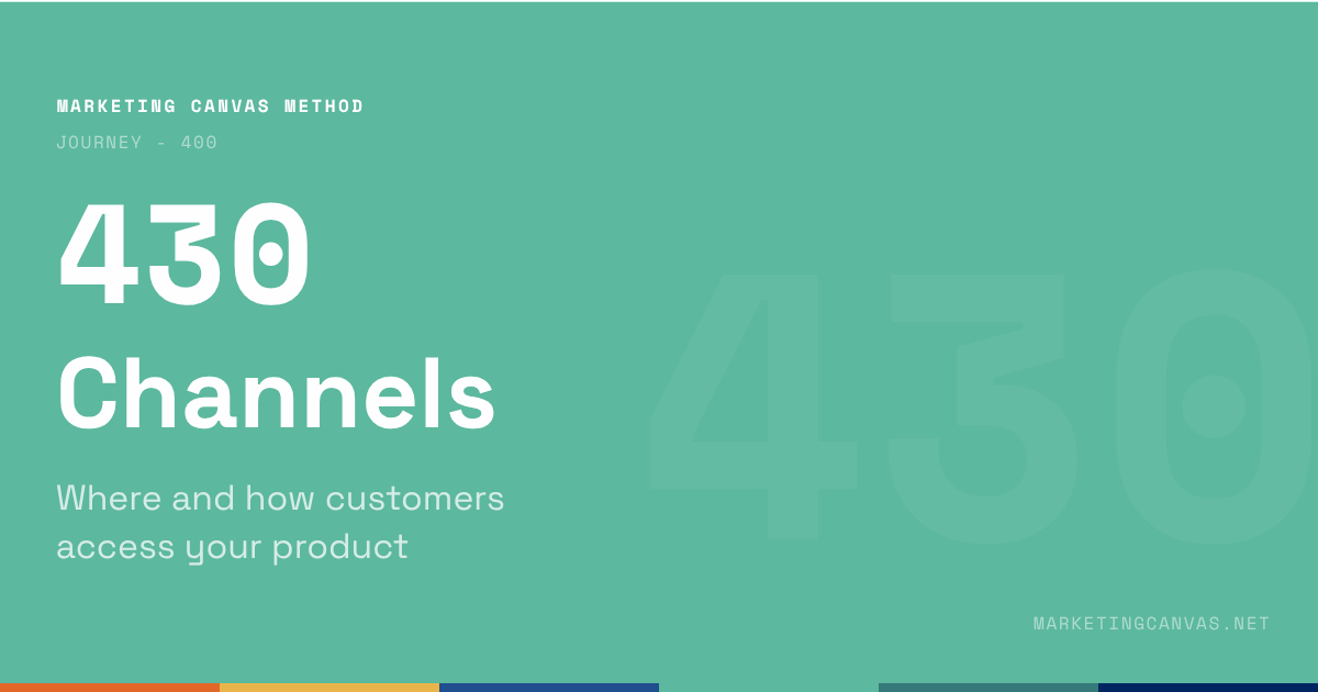
Marketing Canvas - Channels

Most companies have channels. Few have orchestrated channels. Dimension 430 of the Marketing Canvas scores the difference — and explains why a brand with three connected channels outperforms one with eight siloed ones.

About the Marketing Canvas Method

This article covers dimension 430 — Channels, part of the Journey meta-category. The Marketing Canvas Method structures marketing strategy across 24 dimensions and 9 strategic archetypes.
Full framework reference at marketingcanvas.net →  ·  Get the book →

In a nutshell

Channels (dimension 430) scores how customers interact with your brand — physical and digital, owned and third-party — and whether those interactions form a seamless, coherent experience across all of them.

The canonical distinction that defines this dimension: most companies have channels. Few have orchestrated channels. The score measures orchestration, not presence.

A brand with a website, a mobile app, a social media presence, a phone line, and a field team is not necessarily scoring well on dimension 430. The question is whether those channels work together without silos — whether a customer who starts research on one channel can complete the journey seamlessly on another, and whether the company can track and serve that customer across the transition.

In the Marketing Canvas, Channels sits within the Journey meta-category alongside Moments (410), Experience (420), and Magic (440). It is the delivery infrastructure — the system that ensures every moment designed in 410 is actually accessible to the customer in the format that serves them best.

Presence vs. orchestration: the canonical distinction

Every company has channels. Most companies have more channels than they have resources to maintain well. The channel list is not the dimension. The orchestration of that list is.

The test is a single customer journey across multiple channels. A customer who discovers Green Clean through a health parenting blog, visits the website to research the formula, emails a question about ingredient safety, books a service via the app, receives the Family Health Report by email, and calls to ask about a recurring subscription — has touched five channels. If the experience is continuous (the phone call picks up where the booking left off; the subscription question doesn't require re-explaining the service model), the channels are orchestrated. If each channel treats the customer as a stranger, the channels exist but are not orchestrated.

The canonical four properties that define orchestrated channels:

Context (431) — can customers use the most relevant channel for their specific situation at each moment? A customer researching a service in the evening needs findable, credible content on the web. A customer mid-service with a question needs an immediate human response. A customer reviewing their health report at midnight needs a digital self-service interface. The same channel cannot serve all three moments well.

Interaction quality (432) — do channels provide clear, personalised, seamless interactions? Quality here means the interaction is adapted to the customer's identity and context — not generic, not one-size-fits-all, not a copy-paste template.

Information consistency (433) — is data consistent and real-time across channels? A customer who updates their household profile in the app should not have to re-state it on the phone. A booking made on the website should be visible to the cleaner on their route app. Inconsistency in data across channels is the most common channel orchestration failure — and the most invisible to the teams building the channels, who each see only their own system.

Orchestration (434) — are channels connected so customers can navigate seamlessly between them with no silos? This is the composite test: does the company have a joined-up view of the customer's journey, or does each channel operate as a separate interaction with no shared memory?

Digital, physical, and moment-driven channel design

The channel strategy question is not "should we be digital or physical?" Every customer journey involves both. The question is: which channel serves each moment best?

A purely digital company that ignores physical moments — the cleaner arriving at the door, the unboxing experience, the in-person explanation of a result — misses the touchpoints where trust is built or lost at the highest intensity. Physical moments carry emotional weight that digital channels cannot replicate.

A traditional service business that treats digital as a secondary channel — the website as an online brochure, the email as a support afterthought — loses the pre-purchase research phase entirely. Customers research digitally before they commit physically. Winning the digital research moment is often what determines whether the physical visit ever happens.

The best channel strategies design each moment to use the channel that serves the customer best:

  • The research moment needs findable, credible digital content

  • The booking moment needs a frictionless digital transaction

  • The service delivery moment needs a reliable physical interaction

  • The result delivery moment needs a clear digital report with optional human follow-up

  • The renewal moment needs a proactive, low-friction digital prompt

Designing channels from moments is the inversion of the default approach (designing moments around the channels that already exist). The default produces a channel strategy. The inversion produces an orchestrated journey.

Channels in the Marketing Canvas

The canonical question

Can customers interact with your brand through the channels they prefer, with a seamless experience across all of them?

Channels appears in the Vital 8 of two archetypes — in notably different roles:

Secondary Brake for A1 (Disruptive Newcomer): A disruptor's survival depends on being noticed and understood immediately. Features and positioning may be compelling, but if the channels through which the target customer discovers and evaluates the brand are wrong or incomplete, the disruption never reaches beyond the early-adopter bubble. Channel failure for A1 is quiet: the product is ready, the message is sharp, but the distribution infrastructure isn't present where the customers are. A Secondary Brake score means the brake must reach ≥+1 before channel failure begins to limit the reach of the disruption.

Secondary Accelerator for A5 (Pivot Pioneer): A company executing a strategic pivot may find that its existing channels were optimised for the old positioning and the old customer segment. The new direction — new JTBD, new lead segment, new positioning — may require new channels entirely. Legacy channels that served the old strategy are not neutral for the pivot; they actively signal the old identity to customers encountering the brand for the first time in the new context. For A5, channel strategy is part of the repositioning work, not a downstream execution decision.

A note on Fatal Brakes: Channels does not appear as a Fatal Brake in any archetype. But channel failure can block the dimensions that are Fatal. If Acquisition (610) is a Fatal Brake and channel orchestration failures are increasing CAC, the channel problem is a Fatal Brake problem in disguise. If Experience (420) is a Fatal Brake and channel inconsistency is producing the experience variance, the same applies. Channels is the infrastructure. Infrastructure failures propagate upward.

Statements for self-assessment

Rate your agreement on a scale from −3 (completely disagree) to +3 (completely agree). There is no zero — the Marketing Canvas forces a directional position on every dimension.

  1. Your customers can use the most relevant channel in function of their specific context at each moment.

  2. Your channels are physical and digital — you provide clear, personalised, and seamless interactions, anywhere, anytime.

  3. Information captured or shared in your channels is consistent, real-time, personalised, useful, and accurate.

  4. You have orchestrated all your channels — there is no silo between them, and customers can navigate seamlessly through them at each moment.

  5. You optimise the social and environmental impact of your physical and digital channels.

(Dimensions 431–434 + 435 in the Marketing Canvas scoring system)

Note on Detailed Track scoring: if averaging sub-question scores produces a mathematical zero, the method rounds to −1. A split score means the dimension is not clearly helping your goal — and "not clearly helping" requires the same investigation as "hurting."

Interpreting your scores

Negative scores (−1 to −3): Channels operate in silos. Customers who cross channel boundaries encounter a brand that does not recognise them. Orchestration is absent or incomplete. The likely downstream effect: acquisition costs are higher than they need to be (research-to-booking friction), experience scores are lower than designed (channel handoff failures), and engagement data is fragmented (no joined-up view of customer behaviour).

Positive scores (+1 to +3): Channels are orchestrated. Customers move between channels without friction. Data is consistent and real-time across the full journey. Each channel is designed for the specific moment it serves. The company can track the customer journey across touchpoints and improve each channel based on measured performance.

Case study: Green Clean

Green Clean is a fictional eco-friendly residential cleaning service used as the recurring worked example throughout the Marketing Canvas Method. Green Clean sells a residential service — cleaners visit customer homes — not packaged products. Their relevant channels are: website, booking flow, email, in-home service visit, Family Health Report (digital delivery), phone/chat support, and referral mechanics.

Score: −2 to −1 (Weak) Green Clean's channels are independent systems that do not share data or context. The website takes booking requests but is not connected to the cleaner's scheduling app — bookings are manually transferred by the founder. The Family Health Report is generated as a PDF by one team member and emailed by another, introducing a 24–72 hour delay that varies unpredictably. When a customer calls with a question about their report, the support team does not have access to the customer's service history or their specific report data — every call starts from scratch. A customer who books through the website and follows up by email is treated as two separate interactions. No channel knows what the others have communicated. The silos are invisible to the teams but immediately apparent to any customer who crosses a channel boundary.

Score: +1 to +2 (Developing) Green Clean has connected the booking system to the cleaner's route app — scheduling is now automated. The Family Health Report is generated and emailed automatically within 6 hours of service completion. A customer CRM has been introduced: all booking, service, and communication history is accessible to the support team when a customer calls. But the research channel (website) still operates independently — prospects who spend time researching on the website and then book are not identified as the same person until after the booking is made, meaning the website-to-booking conversion cannot be tracked and the research journey cannot be improved with data. The referral mechanic is manual — the team asks existing customers to refer but has no digital system to track referrals or reward them efficiently. Orchestration has improved significantly but is not yet complete.

Score: +2 to +3 (Strong) Green Clean's channels are fully orchestrated around the customer journey, not around internal team structures. The website research behaviour is tracked — customers who read the formula science page before booking convert at a higher rate, so that content is featured prominently in the booking flow. Booking, service, health report, follow-up communication, and subscription renewal are all automated and connected through a single customer record. Support staff see full service history, report data, and communication history before responding to any contact. The referral mechanic is digital — existing customers receive a referral link after every service and can track whether their referrals booked. Channel performance is measured per moment: website conversion rate, booking completion rate, Health Report open rate, support resolution time, referral conversion rate. Each metric corresponds to a specific channel at a specific journey stage. The orchestration is visible in the data: channel handoffs produce no drop-off in conversion that would indicate a silo.

Connected dimensions

Channels does not operate in isolation. Four dimensions connect most directly:

  • 240 — Visual Identity: Channels must carry visual identity consistently. A customer encountering the brand on Instagram, the website, the booking confirmation email, and the physical cleaner's uniform should see a coherent identity at every touchpoint. Channel proliferation without visual governance produces brand fragmentation.

  • 410 — Moments: Channels serve specific moments. The channel strategy is only as good as the moments map underneath it. Without knowing which moments require which types of interaction, channel decisions are made by habit (we've always had a phone line) rather than by design (this moment requires human contact).

  • 420 — Experience: Experience quality depends on channel execution. Channel inconsistency is one of the most common causes of experience variance — customers receive different responses from different channels because the channels are not coordinated. A +2 on Experience requires channel orchestration as a prerequisite.

  • 530 — Media: Media and channels overlap in digital contexts. Paid media, social media, email, and owned content all function as channels at the research and awareness stages. The boundary between Media (530) and Channels (430) is context: Media drives reach and awareness; Channels deliver the interaction and transaction. They share infrastructure and must be planned together.

Conclusion

Channels is the infrastructure dimension of the Journey meta-category. It does not generate the value proposition, design the experience, or create the magic. It delivers all of those things to the customer — or fails to.

The distinction that matters for scoring is not how many channels the brand has. It is whether those channels form a coherent system. A well-orchestrated system of three channels outscores a fragmented system of eight. The customer's perspective is binary: either the journey is seamless across channels, or it is not.

Channel failure is rarely dramatic. It does not produce a single terrible interaction. It produces accumulating friction — the customer who has to re-explain their situation to every channel they touch, the research that doesn't convert because the booking flow is on a different system, the report that arrives three days late because two teams aren't connected. Each incident is minor. The cumulative effect on acquisition, experience, and retention is material.

Sources

  1. Forrester Research, "The State of Omnichannel Commerce", Forrester, 2024 — forrester.com

  2. McKinsey & Company, "The value of getting personalisation right — or wrong — is multiplying", McKinsey, 2021 — mckinsey.com

  3. Marketing Canvas Method, Appendix E — Dimension 430: Channels, Laurent Bouty, 2026

About this dimension

Dimension 430 — Channels is part of the Journey meta-category (400) in the Marketing Canvas Method. The Journey meta-category contains four dimensions: Moments (410), Experience (420), Channels (430), and Magic (440).

The Marketing Canvas Method is a complete marketing strategy framework built around 6 meta-categories, 24 dimensions, and 9 strategic archetypes. Learn more at marketingcanvas.net or in the book Marketing Strategy, Programmed by Laurent Bouty.

Marketing Canvas Method - Journey - Channels by Laurent Bouty

Read More
marketingcanvas.net Laurent Bouty marketingcanvas.net Laurent Bouty

Marketing Canvas - Experience

Experience is a Fatal Brake for three archetypes. In every case the mechanism is the same: experience failure is the proximate cause of churn. Dimension 420 of the Marketing Canvas scores consistency — not brilliance — and explains why "leaving nothing to chance" is a scored criterion, not an aspiration.

About the Marketing Canvas Method

This article covers dimension 420 — Experience, part of the Journey meta-category. The Marketing Canvas Method structures marketing strategy across 24 dimensions and 9 strategic archetypes.
Full framework reference at marketingcanvas.net →  ·  Get the book →

In a nutshell

Experience (dimension 420) scores the brand's answer to every moment in the customer journey. Where Moments (410) maps what the customer thinks, feels, and does, Experience scores how well the company responds. Does the response reflect the customer's identity? Does it help them achieve their objectives? Is it consistent across time and space? Does it meet the expectations it sets?

The canonical question is not "do we create exceptional experiences?" It is: what is it actually like to be your customer?

In the Marketing Canvas, Experience sits within the Journey meta-category alongside Moments (410), Channels (430), and Magic (440). It is the most frequent Fatal Brake in the method — tied with Positioning (220) and Features (310) at three archetypes each. In every case, the mechanism is the same: experience failure is the proximate cause of churn.

Consistency over brilliance: the canonical insight

The most common Experience scoring error in workshops is confusing it with Magic (440). Experience is not about peak moments or memorable impressions. It is about baseline consistency.

A single brilliant experience surrounded by mediocre ones creates more frustration than consistent adequacy. The customer remembers the gap between the peak and the norm. A hotel that provides an extraordinary check-in and then loses the luggage has not delivered a good experience — it has demonstrated that brilliance is accidental and failure is structural.

Experience design is less about creating memorable highs than about eliminating the lows and ensuring reliability. Every touchpoint should be intentional. Every response should be consistent. The design question is not "how do we create moments that wow?" — that is Magic. The design question is "how do we ensure that every single interaction reflects the promise, regardless of which team member delivers it, which channel it occurs on, or which day of the week it is?"

This is why sub-question 423 scores: "For each moment, your brand answer is consistent in time and space, leaving nothing to chance." Leaving nothing to chance is not a phrase about aspiration. It is a scored criterion. Every undesigned moment is a moment where the brand's promise is undefended — delivered differently by different people, interpreted differently by different teams, experienced differently by different customers.

Score negative if customer experience varies unpredictably across touchpoints, teams, or time. Score positive when experience design is intentional, documented, trained, and measured — and when customers describe the experience using the same words the brand intends.

Experience vs. Magic: the critical distinction

These two dimensions are adjacent and routinely conflated. The confusion produces inflated Experience scores and underinvested Magic strategies.

Experience (420) scores the consistent baseline. Does every customer, in every interaction, receive a response that reflects their identity, serves their goals, and meets the expectations that were set? Consistency is the standard. A score of +2 on Experience means: every moment has a designed response, that response is reliably delivered, and customers confirm it matches their expectations.

Magic (440) scores the peaks. Does the brand exceed expectations in ways customers didn't anticipate? Magic is the surprise that converts a satisfied customer into an advocate. It is scored separately because it requires a different design discipline — not reliability engineering but expectation mapping and strategic over-delivery.

The sequencing principle: fix Experience before investing in Magic. A brand with a −1 on Experience that invests in Magic initiatives is adding peaks to an unreliable baseline. Customers who encounter magic in one interaction and inconsistency in the next do not become advocates. They become confused — and confusion is the precursor to churn.

B2B Experience: the seams are felt

In B2C, Experience failure is visible and dramatic: the wrong product delivered, the rude support call, the website that crashes at checkout. In B2B, Experience failure is quieter and more expensive.

NTT Data's Experience challenge was not a single bad project. It was organisational inconsistency across post-merger engagement models. Different teams, acquired through different M&A paths, delivering different service standards under the same brand name. The client could feel the seams — the inconsistency between what the sales team promised and what the delivery team delivered, between what one regional office did and what another understood the engagement model to be.

B2B clients do not churn after one bad interaction. They churn after accumulating evidence that the inconsistency is structural rather than situational. The moment a client forms the belief "this isn't a bad week, this is how they operate" — the renewal conversation has already been lost. The revenue metric confirms it six months later.

For B2B service businesses, Experience design means: what does a client encounter at every stage of the engagement, regardless of which team member they are talking to? The standard is not the best delivery manager on staff. It is the minimum consistent standard that can be trained, documented, and reliably reproduced.

Experience in the Marketing Canvas

The canonical question

What is it actually like to be your customer?

Experience is a Fatal Brake for three archetypes — the most Fatal Brake appearances of any single dimension alongside Positioning and Features:

Fatal Brake for A4 (Stagnant Leader): Experience failure is the proximate cause of stagnation. The canonical A4 pattern: churn rises, leadership reaches for Acquisition to refill the bucket. The method says fix the leak first. For Sage in 2019, fragmented UX across dozens of legacy SKUs and desktop-era screens was driving customers to Xero and QuickBooks before the retention team even knew they were at risk. No acquisition investment can compensate for an experience that is actively driving customers away. Experience must reach ≥+2 before any other A4 investment makes strategic sense.

Fatal Brake for A6 (Value Harvester): A company extracting maximum cash flow from an existing base depends entirely on retention. Every 1% of churn that Experience failure generates is a permanent reduction in the cash extraction potential. For A6, Experience is not a growth lever — it is a defensive necessity. The floor below which the strategy collapses.

Fatal Brake for A7 (Scale-Up Guardian): Hypergrowth destroys experience consistency. Teams grow faster than onboarding can standardise behaviour. Processes built for 50 customers break at 500. The individual attention that defined early relationships becomes structurally impossible at scale. The Scale-Up Guardian's primary Experience challenge is not improving the experience — it is preserving the experience as headcount and customer volume compound. Every month of growth without experience governance is a month of promise dilution.

Secondary Brake for A2 (Efficiency Machine): For the Efficiency Machine, Experience operates at the operational level. Magic (440) is the adjacent dimension that eliminates friction entirely; Experience sets the floor below which efficiency becomes indistinguishable from indifference. A cost-leader that delivers a genuinely frictionless experience retains customers. A cost-leader that delivers a degraded experience loses them to whichever competitor can match the price with marginally better service.

Statements for self-assessment

Rate your agreement on a scale from −3 (completely disagree) to +3 (completely agree). There is no zero — the Marketing Canvas forces a directional position on every dimension.

  1. For each moment, your brand answer has been adapted to your customers' identity.

  2. For each moment, your brand answer has helped customers to achieve their goals.

  3. For each moment, your brand answer is consistent in time and space, leaving nothing to chance.

  4. For each moment, your brand answer has clear expectations and delivers them consistently.

  5. For each moment, your brand answer is compatible with the concept of sustainability.

(Dimensions 421–424 + 425 in the Marketing Canvas scoring system)

Note on Detailed Track scoring: if averaging sub-question scores produces a mathematical zero, the method rounds to −1. A split score means the dimension is not clearly helping your goal — and "not clearly helping" requires the same investigation as "hurting."

Interpreting your scores

Negative scores (−1 to −3): Experience varies unpredictably across touchpoints, teams, or time. The brand promise is undefended in at least some interactions. For archetypes where Experience is a Fatal Brake, this score explains why churn is rising and retention investment is not working. The leaky bucket cannot be fixed by adding more acquisition — it must be fixed at the experience level first.

Positive scores (+1 to +3): Experience is intentional, documented, trained, and measured. Every moment has a designed response. Customers describe the experience in consistent language that matches the brand's intended positioning. The baseline is reliable. Magic (440) initiatives can now be layered on top of a consistent foundation rather than compensating for an inconsistent one.

Case study: Green Clean

Green Clean is a fictional eco-friendly residential cleaning service used as the recurring worked example throughout the Marketing Canvas Method.

Score: −2 to −1 (Weak) Green Clean's experience varies significantly by team member and visit. The two full-time cleaners operate consistently. The three part-time contractors, hired during a growth period, have had no structured onboarding and no shared standard for what a Green Clean visit should look and feel like. Some customers receive a verbal explanation of the formula used; others do not. Some receive the Family Health Report within 24 hours; others wait three days or receive it after a follow-up request. When a customer calls to ask about an ingredient, the response depends on which team member picks up. The experience is sometimes excellent and frequently adequate — but it is never reliably consistent. When the founder asks customers how the experience compares to EcoPure, the feedback is mixed: "better sometimes, comparable usually." That is a −1: experience is not reliably reflecting the positioning.

Score: +1 to +2 (Developing) Green Clean has identified the three highest-variance touchpoints from customer research: the onboarding call, the first-service visit, and the Family Health Report delivery. For each, a standard has been designed and documented. Contractors are trained on the first-service protocol. The Health Report is now automated — delivered within 6 hours of every service completion without requiring manual action. The onboarding call has a structured agenda that ensures the health-first positioning is explained consistently regardless of who conducts it. Variance has reduced but not eliminated — the support interaction (what happens when a customer reports a concern) remains undesigned and inconsistent. Positive customer descriptions of the experience are converging on consistent language: "professional," "trustworthy," "actually explains what they're doing." The experience baseline is improving. It is not yet reliable enough to score +2.

Score: +2 to +3 (Strong) Every Green Clean customer touchpoint has a designed response, documented standard, and trained delivery. The experience is consistent whether the customer is in their first month or their third year, whether they call on a Monday or a Saturday, whether their regular cleaner is available or a substitute is deployed. When a substitute is required, the customer receives a proactive message explaining the change and confirming the substitute has been briefed on the household profile. Support interactions follow a structured resolution protocol — concern acknowledged within 2 hours, resolution proposed within 24 hours, follow-up confirmed within 48 hours. Customer descriptions of the experience use consistent language unprompted: "they always explain what they've done," "I never have to chase anything," "it's the same standard every time." The NPS promoter cohort grew from 38% to 62% between 2021 and 2024 — a direct consequence of experience consistency, not product change.

Connected dimensions

Experience does not operate in isolation. Four dimensions connect most directly:

  • 410 — Moments: Experience responds to moments. Every Experience initiative traces back to a specific mapped moment where the current response is inadequate. Without a complete Moments map, Experience improvements are directional guesses — improving the wrong touchpoints while leaving the highest-variance ones unaddressed.

  • 130 — Pains & Gains: Experience design eliminates pains. The specific pains identified in journey research — the ones that accumulate into churn — are the Experience design brief. A pain at the research phase is an Experience problem in the before stage. A pain at the support interaction is an Experience problem in the after stage.

  • 440 — Magic: Magic elevates experience beyond consistency. Once the baseline is reliable, Magic creates the peaks that generate advocacy. The sequencing is fixed: fix Experience first, then invest in Magic. A +2 on Experience is the prerequisite for Magic initiatives to work as intended.

  • 630 — Lifetime: Experience quality predicts customer lifetime. The most reliable predictor of whether a customer will still be a customer in 12 months is whether their ongoing experience is consistently meeting the promise. Experience is not just a satisfaction metric — it is the leading indicator of lifetime value.

Conclusion

Experience is tied as the most frequent Fatal Brake in the Marketing Canvas Method for a straightforward reason: it is the dimension that most directly connects to churn. Customers do not leave because of a single terrible interaction. They leave because the cumulative experience does not consistently reflect the promise that acquired them.

The strategic diagnostic is not "how good is our best experience?" — teams consistently overrate on this question because they remember peaks and discount inconsistency. The question is: "what does every customer encounter, every time, regardless of team member, channel, or day of the week?"

If the honest answer is "it depends" — dimension 420 is the initiative queue.

Sources

  1. Matt Watkinson, The Ten Principles Behind Great Customer Experiences, FT Publishing, 2013

  2. Bain & Company, "Closing the Delivery Gap", 2005 — bain.com (the foundational 80/8 gap research: 80% of companies believe they deliver a superior experience; 8% of customers agree)

  3. Marketing Canvas Method, Appendix E — Dimension 420: Experience, Laurent Bouty, 2026

About this dimension

Dimension 420 — Experience is part of the Journey meta-category (400) in the Marketing Canvas Method. The Journey meta-category contains four dimensions: Moments (410), Experience (420), Channels (430), and Magic (440).

The Marketing Canvas Method is a complete marketing strategy framework built around 6 meta-categories, 24 dimensions, and 9 strategic archetypes. Learn more at marketingcanvas.net or in the book Marketing Strategy, Programmed by Laurent Bouty.

Marketing Canvas Method - Journey - Experience

Read More
marketingcanvas.net Laurent Bouty marketingcanvas.net Laurent Bouty

Marketing Canvas - Moments

Most companies over-invest in the "during" phase of the customer journey and under-invest in "before" and "after" — which is precisely where both acquisition and retention are won or lost. Dimension 410 of the Marketing Canvas explains how to map moments correctly, and why the most valuable output is the seams it reveals between departments.

About the Marketing Canvas Method

This article covers dimension 410 — Moments, part of the Journey meta-category. The Marketing Canvas Method structures marketing strategy across 24 dimensions and 9 strategic archetypes.
Full framework reference at marketingcanvas.net →  ·  Get the book →

In a nutshell

Moments (dimension 410) maps the complete customer journey as a sequence of interactions seen through the customer's eyes. For each moment — before, during, and after purchase — three questions: what does the customer think? What do they feel? What do they do?

The discipline that makes this strategic rather than descriptive: moments must be built from customer observations and interviews, not from internal assumptions about how the journey should work. Every organisation believes it knows its customer journey. The map built from actual customer research almost always looks different from the one built internally.

In the Marketing Canvas, Moments sits within the Journey meta-category alongside Experience (420), Channels (430), and Magic (440). It is the discovery layer — the research input that makes every other Journey dimension scoreable with evidence rather than assumption.

The seams between departments

The most powerful diagnostic purpose of Moments mapping is one that most companies never anticipate: it reveals the seams between internal departments, and those seams are where the customer experience fails.

Marketing owns "before" — awareness, research, consideration. Sales owns "during" — the purchase conversation, onboarding, first use. Support owns "after" — ongoing use, queries, renewal, advocacy. Each team does their part reasonably well, measured on their own terms.

But the customer experiences one continuous journey.

When a customer moves from "before" to "during" — from the website to the first sales conversation — they often encounter a brand that seems to know nothing about what they read, what concerns they formed, or what decision criteria they brought to that conversation. The seam is visible to the customer; it is invisible to the organisation because no single team owns the transition.

Moments mapping forces the organisation to adopt the customer's timeline rather than its own. When the full map is laid out — every touchpoint from first awareness to advocacy, with what the customer thinks, feels, and does at each stage — the seams appear as blank spaces or contradictory experiences. Those gaps are the strategic agenda.

Score negative if the journey map was built from internal assumptions or if the "after purchase" phase is unmapped. Score positive when moments are customer-researched, granular, and actively used to design specific touchpoints.

Where companies systematically fail: the "during" trap

Most companies over-invest in the "during" phase of the journey — the purchase moment, onboarding, first use — and under-invest in "before" and "after." This is where both acquisition and retention are won or lost, making the imbalance strategically costly.

Before purchase is where acquisition happens or fails. A customer who feels confused during research — overwhelmed by competing eco-friendly claims, unable to find independent verification, uncertain which product fits their specific situation — will not convert, regardless of how good the product is. The pre-purchase experience is entirely within the brand's control, and almost entirely unmapped by most organisations. The website, the content, the comparison experience, the social proof — these are designed by teams who know the product, not by teams who have watched confused prospects try to make a decision.

After purchase is where retention happens or fails. A customer who feels abandoned after the transaction — no structured follow-up, no proactive communication about what to expect, no mechanism to give feedback — begins the churn journey immediately. Engagement does not decline suddenly. It begins its decline at the first moment the customer feels the relationship ended at the point of purchase.

The diagnostic test: map your last twelve months of customer-facing initiatives. What percentage addressed the before phase? The during phase? The after phase? The imbalance is almost always striking — and it predicts where the strategic gaps are before a single score is calculated.

Mental Models - Moments in the Marketing Canvas

Mental Models - Moments in the Marketing Canvas

The three questions at every moment

For each moment in the journey, the Marketing Canvas requires three specific answers — all drawn from customer research, not internal assumption:

What does the customer think? The cognitive content of the moment. What information are they processing? What comparisons are they making? What questions are unanswered? What beliefs — accurate or not — are shaping their interpretation of this interaction? For Green Clean's "first service visit" moment: "I hope this is genuinely different from the eco-cleaning service I tried before. I want to see something that proves the health claim."

What does the customer feel? The emotional state at this moment. Anxiety, anticipation, confusion, trust, pride, disappointment. This is not the emotional job (what they want to feel in their lives) — it is the actual emotional state at this specific interaction. Accurately mapping current feelings is the prerequisite for designing better ones. If the customer feels sceptical at the booking stage, no amount of warm onboarding email copy will resolve it.

What does the customer do? The observable behaviour. Searches. Clicks. Calls. Compares. Reads reviews. Asks a friend. Abandons the checkout. These actions are often more revealing than stated opinions because they reflect actual behaviour under actual conditions, not hypothetical responses to survey questions.

Moments in the Marketing Canvas

The canonical question

Have you identified the critical touchpoints where customers interact with your brand, and do you understand what they think, feel, and do at each one?

Strategic role: foundational for most, existential for one

Moments has an unusual Vital 8 profile — it appears formally in only one archetype: it is a Secondary Brake for A9 (Category Creator).

The reason is specific: in a new category, the customer journey doesn't exist yet. There are no established research behaviours, no familiar comparison frameworks, no prior experience of the product category that shapes customer expectations. Every moment must be designed from scratch — the customer has no mental model to bring to the first interaction. Green Clean in 2021 could not assume customers knew how to evaluate "indoor health protection" because the category had not been defined. The first-clean teaching moment — the onboarding experience that explained what health-first meant in practice — was not a nice-to-have. It was the foundational category education that made everything downstream possible.

For all other archetypes, Moments functions like Pains & Gains (130): it is a research input that feeds the scored dimensions above it, particularly Experience (420) and Channels (430). A company that cannot score Experience honestly — because it does not know what customers actually experience at each touchpoint — almost certainly has an unmapped or assumption-built Moments layer underneath. Improving the Moments map improves the reliability of every Journey dimension score.

Statements for self-assessment

Rate your agreement on a scale from −3 (completely disagree) to +3 (completely agree). There is no zero — the Marketing Canvas forces a directional position on every dimension.

  1. Your moments have been defined based on customer observations and interviews — they reflect the customer's actual identity and experience, not internal assumptions.

  2. You have identified all moments before, during, and after buying your value proposition.

  3. For each moment, you have clearly identified what your customers think, feel, and do.

  4. For each moment, you have clearly identified what the customer objectives are.

(Dimensions 411–414 in the Marketing Canvas scoring system)

Note on Detailed Track scoring: if averaging sub-question scores produces a mathematical zero, the method rounds to −1. A split score means the dimension is not clearly helping your goal — and "not clearly helping" requires the same investigation as "hurting."

Interpreting your scores

Negative scores (−1 to −3): The journey map is absent or built from internal assumptions rather than customer research. The before and/or after phases are unmapped. The seams between departments are invisible because nobody owns the transitions. Experience (420), Channels (430), and Magic (440) scores cannot be reliably set because the evidence base doesn't exist.

Positive scores (+1 to +3): The journey map is built from customer research, covers all three phases, captures think/feel/do at each moment, and actively identifies where seams between departments are creating experience failures. The map is used — it feeds Experience design, Channels decisions, and Magic moment identification — rather than filed as a project deliverable.

Case study: Green Clean

Green Clean is a fictional eco-friendly residential cleaning service used as the recurring worked example throughout the Marketing Canvas Method.

Score: −2 to −1 (Weak) Green Clean's journey map was assembled by the founding team in a two-hour internal session. It covers the booking process (during) and a brief post-service survey (after). The before phase is entirely unmapped: no research has been done on how health-conscious parents discover cleaning services, what search terms they use, which comparison triggers they apply, or what objections form during the research phase. The after phase map stops at the thank-you email. No moment beyond the first three months of service has been researched. When the team describes the customer journey, they describe what they intended to build, not what customers actually experience. The seam between the website (marketing) and the first sales conversation (founder-led) is the most visible gap — customers arrive with questions formed during research that the founder does not know they have.

Score: +1 to +2 (Developing) Green Clean has conducted eight customer interviews specifically focused on journey mapping. The before phase now has three defined moments: the initial search ("what is the difference between eco-cleaning and health-first cleaning?"), the comparison visit (landing on the Green Clean website and trying to find independent validation), and the booking decision (the moment of commitment and what makes it happen or not). For each, the team has documented what customers think, feel, and do based on interview evidence rather than assumption. The during and early-after phases are mapped. The seam between website and onboarding call has been identified — customers arrive uncertain whether the health claim is substantiated. The team has not yet designed a solution to the seam. But the seam is now named.

Score: +2 to +3 (Strong) Green Clean's journey map covers all phases, built from twenty-two customer interviews and three observed service visits. The before phase is mapped in five moments, each with specific documented think/feel/do data. The seam between website and first contact has been designed out: a structured pre-booking sequence sends the university formula summary and B-Corp certification to every prospect before the first call, so the call begins with the health claim validated rather than questioned. The "First-Clean Teaching Moment" — a structured onboarding experience at the first service visit — explains in plain language what health-first means in practice, shows the before/after air quality data, and delivers the first Family Health Report within 24 hours. The after phase is mapped through the 12-month relationship, with specific moments designed at months 1, 3, 6, and 12 that correspond to the highest churn risk periods identified through customer research. The journey map is reviewed quarterly and updated as research produces new evidence.

Connected dimensions

Moments does not operate in isolation. Four dimensions connect directly as the downstream beneficiaries of good journey mapping:

  • 130 — Pains & Gains: Pains and gains map to specific moments. The pain of "I can't find independent verification" belongs to the before-phase research moment. The gain of "the Family Health Report made me feel like I finally know the truth" belongs to the first-service after moment. Without Moments mapping, Pains & Gains is a list. With it, it becomes a journey-anchored strategy.

  • 420 — Experience: Experience is designed moment by moment. Every Experience initiative traces back to a specific moment in the journey where the current response is inadequate. Without a complete Moments map, Experience improvements are based on internal opinion rather than evidence about where the customer actually struggles.

  • 430 — Channels: Channels serve specific moments. The question "which channels should we be present on?" cannot be answered without knowing which moments require which types of interaction. A customer in the research moment needs findable, credible content. A customer in the post-service moment needs a proactive, low-friction feedback mechanism. The channel follows the moment.

  • 440 — Magic: Magic happens at peak moments. The unexpected delight that converts a satisfied customer into an active advocate occurs at a specific moment in the journey — often one that companies hadn't designed for at all. Without a complete Moments map, Magic cannot be placed. The map reveals where the peaks and troughs are; Magic strategy addresses the peaks.

Conclusion

Moments is the dimension that makes the Journey meta-category honest. Without it, Experience is opinion, Channels is habit, and Magic is accident.

The strategic value is not the map itself — it is what the map reveals. The over-investment in "during" at the expense of "before" and "after." The seams between marketing, sales, and support that the customer feels as a fragmented experience. The moments that are assumed to be satisfactory because nobody has actually asked a customer what they think, feel, and do at that point.

For Category Creators building a journey from scratch, the Moments map is the architectural blueprint — without it, every other Journey dimension is being built without knowing the structure it needs to serve. For all other archetypes, it is the evidence base that makes every Journey dimension score credible rather than flattering.

Sources

  1. Chip Heath, Dan Heath, The Power of Moments: Why Certain Experiences Have Extraordinary Impact, Simon & Schuster, 2017

  2. Forrester Research, "Customer Journey Mapping Best Practices", Forrester, 2024 — forrester.com

  3. Marketing Canvas Method, Appendix E — Dimension 410: Moments, Laurent Bouty, 2026

About this dimension

Dimension 410 — Moments is part of the Journey meta-category (400) in the Marketing Canvas Method. The Journey meta-category contains four dimensions: Moments (410), Experience (420), Channels (430), and Magic (440).

The Marketing Canvas Method is a complete marketing strategy framework built around 6 meta-categories, 24 dimensions, and 9 strategic archetypes. Learn more at marketingcanvas.net or in the book Marketing Strategy, Programmed by Laurent Bouty.

Marketing Canvas Method - Journey - Moments

Read More
marketingcanvas.net Laurent Bouty marketingcanvas.net Laurent Bouty

Marketing Canvas - Proof

Every brand makes claims. Few build proof systems. Dimension 340 of the Marketing Canvas identifies four types of proof — demonstration, logical explanation, endorsement, and reputation — and explains why stacking all four is the only way to convert sceptical prospects into convinced ones.

About the Marketing Canvas Method

This article covers dimension 340 — Proof, part of the Value Proposition meta-category. The Marketing Canvas Method structures marketing strategy across 24 dimensions and 9 strategic archetypes.
Full framework reference at marketingcanvas.net →  ·  Get the book →

In a nutshell

Proof (dimension 340) scores the evidence layer of your value proposition — the demonstrations, endorsements, explanations, and reputation markers that make your claims credible. The foundational distinction: proofs are not the same as claims.

Saying "we're the best eco-friendly cleaning service in the city" is a claim. Showing a customer saying "they changed how I think about what clean actually means" is proof. The dimension scores whether evidence exists and whether it is deployed effectively — not whether the brand believes its own story.

In the Marketing Canvas, Proof sits within the Value Proposition meta-category alongside Features (310), Emotions (320), and Prices (330). It is the credibility layer that makes everything else believable: Features describe what the product does; Proof demonstrates it.

Claims vs. proof: the foundational distinction

Every brand makes claims. Few build proof systems.

A claim is a statement the brand makes about itself. Proof is evidence that exists independently of the brand's desire to be believed. The gap between them is the gap between what a brand says and what a prospect believes — and in most markets, that gap is large and widening.

The reason: customers have become systematically sceptical of self-assertion, particularly around sustainability, quality, and expertise claims. "Award-winning," "industry-leading," "eco-friendly," "best-in-class" — these phrases have been used so frequently, by brands of such varying quality, that they carry almost no credibility signal. They are the background noise of value proposition communication.

What breaks through is evidence that exists independently of the brand making the claim: a third party that validated it, a customer who confirmed it, a before/after result that demonstrated it, a mechanism that explains how it works. That is proof. And the dimension that scores whether your value proposition has it is 340.

Score negative if claims are unsupported or if proof relies entirely on self-assertion. Score positive when multiple proof types reinforce each other and customers cite specific evidence when recommending the brand.

The four canonical proof types

The Marketing Canvas identifies four types of proof. The most effective strategies use all four — each type covers a different dimension of credibility, and they stack:

Demonstration — showing the product working in a real context. Not a polished commercial. A before/after air quality result. A live installation. A customer tour. A product in use under realistic conditions. Demonstration answers "does it actually work?" It is the most visceral form of proof because it bypasses scepticism about the brand's motives — the outcome is visible.

Logical explanation — clarifying how and why it works. The mechanism. Why is this formula non-toxic? Because it uses X chemistry instead of Y. How does it eliminate toxins? Here is the molecular process. Why does this hold up better than alternatives? Here is the engineering rationale. Logical explanation answers "can I understand why it works?" It converts the sceptical-but-open prospect — the one who wants to believe but needs a reason — into a convinced one.

Endorsement — third-party validation. Certifications, awards, analyst recognition, celebrity ambassadors, peer recommendations. In B2C: certifications like B-Corp or EcoCert, customer reviews, media coverage, social proof numbers ("550 families served"). In B2B: Gartner Magic Quadrant placement, ISO certifications, named client case studies, analyst endorsements. Endorsement answers "who else believes this?" It transfers credibility from a trusted external source to the brand.

Reputation — established credibility that precedes any specific claim. Years in business. Volume of customers served. Industry recognition over time. The credibility that arrives before a prospect reads a single word of marketing. Reputation answers "can I trust this brand in general?" It is the slowest proof type to build and the most durable once established.

Stacking: why one proof type is never enough

Each proof type addresses a different dimension of credibility. A single proof type is credible on one dimension and silent on the others — leaving gaps a sceptical prospect will fill with doubt.

A brand that has only endorsement (certified, award-winning) but no demonstration (show me it works) can be dismissed as buying certifications. A brand with strong demonstration but no logical explanation raises the question "yes, but how?" A brand with deep reputation but no current endorsement is vulnerable to the claim that past performance is no longer relevant.

The proof stack that makes a category claim genuinely credible combines all four:

  • Here is what it does (demonstration)

  • Here is why it works (logical explanation)

  • Here is who else validates it (endorsement)

  • Here is the track record behind us (reputation)

For Green Clean as an A9 Category Creator — a company asking the market to believe in a category that didn't previously exist — the stacking principle is existential. The burden of proof for creating a new category is ten times higher than for competing within one. Every claim they make is unfamiliar. Every endorsement they earn legitimises the category, not just the company. Every demonstration they run teaches the market that the job is real.

Laurent Bouty - Marketing Canvas Method - Proofs

Laurent Bouty - Marketing Canvas Method - Proofs

B2B and B2C: proof types work differently

The four proof types apply universally but manifest differently by context.

In B2B, proof often determines whether you make the shortlist before any sales conversation begins. Gartner Magic Quadrant placement, ISO certifications, named client case studies with verifiable outcomes, and analyst endorsements function as purchase prerequisites — the deal never begins without them. A B2B buyer who cannot show their CFO a Gartner ranking or a named enterprise reference cannot internally justify the purchase, regardless of the product's quality. Proof here is a gatekeeping mechanism, not just a persuasion tool.

In B2C, proof works through different channels. Customer reviews (demonstration by proxy), before/after results (direct demonstration), media coverage (earned endorsement), social proof numbers ("over 1 million families have switched"), and visible certifications on packaging all contribute to the credibility system. The scale of endorsement matters differently: a single enterprise case study moves a B2B deal; 500 five-star reviews move a B2C conversion. The mechanism is the same — independent validation — but the format and threshold differ.

The implication for scoring: a B2B company that scores its proof stack against B2C norms (focusing on reviews and social media rather than analyst coverage and certifications) will systematically misdiagnose the dimension.

Proof in the Marketing Canvas

The canonical question

Why should customers believe your claims?

Proof appears in the Vital 8 of four archetypes — spanning a wide range of strategic urgency:

Primary Accelerator for A8 (Niche Expert): Expert authority must be demonstrable, not claimed. A niche expert whose expertise cannot be independently verified is simply a specialist with good self-confidence. The proof stack — certifications, published work, client outcomes, peer recognition — is the mechanism that converts internal confidence into external authority. For A8, Proof is the dimension that transforms "we know this space deeply" into "the market knows we know this space deeply." Hermès' resale values (Birkin bags appreciating faster than gold) are a form of proof: independent market validation that the quality claim is real.

Secondary Brake for A3 (Brand Evangelist): Tribal trust is built on values and shared belief — but it is sustained by proof that the brand lives what it claims. Patagonia's "Don't Buy This Jacket" campaign worked because the proof of environmental commitment was already established through decade of verified actions: 1% for the Planet donations (independently tracked), Worn Wear repairs data (published), B-Corp certification (audited). Without the proof stack underneath, the campaign would have been dismissed as marketing theatre. For A3, credibility gaps erode tribal trust faster than any competitive threat.

Secondary Brake for A4 (Stagnant Leader): A stagnant leader's most valuable asset is the credibility accumulated over years of market presence. When that credibility starts to decay — when proof points become dated, when case studies reference old products, when certifications lapse — the legacy position that was the primary competitive defence begins to dissolve. Proof maintenance is as important as proof creation for A4.

Secondary Brake for A9 (Category Creator): The unique challenge here is proving something works in a category that doesn't exist yet. Green Clean cannot reference ten years of "health-first home care" competitors because the category is new. Every proof point they build — the university formula validation, the B-Corp certification, the Family Health Report, the air quality before/after results — is simultaneously proving the company and defining the standards of the category. For A9, Proof is the physical evidence that the new category is real, not just a repositioning exercise.

Statements for self-assessment

Rate your agreement on a scale from −3 (completely disagree) to +3 (completely agree). There is no zero — the Marketing Canvas forces a directional position on every dimension.

  1. You have presented your value proposition in an operational context (demonstration) that makes it possible to see the promised benefits.

  2. You have provided elements that clarify exactly how the value proposition operates (logical explanation) and reassure the customer.

  3. Your value proposition is supported by a recognised third party (endorsement): a certification, an award, or other independently validated source.

  4. Your value proposition makes direct reference to a widely acknowledged element of your brand's reputation.

  5. Your value proposition avoids any form of greenwashing — all sustainability claims are transparent, accurate, and verifiable.

(Dimensions 341–344 + 345 in the Marketing Canvas scoring system)

Note on Detailed Track scoring: if averaging sub-question scores produces a mathematical zero, the method rounds to −1. A split score means the dimension is not clearly helping your goal — and "not clearly helping" requires the same investigation as "hurting."

Interpreting your scores

Negative scores (−1 to −3): Claims are unsupported or rely entirely on self-assertion. Proof types are absent or single-layer. Sceptical prospects — particularly in categories where greenwashing is common — have no independent reason to believe the value proposition. Conversion rates are lower than the product quality justifies. For archetypes where Proof is a Strategic Brake, a negative score here explains why the strategy is not generating the expected traction.

Positive scores (+1 to +3): Multiple proof types reinforce each other. Demonstration, explanation, endorsement, and reputation are all present and deployed at the moments in the customer journey where scepticism is highest. Customers cite specific evidence when recommending the brand — not because they were asked to, but because the proof is memorable and specific enough to pass on.

Case study: Green Clean

Green Clean is a fictional eco-friendly residential cleaning service used as the recurring worked example throughout the Marketing Canvas Method.

Score: −2 to −1 (Weak) Green Clean's proof system is entirely self-asserted. The website states "non-toxic cleaning you can trust" and "safe for your family." No demonstration: no before/after air quality data, no ingredient testing results, no customer outcome evidence. No logical explanation: the website says the formula is "plant-based" but does not explain what that means for toxin elimination or why it is safer than conventional products. No endorsement: no certifications, no third-party validation, no named customer testimonials. No reputation: Green Clean is four years old and has not systematically built a credibility track record. When health-conscious parents research the brand, they find claims that every competitor also makes. There is nothing that distinguishes a Green Clean claim from an EcoPure claim from a NatureFresh claim. The proof gap is the primary barrier to conversion for the Early Believer segment — the very customers who care most about evidence.

Score: +1 to +2 (Developing) Green Clean has begun building a proof stack. The B-Corp certification (first in the region for cleaning services) is the strongest endorsement they have — it is independently audited and competitively rare. The university partnership behind the formula is publicly referenced but not yet explained: the website says "developed with a university chemistry department" without specifying the institution, the testing methodology, or what the validation showed. Customer testimonials are present but anonymous — "a satisfied parent in [city]" — which reduces their credibility impact. The Family Health Report exists and provides per-visit demonstration data but is only seen by existing customers, not by prospects during the research phase. The proof stack is forming but is not yet deployed at the moments that matter most: the first three minutes of a prospect's research.

Score: +2 to +3 (Strong) Green Clean's proof stack covers all four types and is deployed at the right journey stages. Demonstration: the Family Health Report excerpt (average toxin load reduction across 550 customer visits) is visible on the website homepage before any sales conversation. A before/after air quality result from a real customer home (anonymised but with verifiable methodology) appears on the booking page. Logical explanation: a plain-language technical summary explains precisely why the university-validated formula eliminates specific chemical classes that conventional eco-cleaning products do not address. Endorsement: B-Corp certification displayed prominently; EcoCert certification in process; 127 named customer testimonials with full first name and suburb; local health journalist coverage. Reputation: four years of service data, 550 active customers, 35% referral rate cited explicitly as a trust signal. When a prospect asks "why should I believe you over EcoPure?" — the answer is specific, layered, and independently verifiable at every level.

Connected dimensions

Proof does not operate in isolation. Four dimensions connect most directly:

  • 310 — Features: Proofs demonstrate features work. The unique feature (the university-validated formula) is only as strong as the evidence behind it. Without the proof, the formula is a claim like every competitor's. With the proof, it is a category-defining differentiator.

  • 330 — Prices: Proofs justify premium pricing. A customer who has encountered the full proof stack — demonstration data, logical explanation, B-Corp endorsement, reputation track record — is less price-sensitive than one who has not. Proof shifts perceived value upward and expands the WTP range.

  • 520 — Stories: Stories are the delivery vehicle for proof. A case study is a story with demonstration. A customer testimonial is a story with endorsement. A founder origin narrative is a story with reputation. Proof is the evidence; Stories (520) is the format that makes evidence compelling and memorable.

  • 530 — Media: Earned media is a form of proof. A journalist covering Green Clean's health-first positioning in a local parenting publication is providing endorsement at scale — more credible than any paid placement because the editorial decision is independent. Media strategy and proof strategy should be planned together.

Conclusion

The gap between a brand that has good features and a brand that is believed to have good features is exactly the width of dimension 340.

The most capable product in the market cannot sell itself if prospective customers have no independent reason to trust the claims made about it. Every market has category-level scepticism built up by years of overclaimed marketing — "eco-friendly," "expert," "world-class" — that has trained buyers to discount self-assertion reflexively.

The proof stack is the mechanism that breaks through that scepticism. Demonstration shows. Explanation clarifies. Endorsement validates. Reputation precedes. Together, they convert claims into credibility — and credibility into the willingness to buy, recommend, and pay a premium.

Sources

  1. Robert Cialdini, Influence: The Psychology of Persuasion, Harper Business, revised edition 2021

  2. Nielsen, Trust in Advertising, Nielsen Consumer Research, 2023 — nielsen.com

  3. Marketing Canvas Method, Appendix E — Dimension 340: Proof, Laurent Bouty, 2026

About this dimension

Dimension 340 — Proof is part of the Value Proposition meta-category (300) in the Marketing Canvas Method. The Value Proposition meta-category contains four dimensions: Features (310), Emotions (320), Prices (330), and Proof (340).

The Marketing Canvas Method is a complete marketing strategy framework built around 6 meta-categories, 24 dimensions, and 9 strategic archetypes. Learn more at marketingcanvas.net or in the book Marketing Strategy, Programmed by Laurent Bouty.

Read More
marketingcanvas.net Laurent Bouty marketingcanvas.net Laurent Bouty

Marketing Canvas - Visual Identity

Visual identity is the only Brand dimension customers score before any interaction begins. The first impression formed from a colour, a typeface, or a photography style is a scoring event — rapid and largely subconscious. Dimension 240 of the Marketing Canvas applies four tests to determine whether what customers see matches what the brand stands for.

About the Marketing Canvas Method

This article covers dimension 240 — Visual Identity, part of the Brand meta-category. The Marketing Canvas Method structures marketing strategy across 24 dimensions and 9 strategic archetypes.
Full framework reference at marketingcanvas.net →  ·  Get the book →

In a nutshell

Visual Identity (dimension 240) is the visible expression of everything the brand stands for — logo, typography, colour, photography style, tone of voice, packaging, store design, digital experience. It is the layer customers actually see and touch.

Purpose, Positioning, and Values are internal architecture. Visual Identity is the façade that makes that architecture legible to the outside world. A brand can have a sharp purpose and clear values that customers never perceive, because the visual signals contradict or dilute them. Dimension 240 scores whether the visible layer matches the promise.

In the Marketing Canvas, Visual Identity sits within the Brand meta-category alongside Purpose (210), Positioning (220), and Values (230). It is the last of the four Brand dimensions — the one that translates all the others into something a customer can actually recognise.

What visual identity actually is

Visual identity is not just a logo. It is the complete system of signals that make a brand recognisable before a single word is read.

The most common failure in visual identity is not ugliness. It is inconsistency. A premium positioning with a budget-looking website creates cognitive dissonance. An innovation purpose with a conservative visual identity sends mixed signals. A sustainability-led brand using stock photography of white offices and generic smiling faces undermines its own story.

The Marketing Canvas tests Visual Identity against four questions — the same four that determine whether an identity is an asset or a liability:

  1. Consistency — Does the brand feel the same across every touchpoint? Website, social media, packaging, sales presentations, email signatures, physical locations: the brand feeling should survive the channel change.

  2. Alignment — Does the identity reflect Purpose, Positioning, and Values? A brand that stands for transparency should look transparent — open, legible, uncluttered. A brand that stands for premium craft should look handmade, not mass-produced.

  3. Distinctiveness — Is the brand recognisable without the logo? This is the hardest test. Strip the logo from a social post, a packaging shot, a trade show stand. If the brand could belong to any competitor, distinctiveness is failing.

  4. Likeability — Do target audiences find it appealing? Not universally appealing — strategically appealing to the specific people the brand is trying to reach.

Score negative when the brand looks different on social media than in stores, or when competitors' visual identities are interchangeable with yours. Score positive when someone encountering the brand in a new context — a trade show, a LinkedIn post, a delivery box — would recognise it instantly.

Visual identity in the Marketing Canvas

The canonical question

Is your brand instantly recognisable, and does what customers see reflect what you stand for?

Visual Identity appears in the Vital 8 of three archetypes — in different roles, for different strategic reasons:

  • Secondary Brake for A1 (Disruptive Newcomer): A disruptor entering a new market depends on being noticed and understood immediately. Rapid growth frequently outpaces identity coherence — different teams produce different materials, brand guidelines are informal, the visual language fragments. For A1, a weak Visual Identity score means the story isn't landing even when the product is right.

  • Secondary Brake for A7 (Scale-Up Guardian): The Scale-Up Guardian faces the same problem at higher speed. Hypergrowth across geographies, channels, and team sizes is the fastest way to dilute visual identity. The brand that looked coherent at 50 employees starts to splinter at 500. Protecting visual identity during scale is the A7 challenge — it requires governance, not just creativity.

  • Secondary Accelerator for A9 (Category Creator): A company creating a new market category faces a specific visual identity problem: customers cannot yet visualise what the category looks like. A distinctive, ownable visual identity helps customers recognise the new category before they fully understand it. Green Clean's visual shift — moving from generic eco-green to clinical-white-with-green-accents — signalled "health protection" rather than "cleaning products." The visual identity taught the category.

The four tools of visual identity

Visual identity is built from five core components. Each needs to be managed as part of a system, not designed in isolation:

Logo — The anchor of the system. Should be instantly recognisable, scalable from a favicon to a billboard, and capable of standing alone without a tagline. The logo is not the brand, but it is the most compressed expression of it.

Colour palette — The most powerful recognition tool. Colour increases brand recognition by up to 80% and is the first element processed in snap judgements. A primary colour and a disciplined secondary palette give the system range without incoherence. Proprietary colour ownership — the kind Tiffany has with its blue, or Hermès with its orange — is a competitive asset that takes years to build and seconds to dilute.

Typography — Fonts carry personality at a subconscious level. A modern sans-serif suggests clarity and accessibility. A refined serif suggests heritage and authority. Mixing type families without a clear logic produces visual noise. Most brands need two typefaces: one for display (personality), one for body (readability).

Imagery — Photography style, illustration conventions, graphic elements, and iconography. This is where most brands lose consistency first. When three different teams commission three different photographers with three different briefs, the imagery stops telling a single story.

Brand guidelines — The document that makes the system sustainable. Not a creative constraint — a consistency engine. Without guidelines, every new hire, agency, and market makes independent decisions that slowly fragment the identity.

Why consistency is a strategic imperative

Research consistently shows that visual consistency is not just an aesthetic preference — it is a commercial one.

Studies find that consistent branding across platforms can increase revenue by 33%, and that 73% of consumers trust a brand more when it presents a consistent visual identity. The Ehrenberg-Bass Institute found that products from high-cohesion brand portfolios achieve 17% higher brand recall than those from low-cohesion portfolios — a measurable commercial effect from visual discipline alone.

The mechanism is psychological: visual consistency is interpreted as reliability. A brand that looks the same everywhere signals that it behaves the same everywhere. Inconsistency, even subtle, reads as unprofessionalism or worse — as a brand that does not fully believe its own story.

Statements for self-assessment

Rate your agreement on a scale from −3 (completely disagree) to +3 (completely agree). There is no zero: the Marketing Canvas forces a directional position on every dimension.

MCM Self-Assessment — Visual Identity (241–245)
Marketing Canvas Method BRAND · 200
Visual Identity Self-Assessment
Select your level of agreement for each statement. There is no neutral option — the Marketing Canvas forces a directional position on every dimension. The dimension score is the average of the five, rounded to the nearest whole number.
Dimension score
Select one option per statement  ·  Dimensions 241–245  ·  Score revealed after each selection
DIM
Statement
Score
← Brake
Accelerator →
241
01.Your brand identity is consistent throughout the customer touchpoints.
242
02.Your brand identity is in line with brand purpose, positioning, and values.
243
03.Your brand identity characteristics are different from other competitive brands and are easily attributed to your brand.
244
04.Your brand identity has a high likeability rating with your target audiences.
245
05.Your brand identity accurately reflects the sustainable nature of your products or services.
Brake verdict · Dim 240
My Visual Identity is a Brake
No, my brand identity is not consistent, aligned, or distinctive enough to be recognised and liked by my target audiences. It will not help me with my goals.
Accelerator verdict · Dim 240
My Visual Identity is an Accelerator
Yes, my brand identity is consistent, aligned with purpose and values, distinctive, and well-liked by my target audiences. It will help me with my goals.
Strength
Per dimension
Marketing Canvas Method · marketingcanvas.net
© Laurent Bouty · Marketing Strategy, Programmed

Note on Detailed Track scoring: if averaging sub-question scores produces a mathematical zero, the method rounds to −1. A split score means the dimension is not clearly helping your goal — and "not clearly helping" requires the same investigation as "hurting."

Interpreting your scores

Negative scores (−1 to −3): Your visual identity lacks consistency, alignment, or distinctiveness — or all three. The likely result: customers cannot recognise the brand across contexts; the visual signals contradict the positioning; trust erodes because the brand looks different in different places. The identity is not working as a strategic asset.

Positive scores (+1 to +3): Your visual identity is consistent, aligned with purpose and values, distinctively ownable, and liked by the right audiences. The brand is recognisable without the logo. The visual layer makes the strategic promise visible and believable before a word is read.

Case study: Green Clean

Green Clean is a fictional eco-friendly residential cleaning service used as the recurring worked example throughout the Marketing Canvas Method.

Score: −2 to −1 (Weak) Green Clean's visual identity was assembled rather than designed. The website uses a stock photography library of forests and leaves. The social media uses bright greens and cartoonish icons. The service vehicle is plain white. The invoice template is a generic Word document. There is no logo consistency rule: the stacked version appears on the website, the horizontal version on vehicles, and a wordmark variant on the app. A customer encountering Green Clean on Instagram would not recognise them on a doorstep. The four tests all fail. Consistency: no. Alignment: no (the visuals say "eco" not "health"). Distinctiveness: no. Likeability: inconclusive because there is no unified identity to evaluate.

Score: +1 to +2 (Developing) Green Clean has developed a visual identity system connecting "health" and "home" — a palette of off-white, clean greens, and clinical blues that signals medical-grade standards rather than generic eco-friendliness. The logo exists in one canonical version. Photography guidelines specify real homes, real light, real people — not stock. But execution is uneven: the vehicles haven't been updated, the invoice template still looks generic, and two social media accounts use different colour proportions. The system exists. It is not yet fully applied.

Score: +2 to +3 (Strong) Green Clean's visual identity passes all four tests without effort. A customer who finds them on Instagram, receives their Family Health Report, sees their van outside a neighbour's house, and reads a local press feature would recognise the brand immediately across all four contexts — without seeing the logo in three of them. The off-white and clean-green palette is theirs. The photography style — natural light, visible ingredient labels, children in the background — is theirs. Every touchpoint looks like it was made by the same team with the same brief. The identity makes the positioning visible before a word is read.

Connected dimensions

Visual Identity does not operate in isolation. Four dimensions connect most directly:

  • 220 — Positioning: Visual identity makes positioning visible. A brand positioned as "the indoor health protection company" needs a visual language that looks clinical and trustworthy — not naturalistic and decorative. If the identity contradicts the positioning, customers feel the dissonance even if they cannot name it.

  • 230 — Values: Visual identity expresses values without words. A transparency value requires an open, uncluttered visual language. An environmental integrity value requires imagery that shows real commitment, not stock nature photography.

  • 430 — Channels: Channels must carry visual identity consistently. A brand present across six channels that applies its identity differently in each one loses the cumulative recognition effect that makes visual identity commercially valuable.

  • 520 — Stories: Stories are told through visual identity. The photography style, colour palette, and typographic voice are the container for every piece of content the brand produces. A weak visual system undermines strong storytelling — the message is right but the vessel dilutes it.

Conclusion

Visual Identity is the only Brand dimension that customers score for you before any interaction begins. The first impression formed from a logo on a van, a colour on a packaging shelf, or a typography choice on a social post is a scoring event — a rapid, largely subconscious assessment of whether this brand looks like one worth trusting.

The strategic imperative is not to look beautiful. It is to look consistent. A mediocre identity applied with total discipline across every touchpoint outperforms a brilliant identity applied inconsistently. Consistency is what turns recognition into trust, and trust is what turns visual identity from a design asset into a commercial one.

Sources

  1. Cameron Chapman, "A Logo Is Not a Brand", Harvard Business Review, June 2011 — hbr.org

  2. Marty Neumeier, The Brand Gap, New Riders, 2006 — amazon.com

  3. Ward, Trinh, Beal, Dawes, Romaniuk, "Standing out while fitting in: Visual branding cohesion across a product portfolio", Journal of Marketing Management, Ehrenberg-Bass Institute, January 2025 — journals.sagepub.com

  4. Marketing Canvas Method, Appendix E — Dimension 240: Visual Identity, Laurent Bouty, 2026

About this dimension

Dimension 240 — Visual Identity is part of the Brand meta-category (200) in the Marketing Canvas Method. The Brand meta-category contains four dimensions: Purpose (210), Positioning (220), Values (230), and Visual Identity (240).

The Marketing Canvas Method is a complete marketing strategy framework built around 6 meta-categories, 24 dimensions, and 9 strategic archetypes. Learn more at marketingcanvas.net or in the book Marketing Strategy, Programmed by Laurent Bouty.

Read More
marketingcanvas.net Laurent Bouty marketingcanvas.net Laurent Bouty

Marketing Canvas - Engagement

Satisfaction and engagement are not the same thing. A customer can score 7/10 on satisfaction and never return. Dimension 140 of the Marketing Canvas explains the difference, how to measure it, and why engagement is the leading indicator that predicts churn before it appears in the revenue line.

About the Marketing Canvas Method

This article covers dimension 140 — Engagement, part of the Customers meta-category. The Marketing Canvas Method structures marketing strategy across 24 dimensions and 9 strategic archetypes.
Full framework reference at marketingcanvas.net →  ·  Get the book →

In a nutshell

Engagement (dimension 140) measures the quality and depth of the relationship between brand and customer. Not satisfaction. A customer can be satisfied and completely disengaged.

That distinction is the entire point of this dimension. Satisfaction measures how a customer felt about the last interaction. Engagement measures whether the customer is actively participating in the relationship — recommending the brand unprompted, providing feedback, returning without being asked, defending the brand when challenged. These are different signals, and they require different interventions.

In the Marketing Canvas, Engagement sits within the Customers meta-category alongside Job To Be Done (110), Aspirations (120), and Pains & Gains (130). It is the last of the four Customer dimensions — and the one that translates everything upstream into a measurable, trackable relationship signal.

Engagement as a leading indicator of churn

The most commercially important insight in this dimension is also the least intuitive: engagement is a leading indicator of churn, while revenue is a lagging one.

Churn does not happen suddenly. It is preceded by a sequence of declining engagement signals — fewer referrals, slower response to outreach, silence where there used to be feedback, reduced product usage depth, a shift from promoter to passive. By the time churn appears in the revenue line, the customer made the decision weeks or months earlier. Companies that track engagement signals catch that decision in progress. Companies that track only revenue discover it after the fact.

Research consistently confirms this pattern. A 2025 analysis of customer engagement as a retention predictor found that engagement metrics — frequency of use, depth of feature adoption, responsiveness to outreach — signal churn risk before any revenue indicator does. Customers who begin ignoring key features are significantly more likely to churn; those who maintain consistent usage patterns, even at modest levels, renew at materially higher rates.

The practical implication for the Marketing Canvas: a company that scores Engagement at −1 is not just describing a weak customer relationship today. It is describing a churn problem that will show up in User Lifetime (630) figures within the next 6–12 months.

What engagement actually measures

Engagement is active participation. The four observable forms:

Recommendation — does the customer refer the brand to others without being asked? Unprompted referral is the strongest engagement signal because it requires the customer to put their own reputation behind the brand. Green Clean's 35% referral rate by 2024 was the clearest evidence of high engagement — customers were actively recruiting new ones.

Feedback — does the customer respond to outreach, complete surveys, attend review sessions, and provide input into product or service evolution? A customer who stops providing feedback is not neutral — they have disengaged. Silence is a signal.

Return without prompt — does the customer come back without a campaign, a discount, or a re-engagement effort? Repeat purchase driven by marketing spend is retention. Repeat purchase driven by habit and relationship is engagement.

Defence under challenge — does the customer defend the brand when it is criticised? This is the tribal signal. Customers who have moved from satisfied to engaged will tell a sceptical colleague "actually, here's why I use them" without being asked to.

The NPS instrument

The classic measurement tool for Engagement is the Net Promoter Score — a single question that segments customers into three groups based on their likelihood to recommend:

Promoters (score 9–10): actively recommend the brand to others. The growth engine. Every promoter generates acquisition at zero additional cost. The strategic goal is to grow this group and give them the tools to advocate effectively.

Passives (score 7–8): satisfied but not engaged. They stay until something better comes along or a pain accumulates. They do not recommend, but they do not damage the brand either. The strategic goal is to understand what would move them to promoter status.

Detractors (score 0–6): dissatisfied and potentially vocal. They represent churn risk and reputational risk simultaneously. The strategic goal is not to ignore them — detractor verbatims are the richest source of improvement intelligence in any customer base.

The NPS score itself (% Promoters − % Detractors) is useful as a tracking metric. What matters more in the MCM audit is the ratio between the two groups and whether the company has systems in place to act on what both groups are saying. A high NPS with no feedback loop is a number, not a strategy.

Score negative if engagement is unmeasured, or measured only through satisfaction surveys. Score positive when the company tracks promoter/detractor ratios, acts on the feedback, and can demonstrate a link between engagement scores and business outcomes.

public.jpeg

Engagement in the Marketing Canvas

The canonical question

How deeply connected are your customers to your brand?

Engagement appears in the Vital 8 of three archetypes — and the roles span the full range of urgency:

  • Fatal Brake for A3 (Brand Evangelist): The Brand Evangelist archetype is built entirely on tribal belonging. If the tribe is not engaged, there is no tribe — just customers who happen to have bought the same product. Patagonia's NPS of 70+ and customer retention of 82% by 2022 are not incidental. They are the strategic output of an engagement system built around Worn Wear, environmental activism, and community events that make customers active participants rather than passive purchasers. For A3, a low Engagement score does not mean "improve the relationship." It means the entire archetype is failing.

  • Primary Accelerator for A4 (Stagnant Leader): A leader experiencing stagnation faces a leaky bucket — churn is rising while acquisition is fighting to refill it. Deepening engagement with the existing customer base is the primary defence. It is cheaper to re-engage a passive customer than to acquire a new one. It is far cheaper to convert a detractor's concern into product improvement than to lose them and acquire a replacement. For A4, Engagement is not a nice-to-have — it is the mechanism that slows the leak while the experience is being fixed.

  • Primary Accelerator for A7 (Scale-Up Guardian): Hypergrowth tends to destroy the relationships that created growth. As teams scale, as processes become standardised, as the personal touch disappears, early adopters shift from promoters to passives. The Scale-Up Guardian's specific challenge is maintaining engagement quality while growing volume. Tracking engagement signals during rapid growth is the early warning system that tells leadership whether the brand is scaling its relationship — or just scaling its revenue.

Statements for self-assessment

Rate your agreement on a scale from −3 (completely disagree) to +3 (completely agree). There is no zero — the Marketing Canvas forces a directional position on every dimension.

MCM Self-Assessment — Engagement (141–145)
Marketing Canvas Method CUSTOMERS · 100
Engagement Self-Assessment
Select your level of agreement for each statement. There is no neutral option — the Marketing Canvas forces a directional position on every dimension. The dimension score is the average of the four sub-scores, rounded to the nearest whole number.
Dimension score
Select one option per statement  ·  Dimensions 141–145  ·  Score revealed after each selection
DIM
Statement
Score
← Brake
Accelerator →
141
01.You have the right tools and systems at your disposal for measuring the engagement of your customers.
142
02.The level of detractors amongst your customers is helping you achieve your goals.
143
03.The level of promoters amongst your customers is helping you achieve your goals.
145
04.You understand the role of sustainability in customer engagement and have aligned your strategies accordingly.
Brake verdict · Dim 140
My Engagement is a Brake
No, I cannot measure customer engagement reliably, and the balance of promoters and detractors is not helping me achieve my goals.
Accelerator verdict · Dim 140
My Engagement is an Accelerator
Yes, I have the tools to measure engagement and the balance of promoters over detractors is actively helping me achieve my goals.
Strength
Per dimension
Marketing Canvas Method · marketingcanvas.net
© Laurent Bouty · Marketing Strategy, Programmed

Note on Detailed Track scoring: if averaging sub-question scores produces a mathematical zero, the method rounds to −1. A split score means the dimension is not clearly helping your goal — and "not clearly helping" requires the same investigation as "hurting."

Interpreting your scores

Negative scores (−1 to −3): Engagement is unmeasured, or measured only through satisfaction surveys that don't distinguish between satisfied-and-disengaged and genuinely loyal. Detractors are not being systematically identified or addressed. Promoters are not being activated. Churn signals are invisible until they appear in the revenue line — by which point the decision has already been made.

Positive scores (+1 to +3): Engagement is tracked systematically through promoter/detractor ratios and behavioural signals. Detractor feedback feeds directly into service and product improvements. Promoters have tools and reasons to advocate. The company can demonstrate a measurable link between engagement scores and retention outcomes. Engagement is functioning as the leading indicator it is designed to be.Case study: Green Clean’s Engagement strategy

  • Misaligned understanding (-3, -2, -1): Green Clean lacks the tools to measure engagement and struggles to address customer dissatisfaction. Detractors outnumber promoters, harming the brand’s reputation, while sustainability efforts are absent from its engagement strategy.

  • Surface understanding (0): Green Clean uses basic tools like surveys but lacks a cohesive approach to managing detractors and empowering promoters. Sustainability is a peripheral concern, limiting its appeal to eco-conscious customers.

  • Deep understanding (+1, +2, +3): Green Clean leverages NPS and behavioral data to track engagement effectively. It proactively resolves detractor concerns, encourages promoters to share positive reviews, and integrates sustainability into its messaging, fostering strong customer relationships.

Case study: Green Clean

Green Clean is a fictional eco-friendly residential cleaning service used as the recurring worked example throughout the Marketing Canvas Method.

Score: −2 to −1 (Weak) Green Clean has no formal engagement measurement. The team sends an annual satisfaction survey — three questions, 22% response rate — and reads the results as confirmation that customers are happy. There is no NPS measurement. No promoter/detractor tracking. No system for capturing or acting on feedback between services. When a customer cancels, the cancellation is processed without any outreach to understand why. The churn rate of 20% in 2021 is treated as an industry benchmark issue, not an engagement signal. The team cannot name a single specific action taken in response to customer feedback in the past twelve months. Engagement is not measured. Engagement is not managed.

Score: +1 to +2 (Developing) By 2022, Green Clean has introduced NPS measurement after each service visit. They have identified a promoter group (score 9–10) representing 38% of customers, and a detractor group (score 0–6) representing 14%. The promoter group is being asked for referrals informally. The detractor group is contacted by the founder within 48 hours of a low score — a process that is recovering approximately 40% of those customers. A quarterly feedback session with a sample of long-term customers is feeding service improvements. But the system is still primarily reactive: engagement is being tracked, but not yet used as a leading churn indicator. The referral rate sits at 18% — growing, but not yet the dominant acquisition channel.

Score: +2 to +3 (Strong) Green Clean's engagement system is proactive and closed-loop. NPS is tracked after every service visit and monthly at the account level. Detractor verbatims are reviewed weekly and feed directly into the service improvement backlog — four product changes in 2023 traced directly to detractor feedback. Promoters receive structured advocacy tools: referral cards, a community group, and the option to share their Family Health Report data publicly with anonymisation. The referral rate reached 35% by 2024, making word-of-mouth the largest single acquisition channel. Churn fell from 20% to 12% between 2021 and 2024 — a decline that correlated directly with the improvement in NPS and the reduction in the detractor-to-promoter ratio. Engagement is the company's most reliable leading indicator of both retention and growth.

Connected dimensions

Engagement does not operate in isolation. Four dimensions connect most directly:

  • 130 — Pains & Gains: Engagement drops when pains accumulate. The most reliable way to convert a promoter into a passive — or a passive into a detractor — is to leave a mapped pain unaddressed. Pains & Gains research identifies what to fix; Engagement measurement tracks whether fixing it is working.

  • 510 — Listening (VOC): VOC systems feed engagement data. The feedback loop that makes engagement actionable requires a systematic listening infrastructure — not just NPS, but the full VOC stack that captures what customers say, where they say it, and at which stage of the journey.

  • 630 — User Lifetime: Engagement predicts lifetime. The correlation between promoter status and customer lifetime value is well-established. A customer who actively recommends the brand has already demonstrated a level of commitment that translates directly into longer retention and higher ARPU.

  • 520 — Stories: Engaged customers become storytellers. The most valuable content the brand can produce is a promoter's authentic account of why they use and recommend it. Engagement measurement identifies who those promoters are. Stories strategy gives them a stage.

Conclusion

Satisfaction is easy to achieve and easy to mistake for something more. A customer who rates the last service 7/10 and never comes back is satisfied. A customer who rates it 6/10, calls to say why, and stays for three more years after the issue is resolved is engaged.

The dimension that distinguishes between those two customers — and builds systems to identify, track, and act on the difference — is Engagement. It is the Customer meta-category's mechanism for translating everything upstream (JTBD clarity, aspiration alignment, pain elimination) into a measurable relationship.

For archetypes where brand loyalty is the strategic imperative — A3, A4, A7 — a low Engagement score is the diagnostic that explains why the strategy is not working, even when the product is sound. Fix Engagement, and the downstream metrics follow. Leave it unmeasured, and the churn signal arrives in the revenue line: accurate, too late, and expensive to reverse.

Sources

  1. Frederick Reichheld, "The One Number You Need to Grow", Harvard Business Review, December 2003 — hbr.org

  2. Stellafai, "6 Leading Indicators to Accurately Predict Renewal and Churn", 2025 — stellafai.com

  3. Marketing Canvas Method, Appendix E — Dimension 140: Engagement, Laurent Bouty, 2026

About this dimension

Dimension 140 — Engagement is part of the Customers meta-category (100) in the Marketing Canvas Method. The Customers meta-category contains four dimensions: Job To Be Done (110), Aspirations (120), Pains & Gains (130), and Engagement (140).

The Marketing Canvas Method is a complete marketing strategy framework built around 6 meta-categories, 24 dimensions, and 9 strategic archetypes. Learn more at marketingcanvas.net or in the book Marketing Strategy, Programmed by Laurent Bouty.

Read More
Laurent Bouty Laurent Bouty

Hack: Marketing Canvas and Triple Bottom Line

As Marketers, we are not excused for being complaisant with the world around us. It should have been always the case but today the situation is so critical that we need to take action.

REVISIT STEP 2 - SET YOUR GOAL

The original approach at Step 2 was profit oriented. Indeed, during this step, we recommend to set a financial goal (revenue) before starting step 3 which is the assessment.

The triple bottom line approach (wikipedia) as proposed by John Elkington consists of extending the bottom line concept with sustainable elements. In addition to Profit, Elkington proposed to add Planet and People. The Marketing Canvas Method can be easily hacked for integrating the Triple Bottom Line concept by simply changing the way Goals are set during step 2.

HOW?

At Step 2, you can define goal for Profit (original approach) but also goal for Planet and People. It is not fully clear for me whether a standard framework exists with clear KPIs linking Marketing Strategy and Planet/People elements. You can chose the goals that would specifically work for you when discussing Planet and People topics. Based on a very quick desk research, I identified few topics that could be used for defining objectives for Planet and People. It would be interesting to have your point of views and make this list more robust. Don’t hesitate to comment this post.

LIST OF GOALS FOR PEOPLE AND PLANET

  • Energy Management: How could you reduce your energy consumption and use more renewable energy when executing your marketing strategy? Goal?

  • Resource Management: How could you make use of resources for your marketing strategy in such a way that our next generation or in future there are no effects on the resource? Goal?

  • Waste Management: How could you collect, transport, process or dispose of, manage and monitor various waste materials generated by your marketing strategy? Goal?

  • Employee Welfare: How could you reinforce employee welfare when executing your marketing strategy? Goal?

  • Fair Trade: How could you reinforce fairness in your marketing strategy through dialogue, transparency and respect, that seeks greater equity in international trade? Goal?

  • Cause Marketing: How can you better the society while executing your marketing strategy? Goal?

PROCESS

When you have defined these goals (e.g. CO2), you can apply the Marketing Canvas Method for assessing your current situation (STEP 3). Let’s take 2 examples from the 24 dimensions.:

  • JOB TO BE DONE (CUSTOMERS): Is the knowledge of your customers’ job to be done helping you from achieving your goals?

  • FEATURES (VALUE PROPOSITION): Are the features of your value proposition helping you achieve your goals?

By asking these questions, you have interesting discussions about your current ability to achieve these goals (like CO2) or not (Brake or Accelerator).

NEW TEMPLATE

Marketing Canvas Method and Triple Bottom Line

Marketing Canvas Method and Triple Bottom Line

Read More